Graduation

2026

Skills
  • Branding/Identity Design
  • Web/Mobile Media Design
  • Design Strategy
Employment Badge

The Laws of Simplicity

The Laws of Simplicity

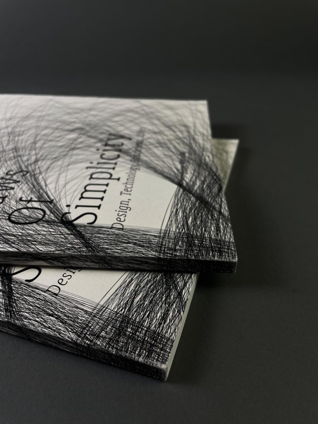
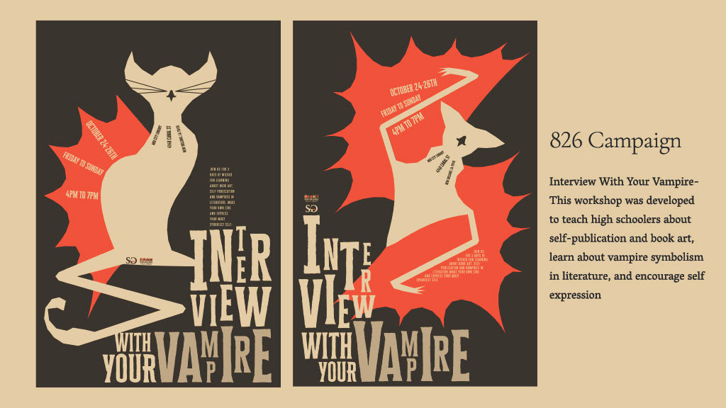
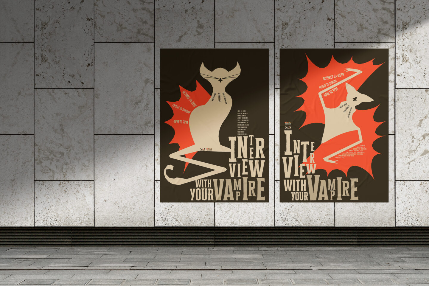
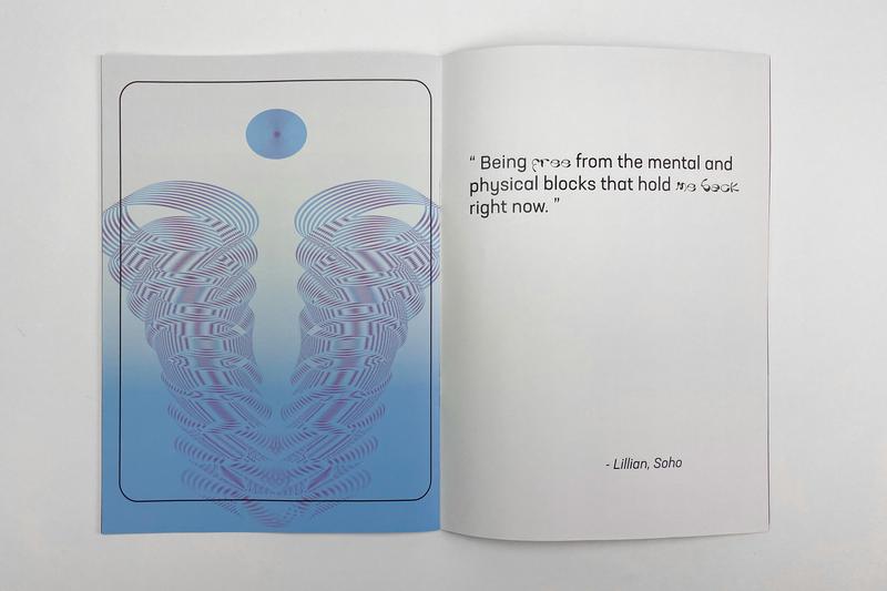
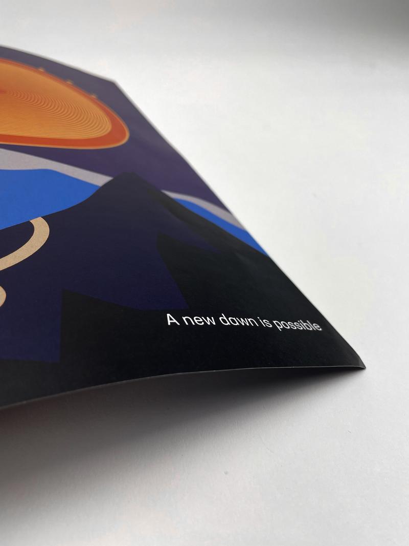
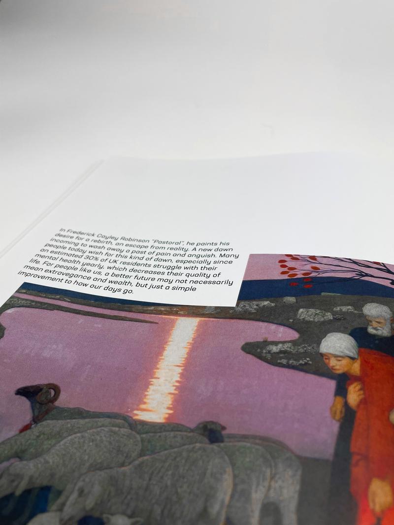
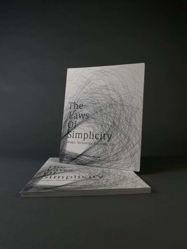
This 100-page perfect bound book, designed using The Laws of Simplicity written by the fabulous John Madea, is an exploration of complex typographic systems. My focus was developing a sense of form and a better ability to convey meaning through design choices. The biggest challenge for me was re-imagining a book that already existed. It was necessary to respect the original publication, while at the same time inserting my personal style and design understanding. The target audience were those who are eager to learn about how simplicity could elevate their design, which could be novices and professionals in the field alike. My interpretation of the book was driven by sophistication, while also retaining accessibility. This was achieved through refining the use of information hierarchy and integration of images, so that read path was intuitive. My biggest takeaway was how to manage a sizable workload. It was a challenge maintaining coherency throughout so many pages, so this book was a great practice in organization and focus.

New Orleans 826 Branding - St. Germain's Passage

New Orleans 826 Branding - St. Germain's Passage

St. Germain's Passage is a branding project that developed a retail identity for a store inspired by the Vampires of the French Quarter mythology of New Orleans It began as a research project, which included reviewing many articles about the city, reading local interviews, and creating case studies for successful brands. The goal was to then to produce an asset library that was able to reflect the spirit of NoLa, while simultaneously maintaining a unique identity. The target is the Vampire community in Louisiana that wished to enjoy the state. St. Germain's products help solve the various challenges Vampires might face during their journey. My main tools were Adobe Illustrator, InDesign, and Photoshop. My greatest challenge was creating a comprehensive brand that followed one visual direction but still had enough diversity to keep the brand from being monotone. St. Germain's was my introduction into the discipline of branding, and it taught me many important lessons on considering dynamic assets, color usage, and packaging.

New Orleans 826 Campaign - Interview With Your Vampire

New Orleans 826 Campaign - Interview With Your Vampire

The "Interview With Your Vampire" campaign is a continuation of the St. Germain's Passage brand. This project aimed to envision a collage creation workshop for high schoolers hosted by St. Germain's Passage, who's promotional posters reimagine the pre-established identity. The target audience was both the teens of high school and their teachers + parents, so my visuals had to strike a balance between informational and appealing. I was heavily inspired by Polish media posters from the 70's, which influenced my use of vector illustration and typography. These posters are designed to be viewed solo or together to allow for adaptability when placing them in a promotional environment.

Rectangle Site

Rectangle Site

The goal of this project was to code a website from the ground up. It began with research on Rectangle, a Scottish design studio. I conducted an in-depth investigation into their past projects, aesthetics, and work style. This informed four unique web pages, two of which included motion design. The objective was to create a snapshot of Rectangle’s design philosophy to entice an audience into looking further into the studio. This website was meant to be an exercise in HTML and CSS in order to expand my understanding of coding languages, as well as synthesize information into visuals. Getting lost in lines of code proved to be my greatest challenge. Proper workspace organization, self-guided research, and lots of troubleshooting proved to be the key to bringing the site to life. This project was a fun way to develop coding skills and generate an interest into the field of web design.

Living With Disorder

Living With Disorder

This book was a double tiered task- the development of content required both illustrations and typography. A group of young adults was asked to respond to the question, “What does living a good life look like to you?” Using the answers, I created a series of illustrations inspired by each response. This was an interesting exercise in translating verbal information into visual representations. The target audience was the same demographic as interviewed- young adults. The goal was to show others struggling with mental illness that they weren’t alone in their troubles and a happier life was possible. The biggest challenge I faced was the fast deadline. It forced me to be really efficient in decision making. I had to focus on the big picture instead of getting caught up in the small details and losing touch with the main idea. Thanks to this project, I got a new appreciation for the design industry’s fast paced environment. It was exciting to be able to marry my passions for illustration and typography. This publication set a nice groundwork for my future projects to expand upon.

Community Arts Partnerships Graphics

Community Arts Partnerships Graphics

Community Arts Partnership, or CAP, is a nonprofit organization that provides K-6 schools all over Metro Detroit with free art programs and classes. In order to fulfill their mission, they have annual training sessions aimed at teaching artists how to write curricula and lead a classroom. These graphics were created to supplement the trainings. The graphics had to be clear and educational, while simultaneously engaging enough to keep the attention of the room for 6 to 7 hours. The greatest hurdle was creating material up to standard for such a well-established organization. It was necessary to understand the mission of CAP as a whole, their previous branding, as well as getting to know the training program inside and out. The entire research, ideation, and creation process took about three months, but it resulted in material that adhered to CAP’s branding guidelines, reflected the spirit of the program, and proved to be successful during the 2024 fall training period. This was a rewarding experience that taught me how to expand on a preexisting brand and create informational design that is also visually pleasing.