Defining the Nothing Brand
Defining the Nothing Brand

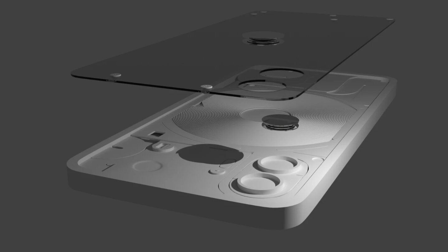
Transparency, playfulness, and a unique balance between simplicity and complexity. This project aims to encapsulate those core values of the Nothing tech brand through motion graphics. I took on the challenge of bringing a new voice to their identity, creating a narrative that resonates with Nothing’s aesthetic yet introduces an innovative element: the integration of typography with 3D objects. This is something the brand hasn\'t explored through their visuals. The journey began with modeling the entirety of the Nothing Phone (2) in Blender, crafting detailed textures in Substance Painter, achieving tone with custom scoring in Logic Pro, and meticulous color grading in DaVinci Resolve. Drawing heavily on statements from Nothing and inspired by the brand\'s existing aesthetic, the script I developed embodies the essence of Nothing while offering a novel direction.