Graduation

2027

Skills
  • Communication Design
  • Motion design
  • Typography
Employment Badge

RGBK

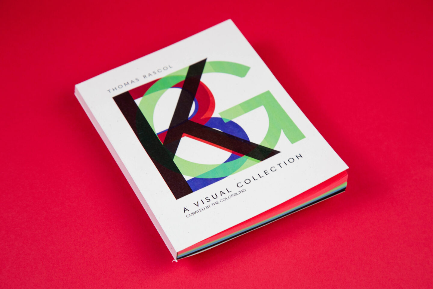
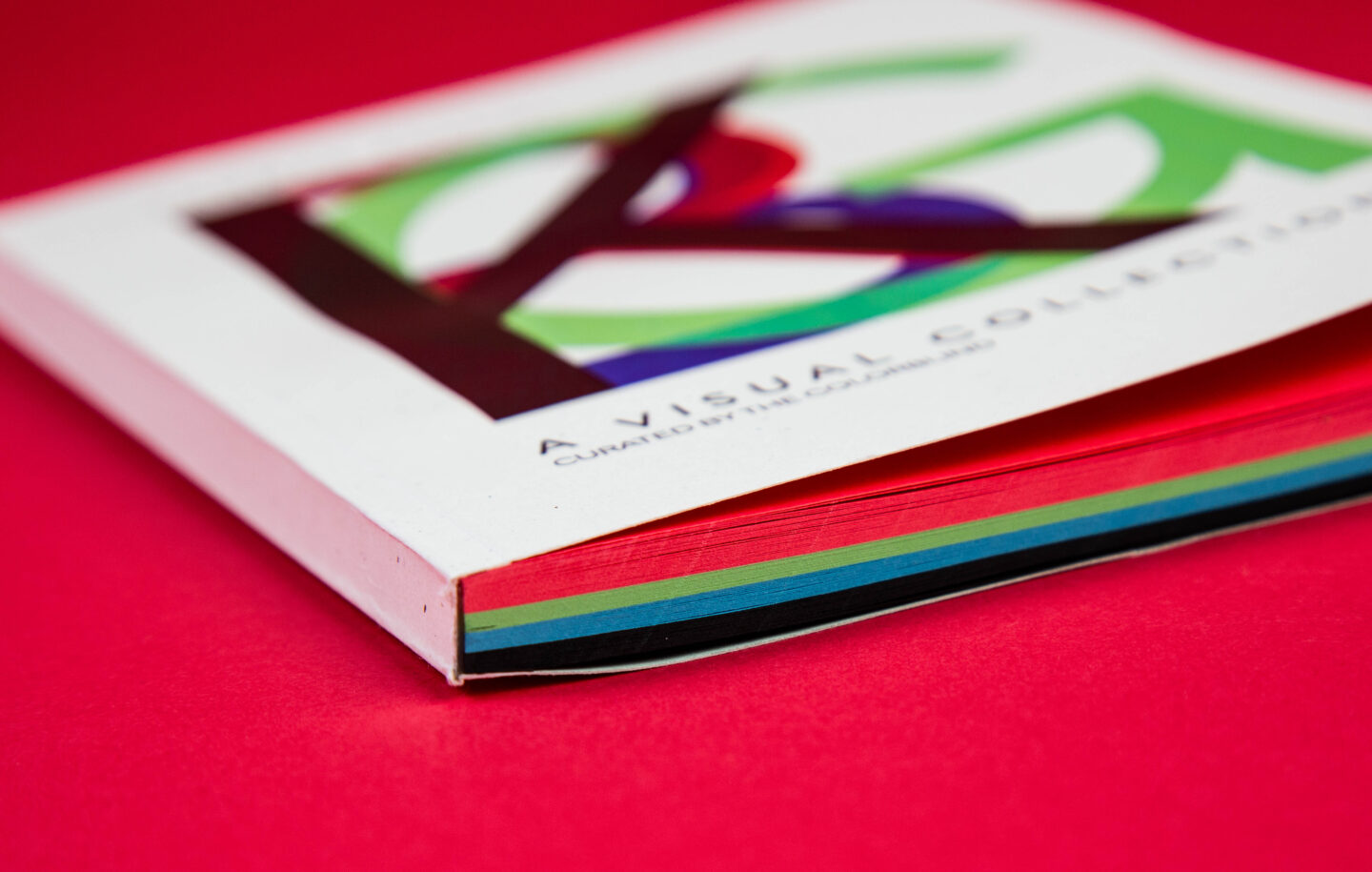
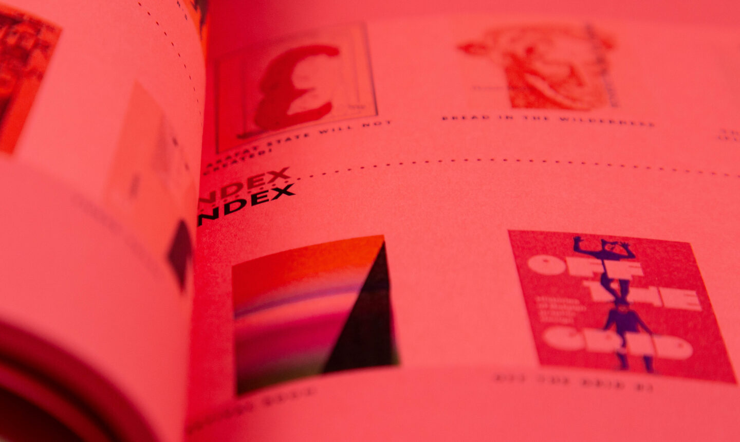
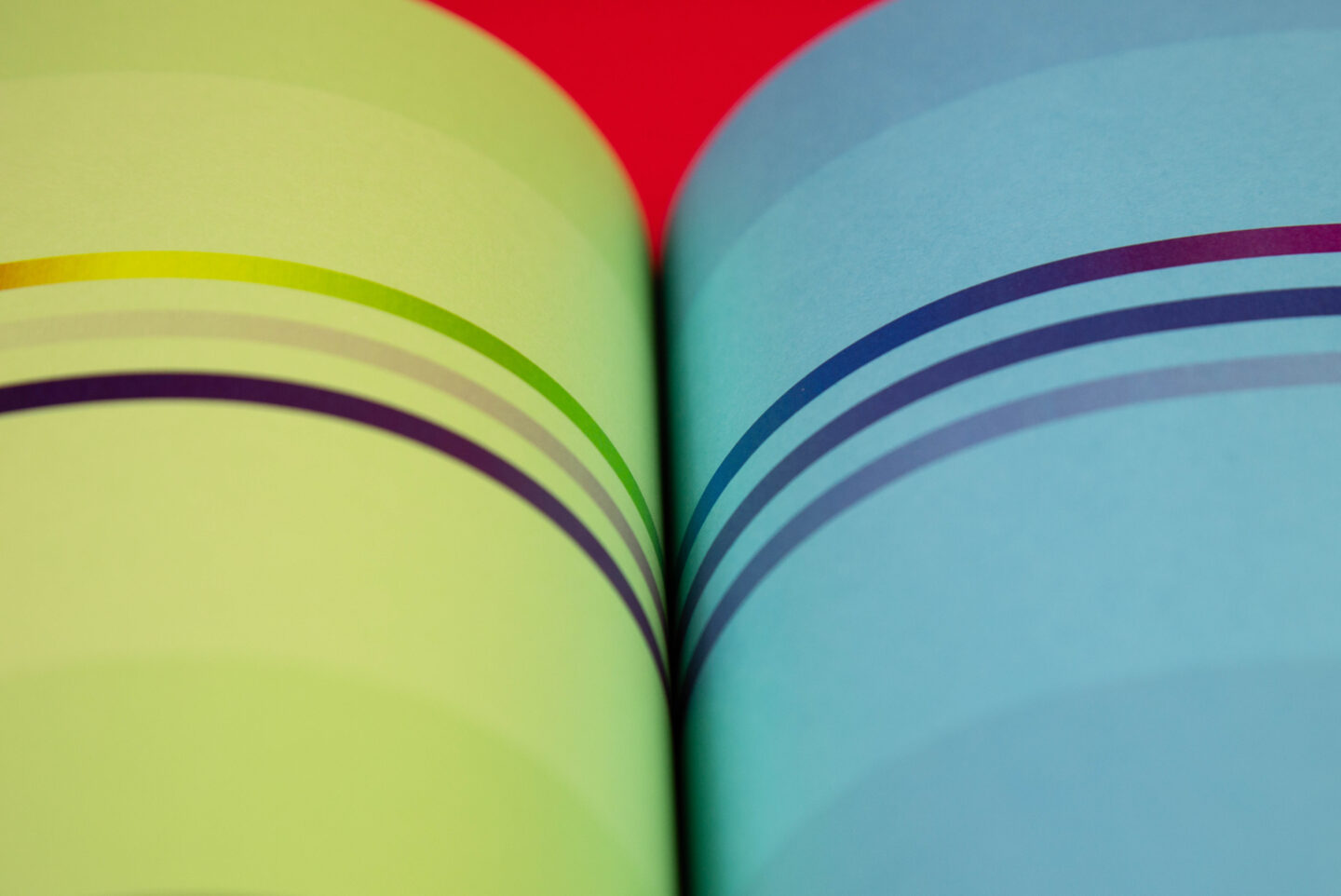
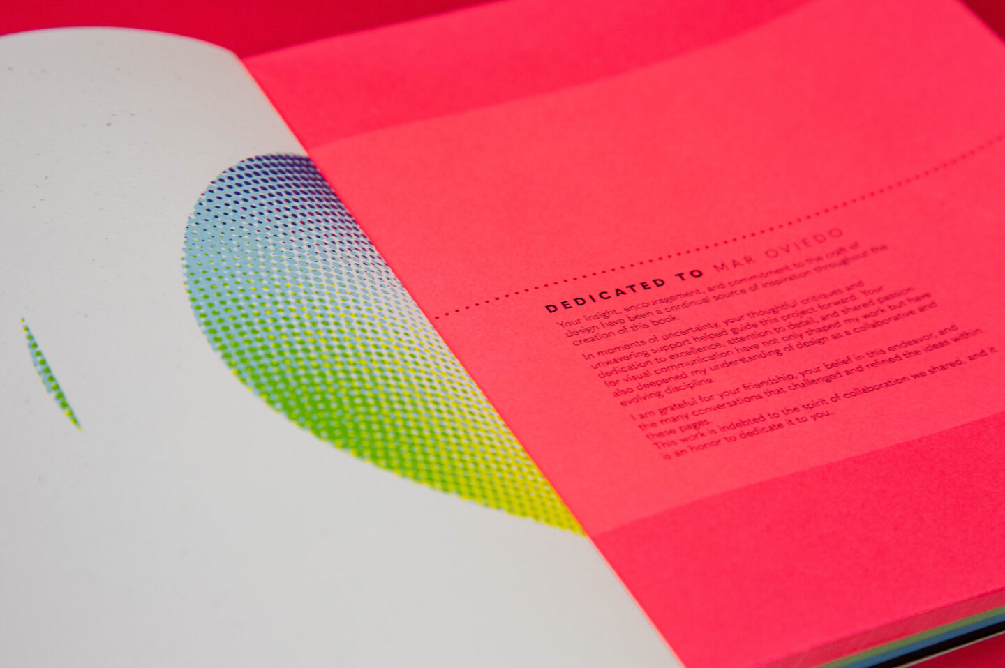
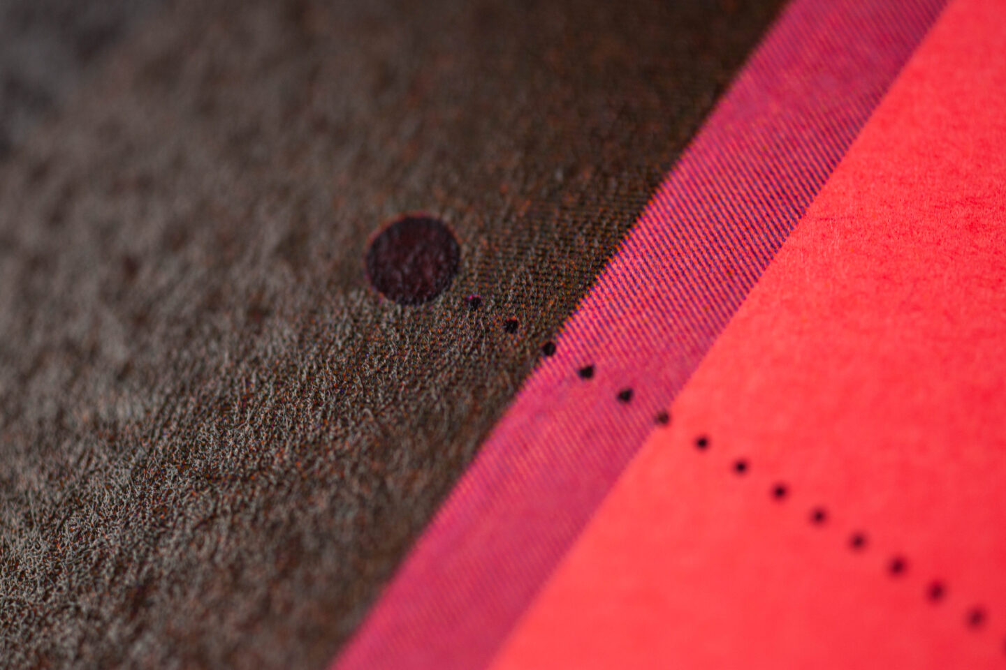
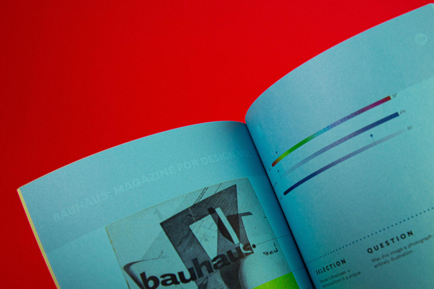
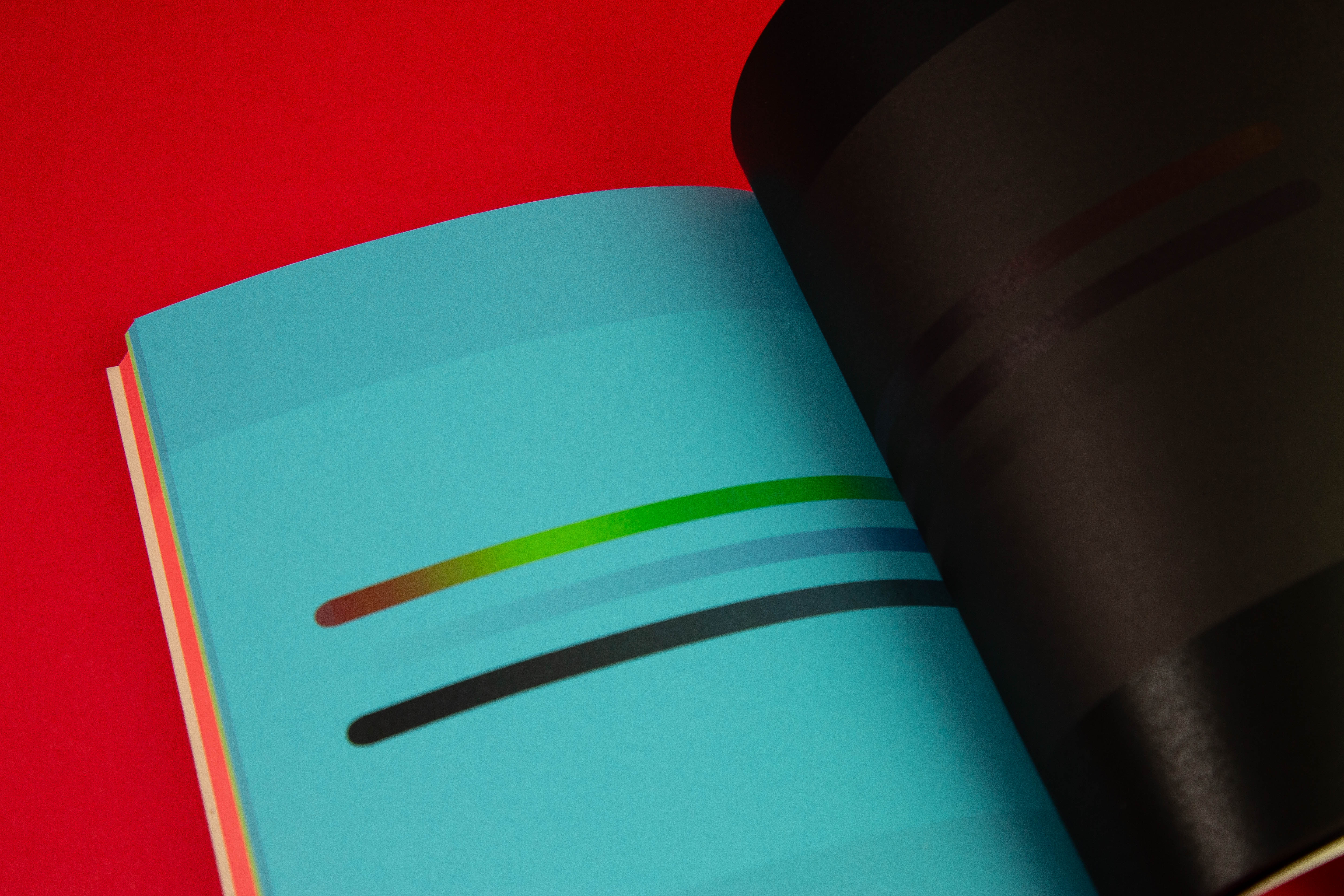
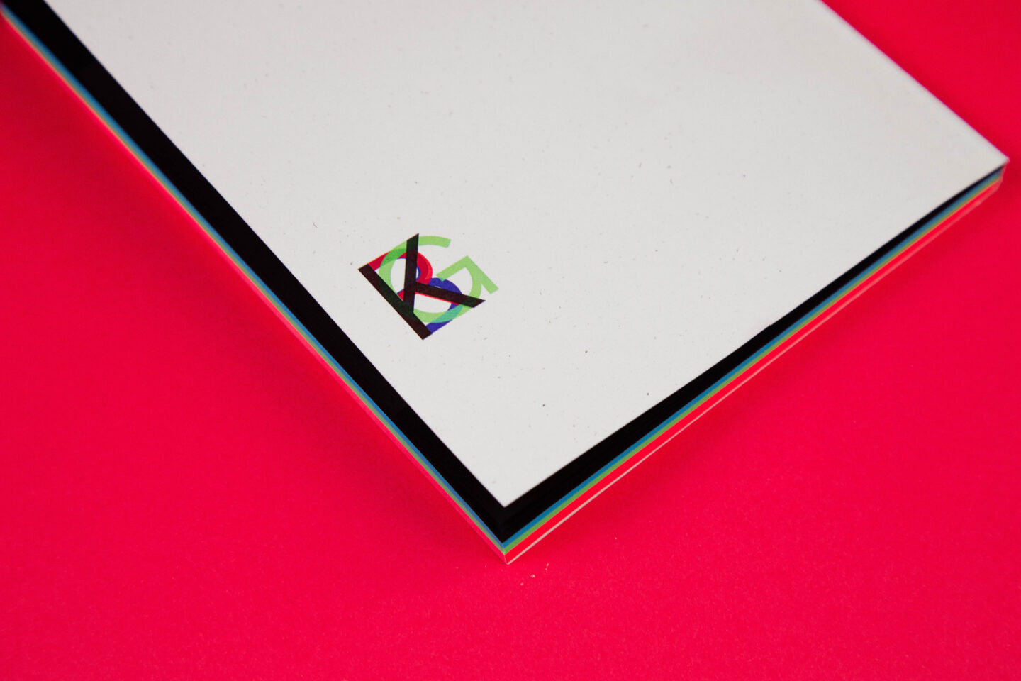
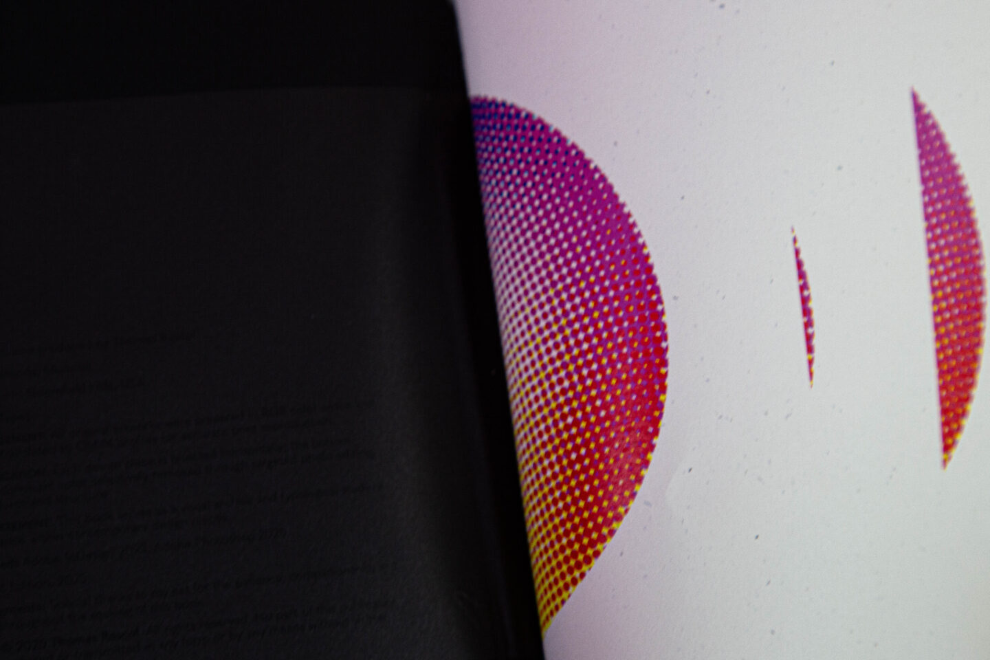
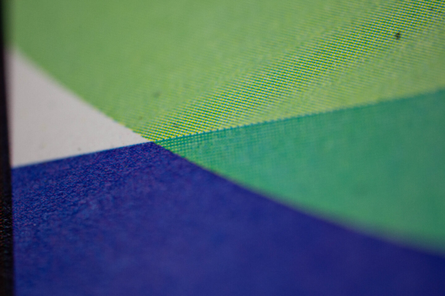
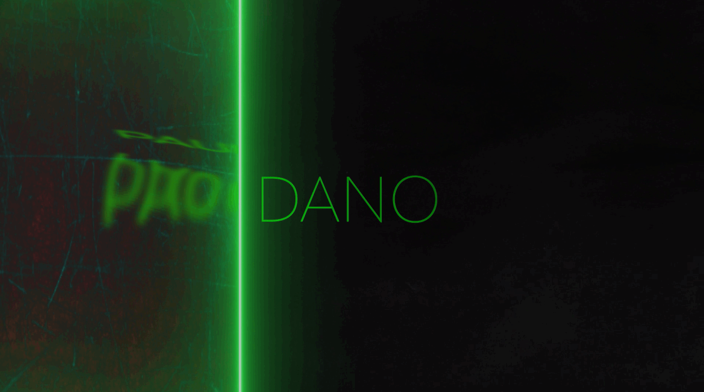
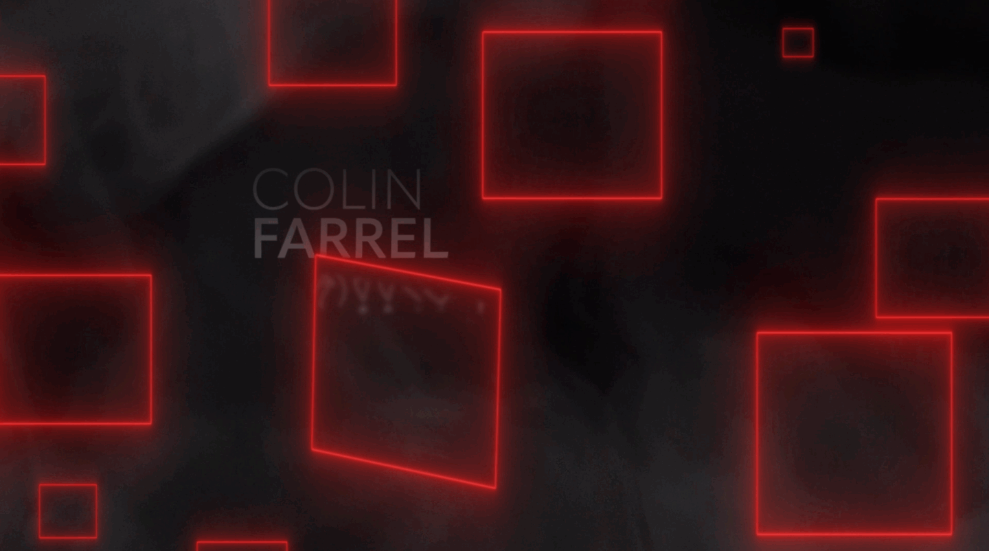
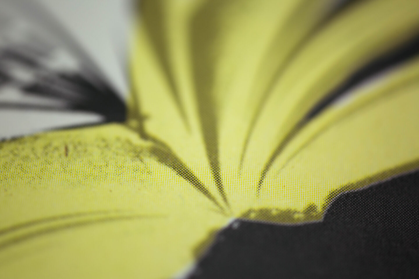
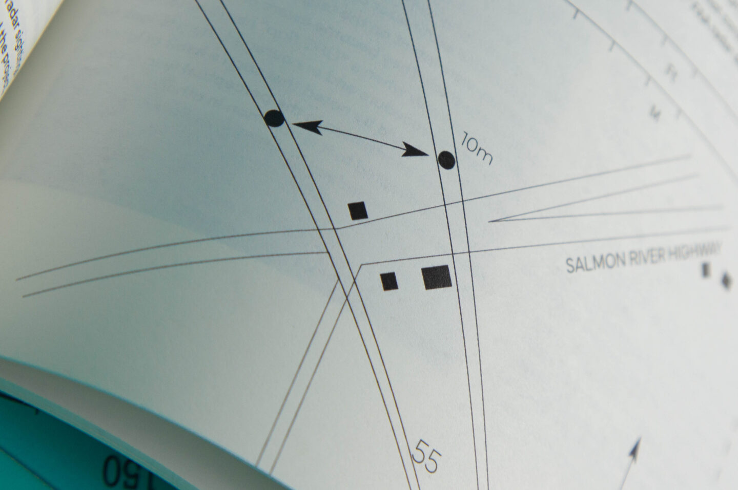
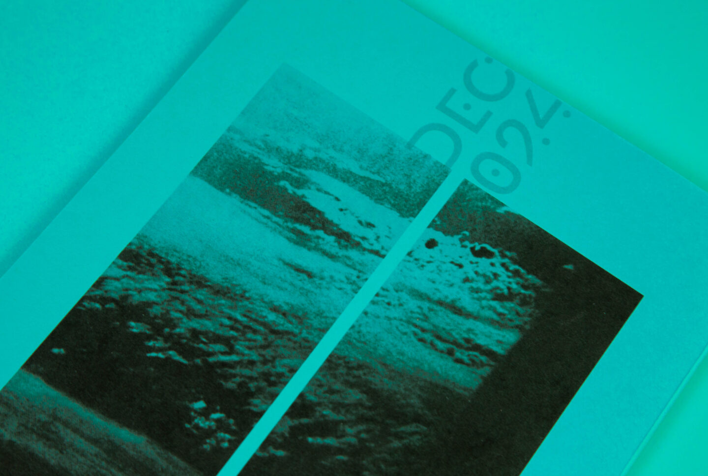
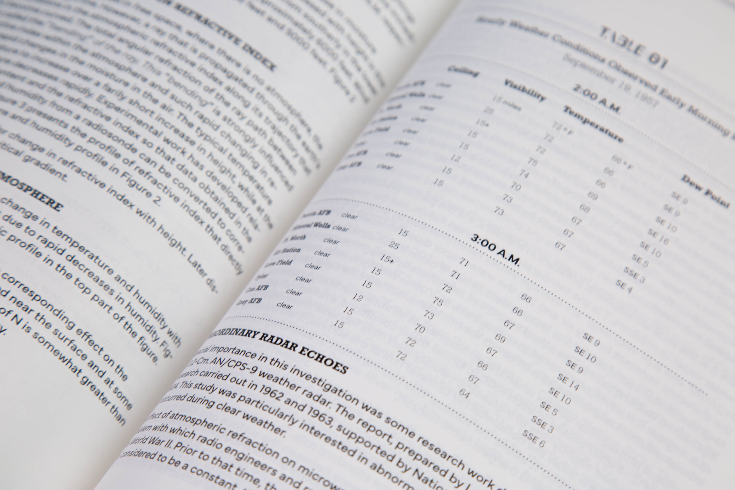
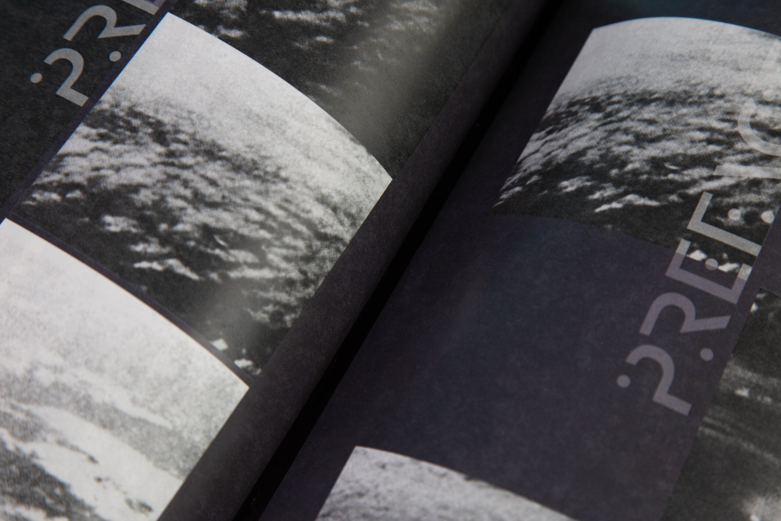
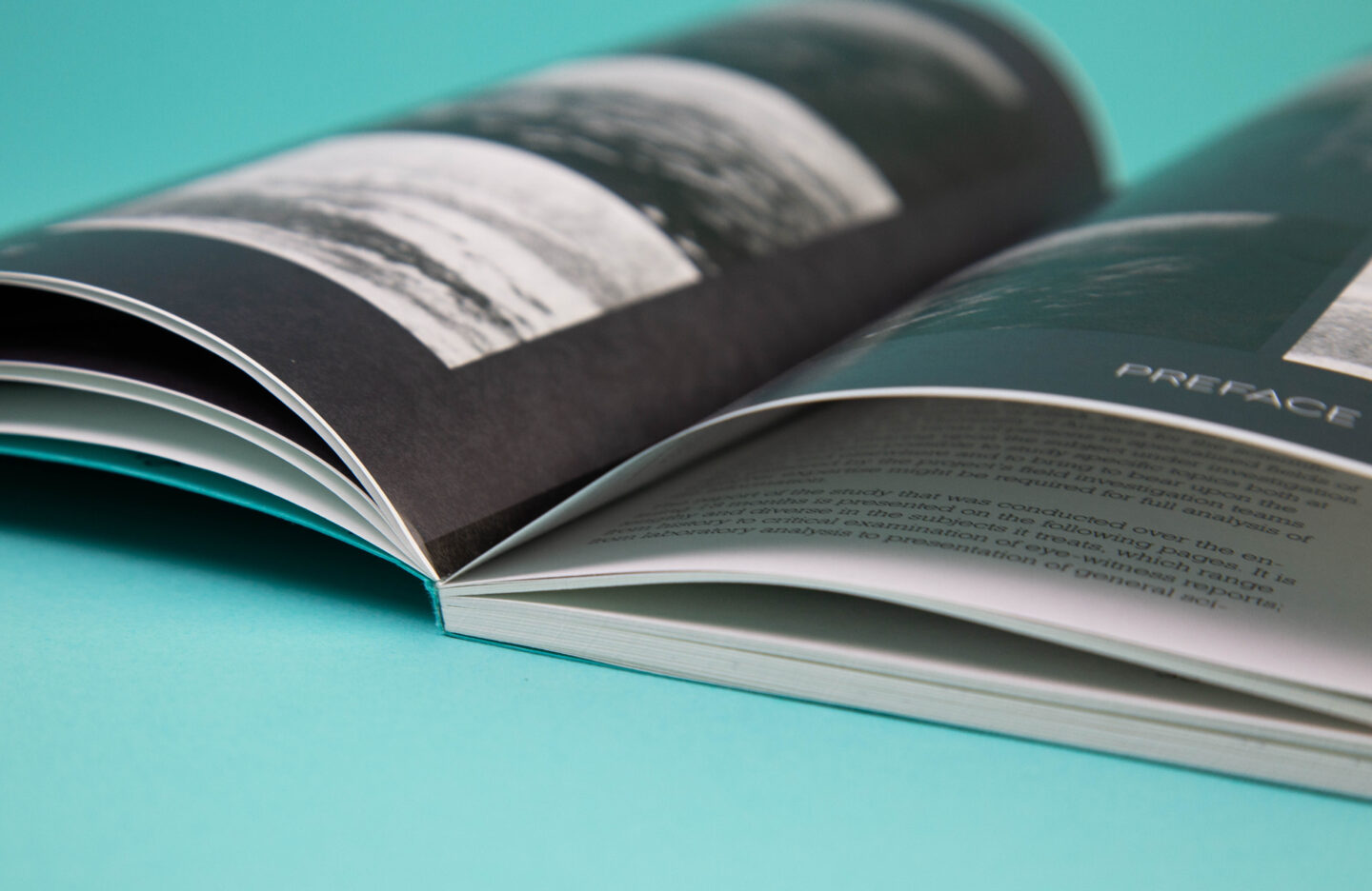
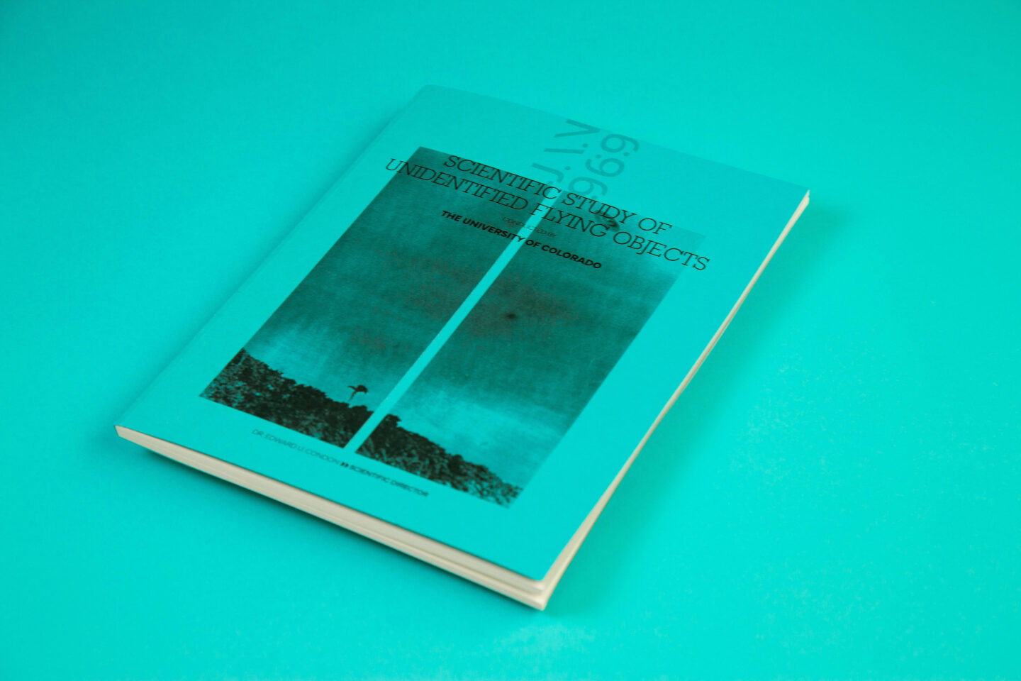
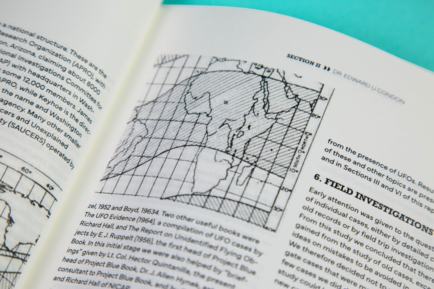
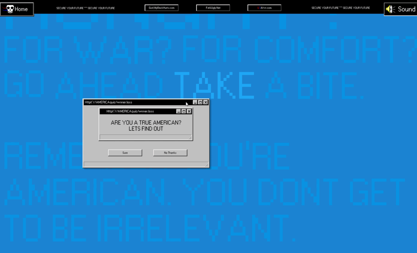
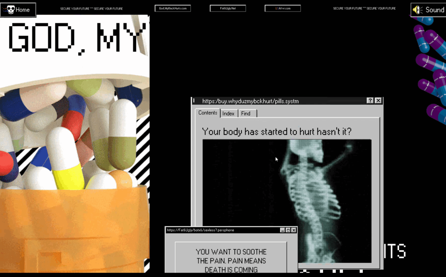
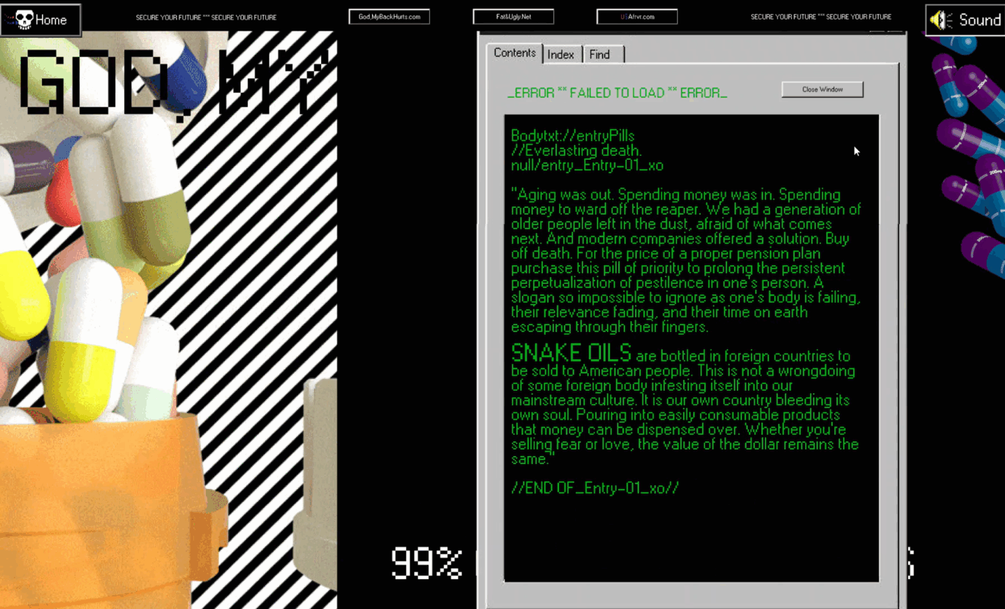
The Design Archive project, also known as RGBK, is a collection of seventy design works from across design history. Its purpose was to bring a personal perspective to the history of design by highlighting an identity shaped by colorblindness. RGBK is organized into four distinctive sections: red, green, blue, and black. This structure was designed to highlight color and emphasize different kinds of light while integrating the concept of colorblindness. The works themselves were curated from a variety of online digital archives, selected for their alignment with both a design philosophy and an aesthetic that resonated on a personal level. Each composition is bisected by a strong hangline, with the top half devoid of the primary wave of light present in the original. For instance, a work with primarily red has the red removed in the top half, leaving only its blue and green components. This treatment illustrates the scientific basis of colorblindness, in which a defective light-receiving cone alters the perception of light. This scientific functionality established the publication’s identity and became the foundation of the project. Balancing these conceptual ideas with the systematic nature of an archive presented challenges, particularly in terms of legibility and scannability. The shifting color palettes introduced depth but also made the text difficult to read in early iterations, at times approaching complete illegibility. Careful adjustments were required to balance visual experimentation with functional clarity. This process emphasized the importance of refining details so that the final archive not only appeared striking but also retained structural and conceptual integrity. In the end, the project became both an achievement and an educational experience, demonstrating the balance between aesthetic experimentation and the practical demands of functionality.

"The Batman" Title Sequence

"The Batman" Title Sequence

When tasked with creating a title sequence, the primary goal was to produce visuals that evoke the film while integrating its deeper imagery and themes throughout the sequence. This objective was achieved through deliberate stylistic choices and layers of metaphor embedded within the visuals. The sequence features large reflective mirrors that capture the foggy surroundings, simultaneously distorting and revealing the type behind them. The mirrors’ rims glow with neon red, reinforcing themes of concealment, distortion, corruption, and ultimately, breaking through layers of deception. The project presented distinct technical challenges. Reflection and distortion of the glass required precise execution, while shooting smoke with dry ice demanded additional focus and control. These difficulties, however, facilitated a deeper understanding of the tools and encouraged exploration of new techniques. The project also highlighted the importance of early-stage development. Style framing and storyboarding were essential for planning the sequence, ensuring that pacing, tone, and visual consistency were maintained. The success of the final project depended on this preparation rather than building spontaneously. By establishing a clear plan and aesthetic from the outset, the project was able to realize a cohesive and impactful sequence. This process reinforced the value of careful planning, technical experimentation, and thoughtful integration of metaphor in motion design.

Math VS Magic Newspaper

Math VS Magic Newspaper

The primary objective of this project was to integrate content into the form of a newspaper, creating a system that engages with the material in a unique and intuitive way. The project explored how design could interact with prior expectations of newspapers and their imagery. At the core of the project, the newspaper embodies stark juxtaposition typographically, grid-wise, and in color. Initial ideas were developed through experimentation with sample spreads. The central contrast lies between the concepts of math and magic in relation to love. This was expressed through the text and visual system, using geometric typefaces against more playful ones, odd-numbered versus even-numbered columns, and a defined color palette to reinforce the distinction. This system of communication served as the backbone of the project, establishing a visual language that conveyed the content effectively. The greatest challenge involved balancing the project with a partner. Creating a coherent style that could be replicated when work was divided proved more difficult than anticipated, as designs often failed to align with the established system. This required the clarification and organization of rules that both collaborators could understand and apply consistently. The project also emphasized attention to fine details, allowing for nuanced juxtapositions throughout the design. It reinforced the importance of collaboration, communication, and trust, ensuring that stylistic integrity was maintained while providing experience in leading and facilitating design work beyond individual contributions.

The Condon Report

The Condon Report

The initial goal of this project was to explore typographic structure, hierarchy, and the use of quality type in large-scale print. This objective was approached through style sheeting and large-scale print methods designed to create a system capable of integrating additional media, such as diagrams and tables. The explorations conducted throughout the project led to a distinct design decision that defined the visual identity of the work: center alignment. This choice became the focal point of the design, serving as the foundation for hierarchy and guiding the structure of the entire publication. By consistently employing center alignment, points of emphasis were established and reinforced across the work. The process of creating this project was particularly demanding. Producing a 100-page book over the course of six weeks required careful management of workflow and consistent iteration. Large-scale style sheeting played a central role in maintaining cohesion and driving the project forward despite the compressed timeframe. Ultimately, the experience underscored the importance of efficiency and refinement in design practice. It provided not only the ability to create strong typographic work but also the skill to curate, organize, and execute it under significant time constraints. These lessons strengthened both technical and organizational abilities, contributing to a more disciplined and systematic design approach.

Soulmart Experience

Soulmart Experience

This project takes shape as a retro computer interactive experience. The art is kitschy and reminiscent of early 2000s Windows. The design philosophy showcases a deliberately busy and nostalgic approach to web design, an information overload carefully curated and designed. It’s active and loud, with no semblance of sleekness, instead embracing the nostalgic noise of the old internet. At the core of the project is interaction. The experience was created to be more than visuals, ensuring engagement and participation throughout. The tone and messaging function as a commentary on aging and its connotations in modern society. The fear of death is rooted in old age and its commodification, showcasing a world where death is postponed at the swipe of a credit card. All of this is conveyed through imaginative, satirical language. The experience has users working through multiple pages of an e-commerce site, progressing the narrative and encountering interactions along the way. With interaction as the focus, iteration placed new emphasis on integrating it wherever possible. This led to a design process that mapped each section of the project and identified what unique mechanical interaction would be present, ensuring every stage felt distinct and offered something new. This shift in process guided the entire project, shaping how engagement can and should be embedded into user experience. The result is not merely a story, but an interactive narrative that users actively inhabit and experience.

Spoken Word

Spoken Word

This project is an animation relaying the words of design icon Milton Glaser. The goal was to create a cohesive flow throughout the work, capturing typographic movement and establishing visual metaphor through animation. This idea of metaphor introduced a level of character into the animation that, without it, the entire project would have lacked. The animation is quick and energetic, moving rapidly with each spoken line. Its tone follows this rhythm, with typographic metaphor woven throughout to give a playful lens to the already playful voiceover. The design process centered on creating distinct frames and developing seamless transitions between them. An accented grid supported these transitions, propelling the viewer from one keyframe to the next. For imagery, a system was devised to ensure cohesion and to dictate how images would appear and disappear within the sequence. The most significant influence on the design process was the use of a visual metaphor. Building in moments of character within both text and graphics established the tone and voice of the project. Beyond generating interest for the viewer, this approach elevated the work, moving it beyond simple execution and into a space of intention and reflection. The project ultimately reinforced one of motion design’s most important principles: embedding metaphor not only in static composition but also in the animation and movement of content.

How To: Make Clatites

How To: Make Clatites

The objective of this project was to integrate type and video in a cohesive manner in order to explain a concept thoroughly. The work also aimed to establish an aesthetic identity that would represent the entirety of the finished video. In this case, the chosen identity reflected rural Romania. This was achieved through high-quality footage combined with engaging typographic play, both serving the purpose of education. The video was produced through multiple shoots over the course of a week, followed by another week of post-production. Typography was then layered into the footage to add both emphasis and interest. Scattered throughout the work, the type underscored the imagery and voiceover, guiding the viewer through the process of creating the dessert. The typography and graphics drew from floral motifs, while the set design reinforced the rural Romanian aesthetic with traditional tunics, wooden bowls, and a home-worn tablecloth. Together, these choices established the project’s distinct identity. The greatest difficulty of the project lay in filming the how-to sequence. The process was time-consuming and detail-oriented, requiring consistency across shots while managing numerous technical challenges. These obstacles created frustration during production, but they also led to the strongest element of the project: the quality of the footage itself. Careful editing, paired with determination, produced visuals that both captured the intended aesthetic and provided a foundation for typographic experimentation. Ultimately, the project underscored the value of persistence in overcoming obstacles, demonstrating how difficulty in the creative process can lead to work that is both effective and meaningful.