Graduation

2027

Skills
  • Communication Design
  • Editorial Design
  • UI/UX
Employment Badge

'Stalker' Title Sequence

'Stalker' Title Sequence

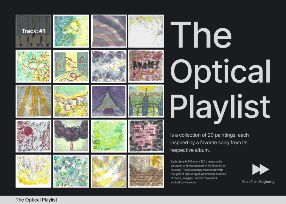
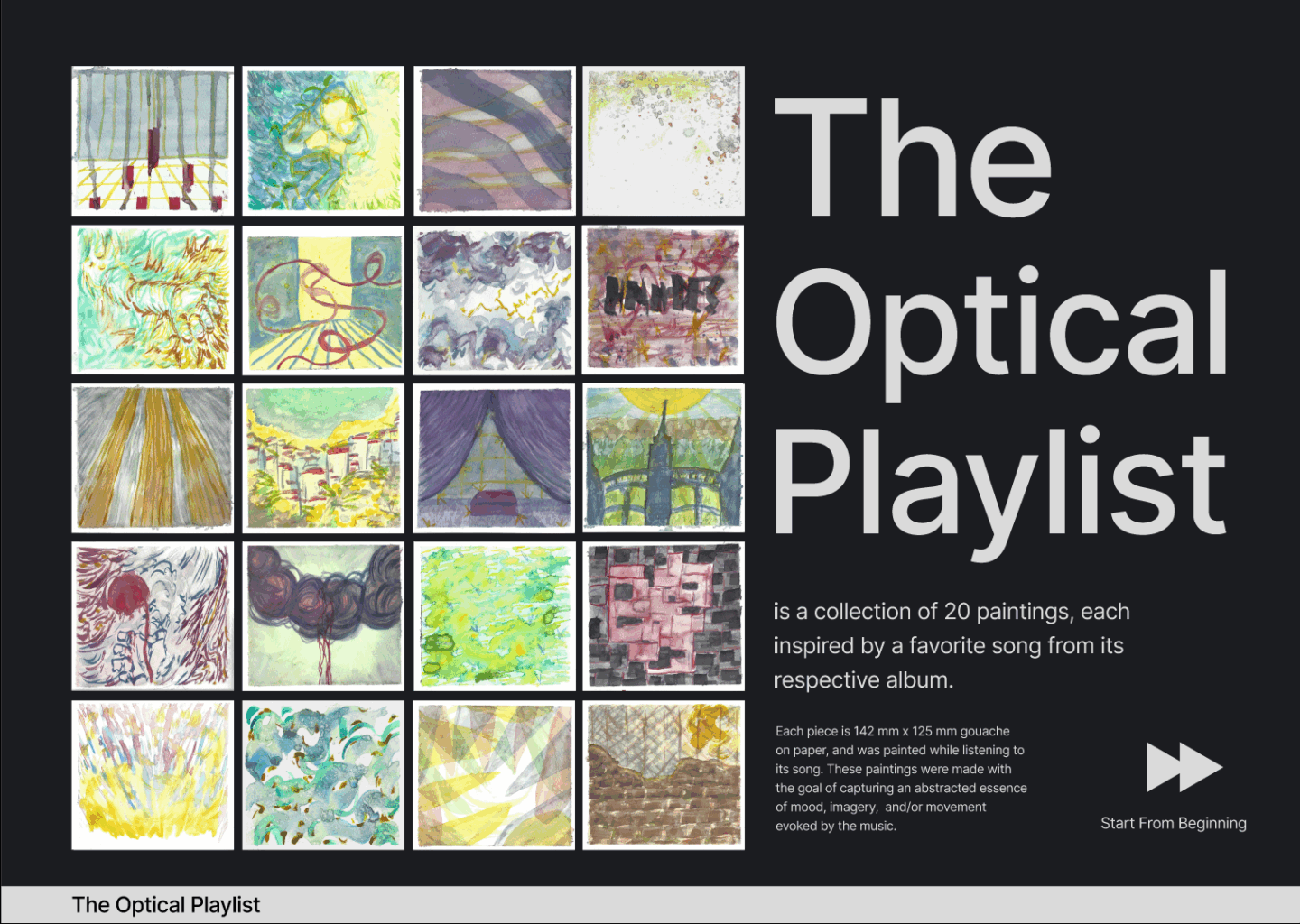
This project involved designing a new title sequence for Andrei Tarkovsky’s Stalker (1979), focusing on the film’s atmospheric tension between overgrown landscapes and decaying industrial structures. Working with my partner, Nidhi Srikanth, we combined original footage, typography, and visual research to create a sequence rooted in the film’s symbolic compositions and use of color. We alternated between Roman and Cyrillic type to echo the film’s Russian language and thematic dualities. The project strengthened my technical, conceptual, and collaborative skills, especially in asset management and team communication.

Technology v.s Nature Collages

Technology v.s Nature Collages

This project involved creating 42 collages around the theme of technology vs. nature. Using found images and type, I produced each collage by hand under a strict five-minute time limit. Afterward, I selected the strongest 24, digitized and refined them, and compiled the set into a GIF. The process was a practical exercise in composition, asset collection, and typographic integration, with challenges including sourcing relevant imagery and balancing it with existing type. Working under time constraints pushed me to embrace imperfection, think quickly, and prioritize ideas over polish, ultimately strengthening my ability to experiment and generate concepts rapidly.

CD Collection Website

CD Collection Website

This project involved designing both a desktop and mobile website in Figma to showcase my CD collection through two distinct visual approaches. The mobile site presented 20 albums with the average color of each cover, creating a clean, minimal system focused on clarity and denotative information. The desktop site paired the same albums with paintings I created while listening to each album’s standout track, emphasizing mood, interpretation, and expressive visual response.

70: Personal Design Archive

70: Personal Design Archive

This project involved curating a 70-piece design archive spanning diverse mediums that inform and inspire my practice. I intentionally moved beyond the traditional design canon, pairing niche and lesser-known works with more established examples to broaden my historical and visual reference points. After researching each piece, I developed a cohesive book system and produced a perfect-bound volume modeled after gallery and museum catalogues. The main challenge was creating consistency across varied content, which required careful attention to layout, hierarchy, and pacing. The project strengthened my research process, refined my editorial design skills, and expanded a reference archive I can continue to draw from.

Don't Obey

Don't Obey

This project was my first exploration of Augmented Reality as a design tool. Building on my Technology vs. Nature collages, I created a poster and used Adobe Aero to add an AR layer that expanded its narrative. The piece contrasts humanity’s historical reliance on mythology and spirituality with the modern use of science and technology to explain the unknown. The main challenge was crafting a cohesive story across both physical and digital forms while learning new AR software. The project strengthened my technical skills and showed me how augmentation can deepen storytelling and broaden the communicative potential of design.