Graduation

2027

Skills
  • Packaging/Brand Design
  • Book Binding
  • Multimedia Graphic Design
Employment Badge

826 Over & Dover Branding

826 Over & Dover Branding

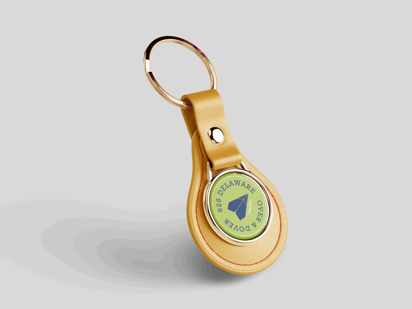
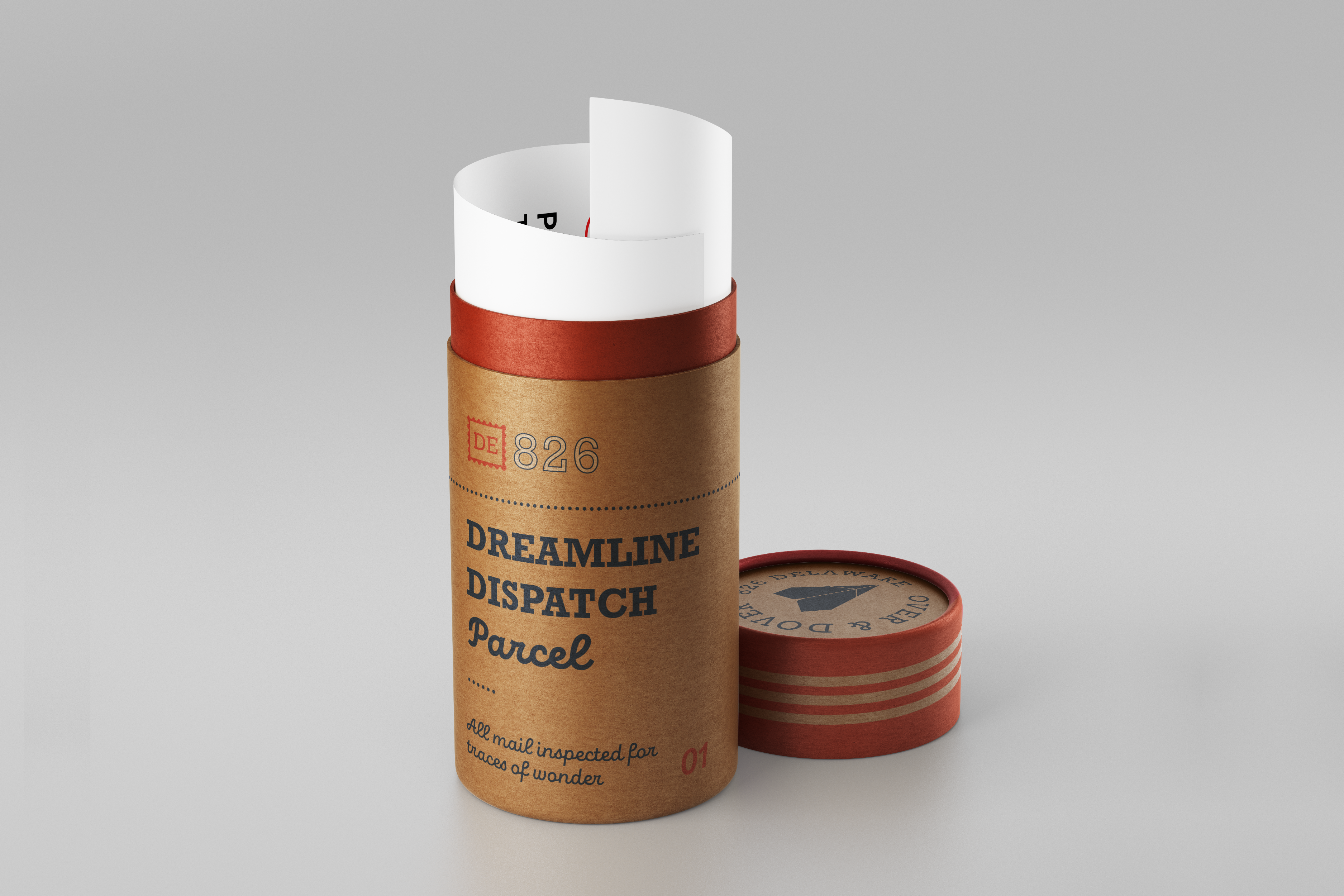
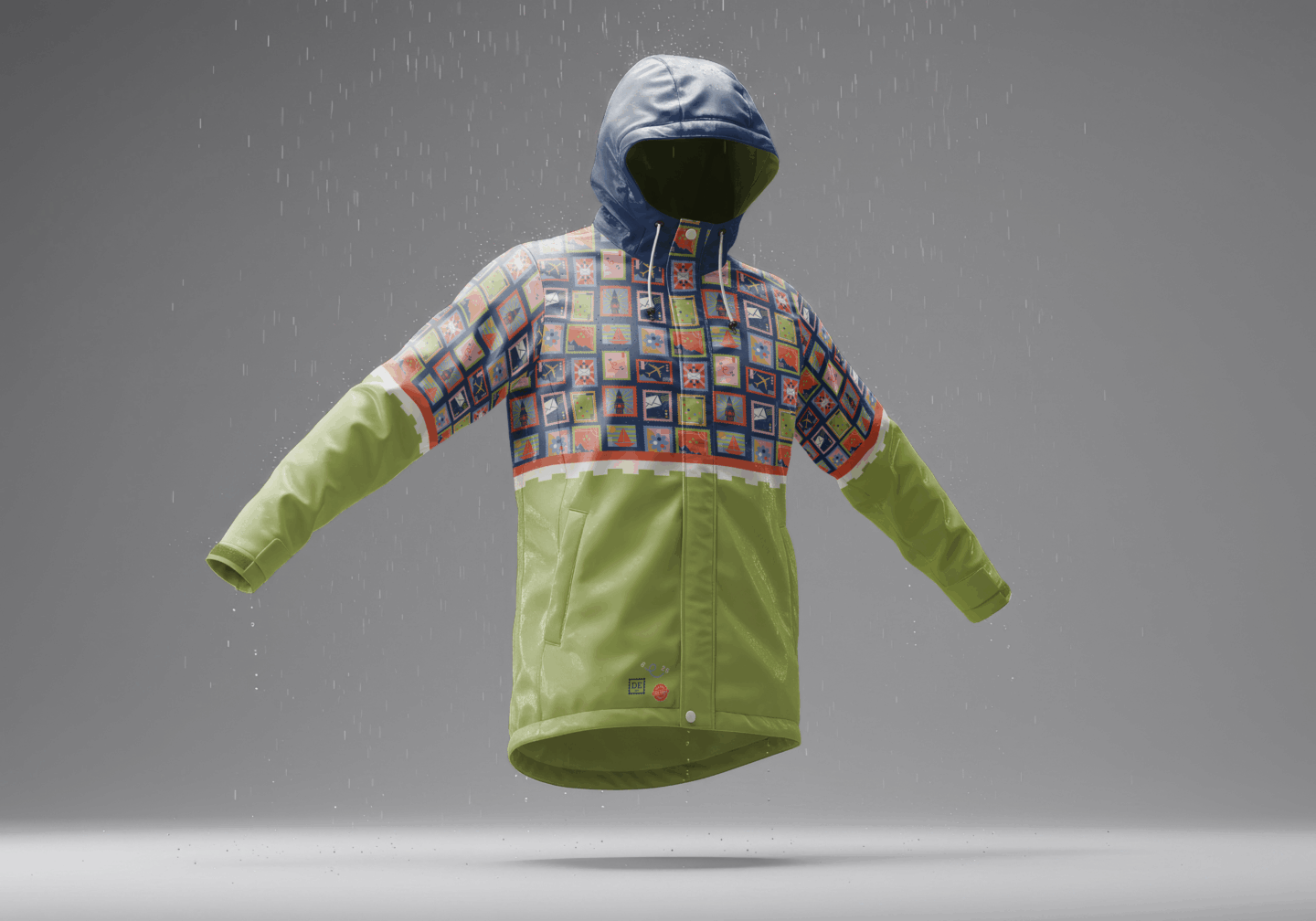
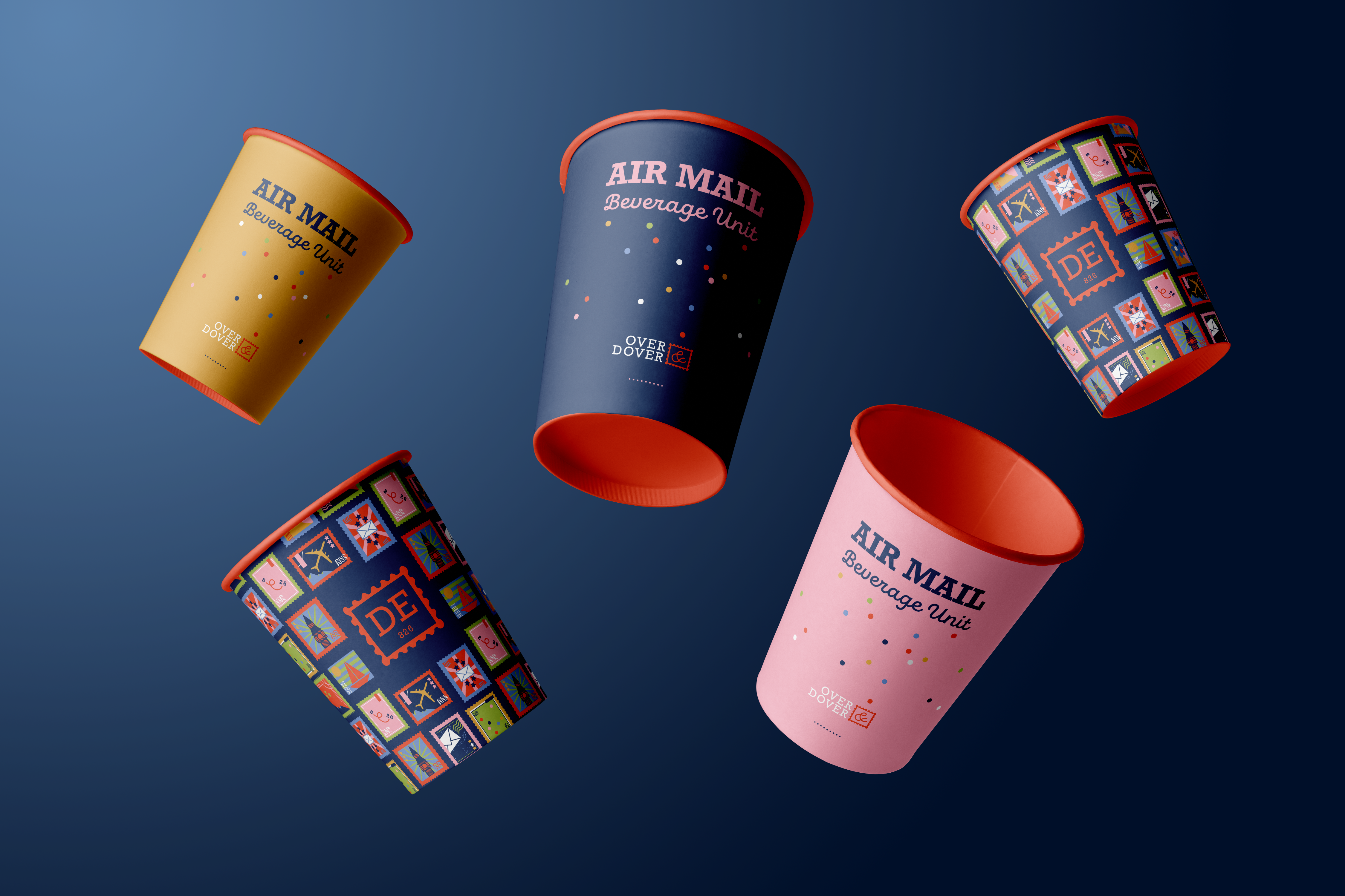
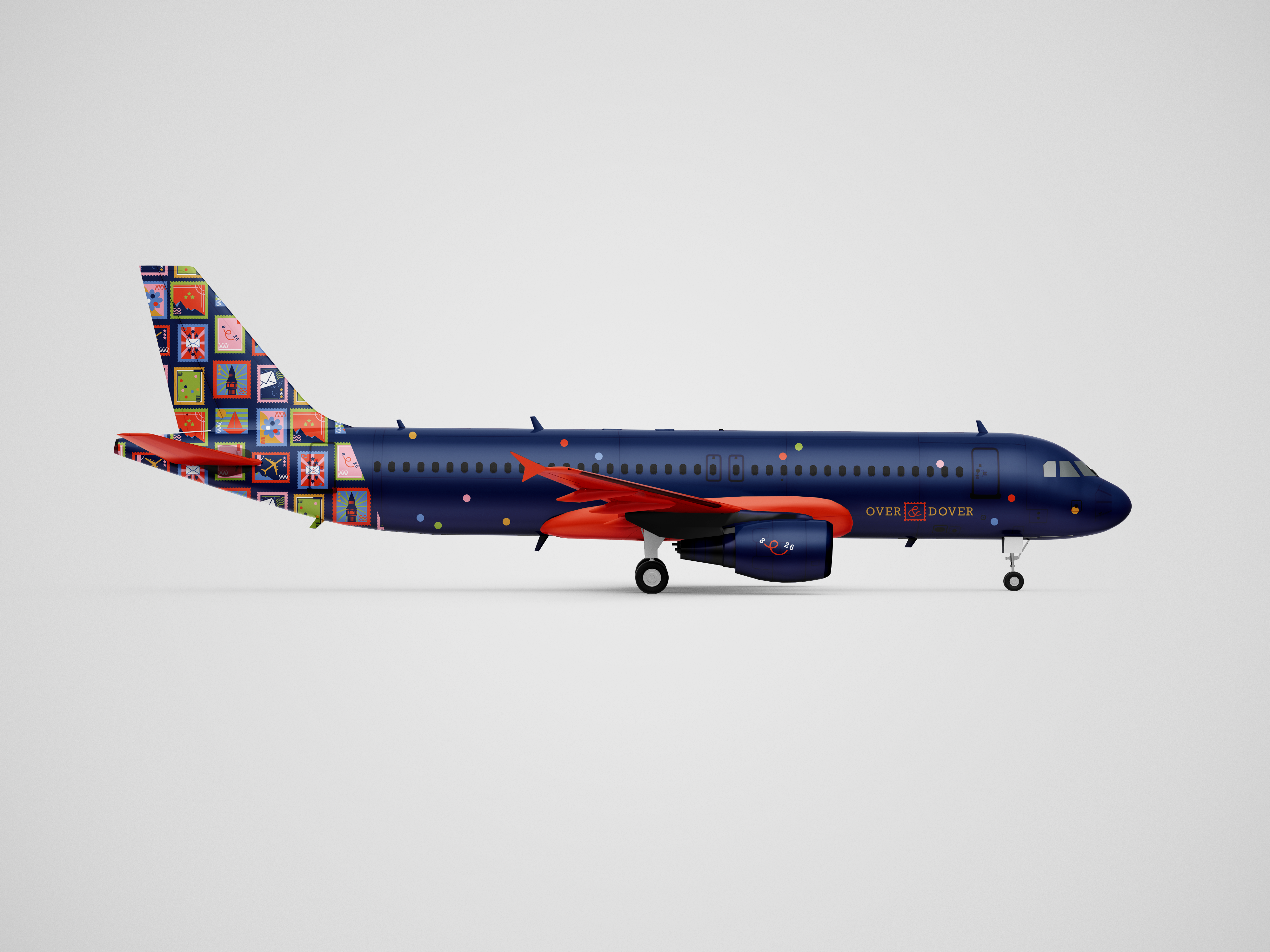
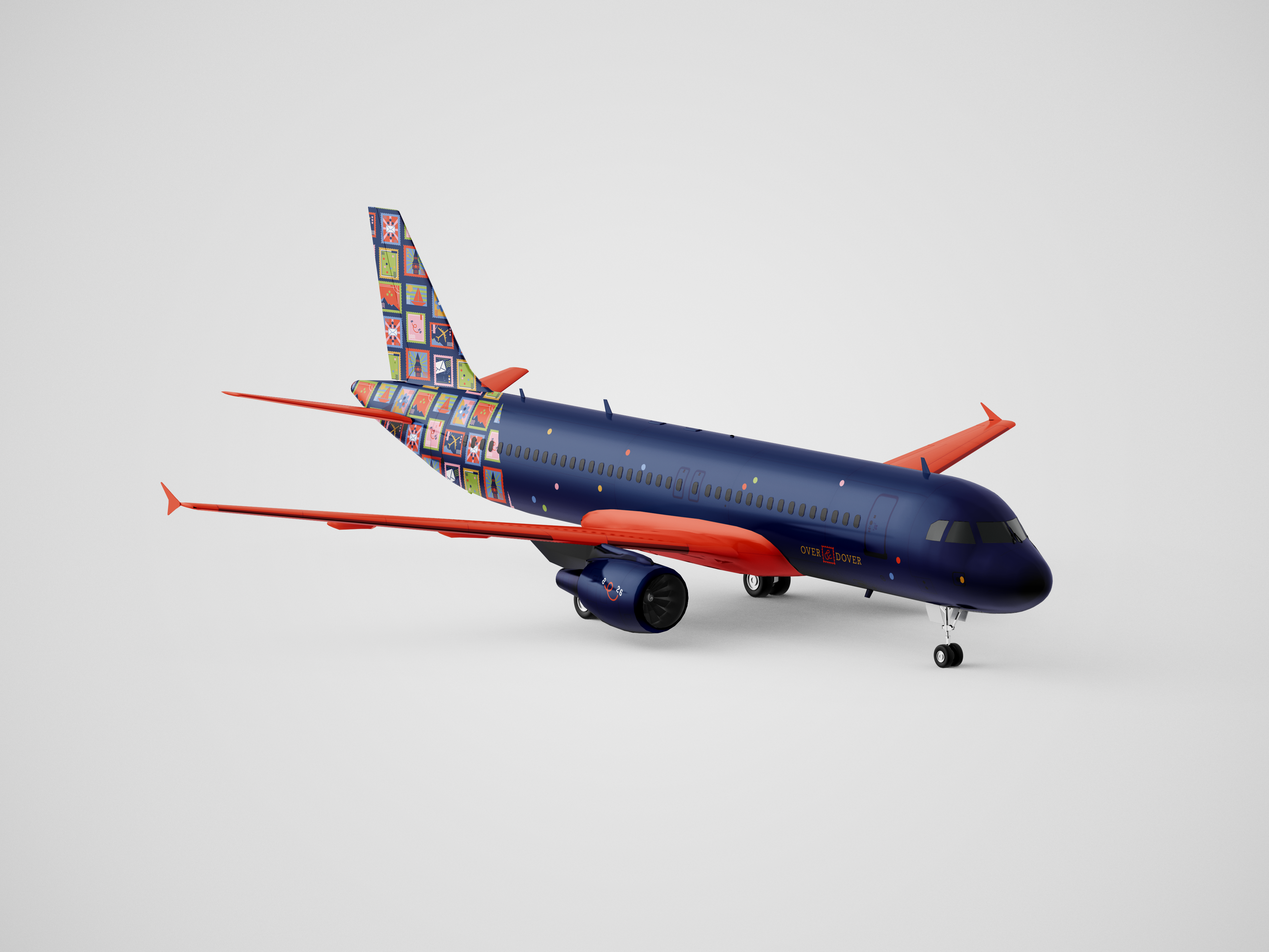
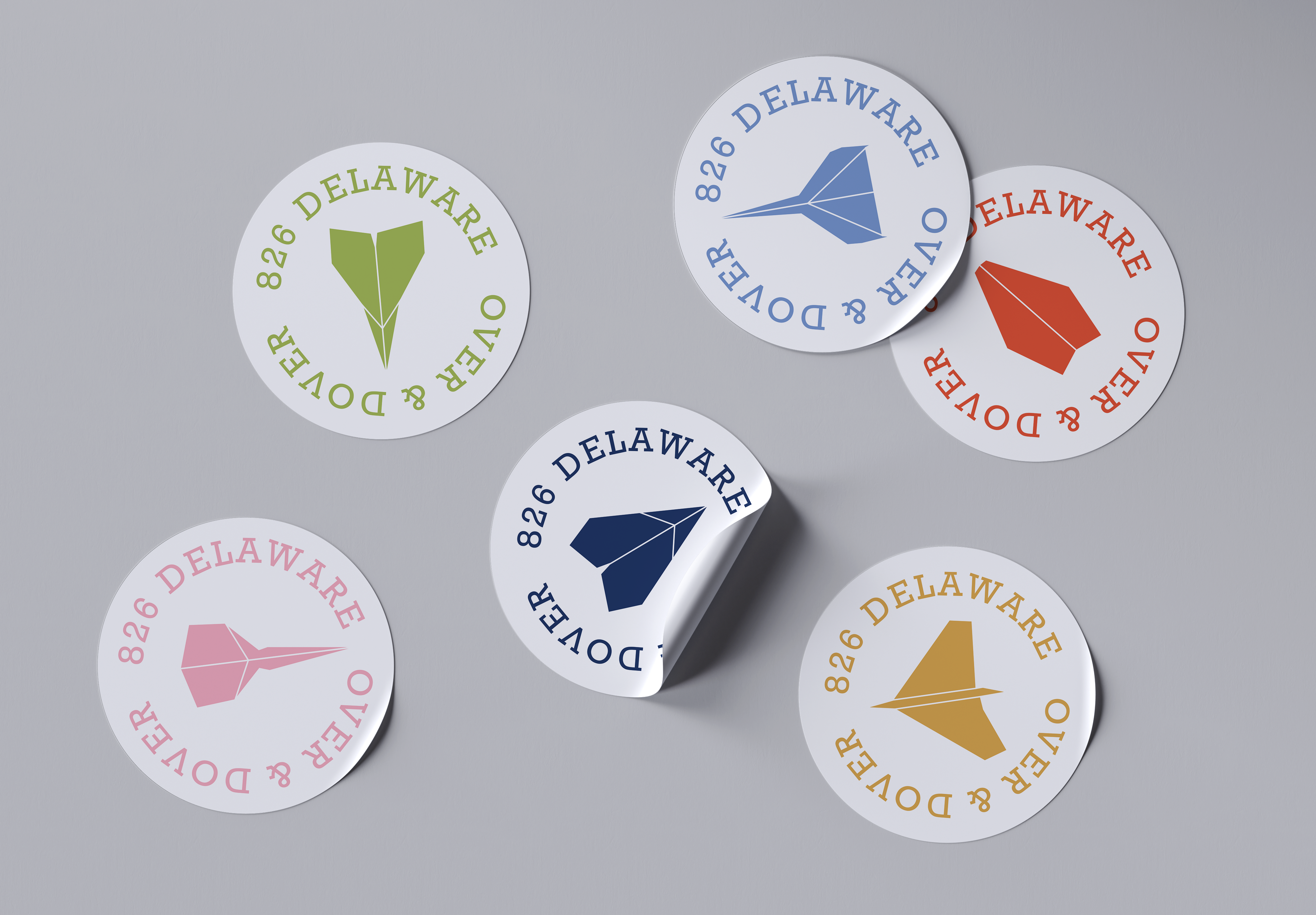
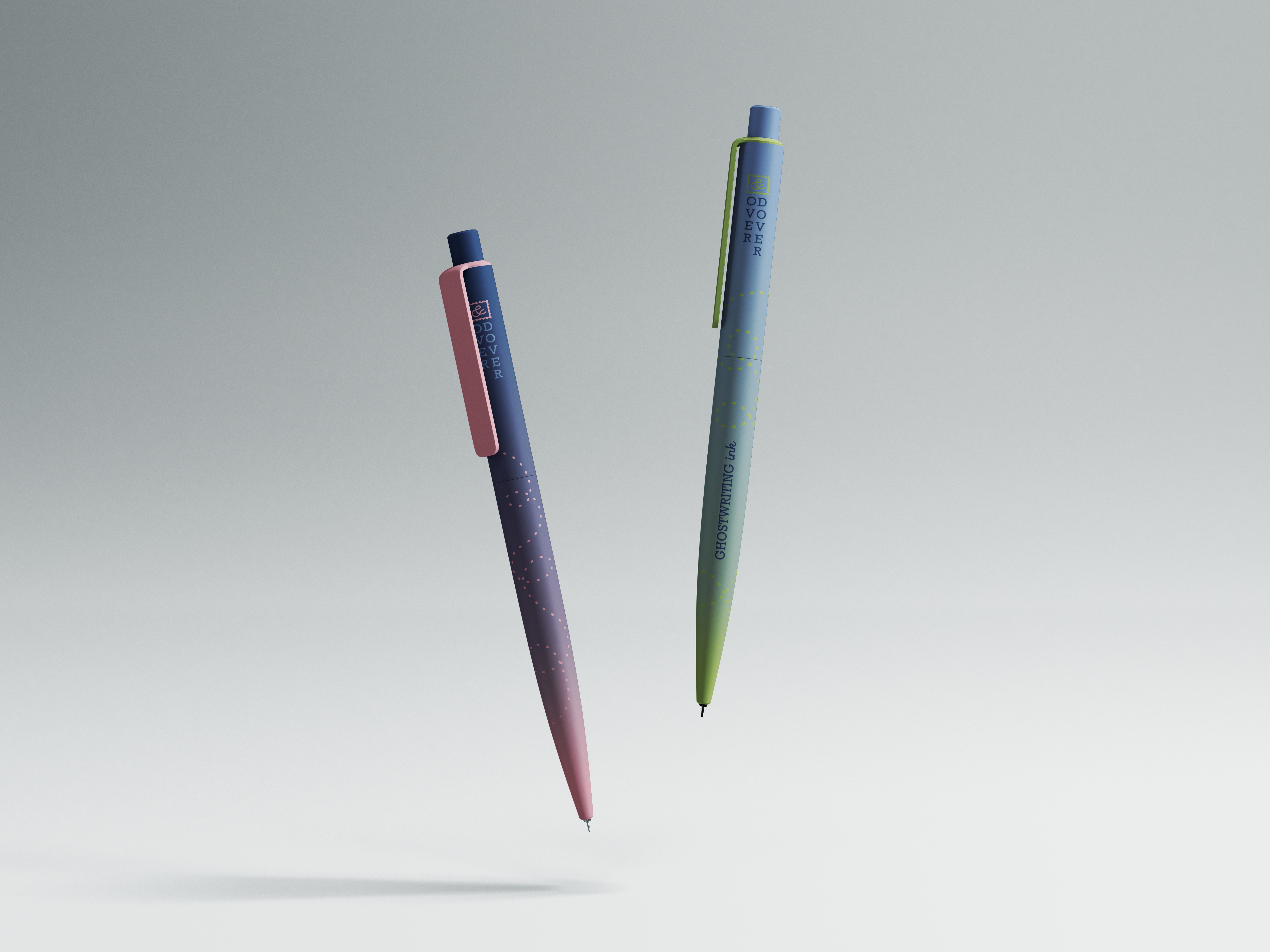
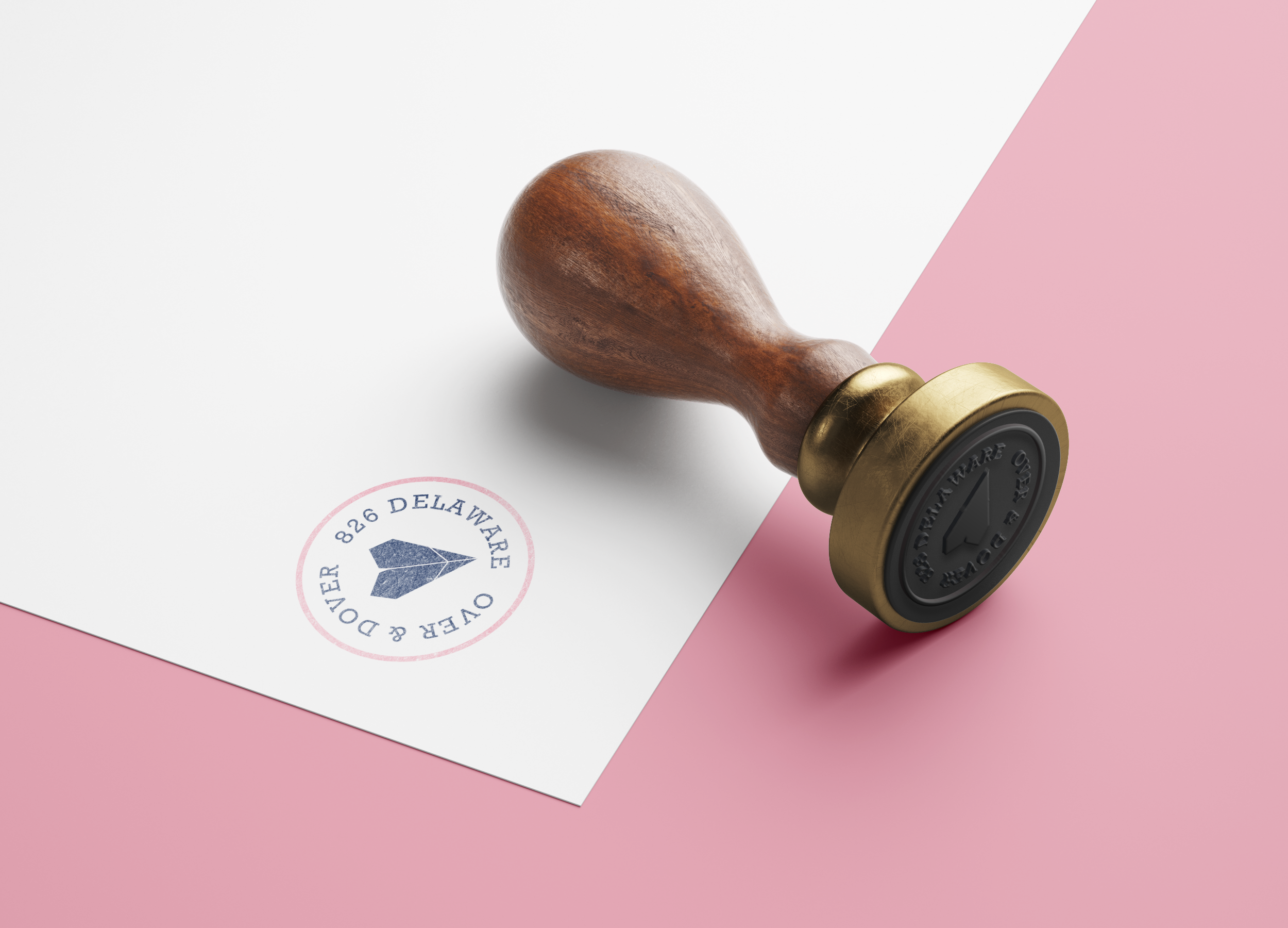
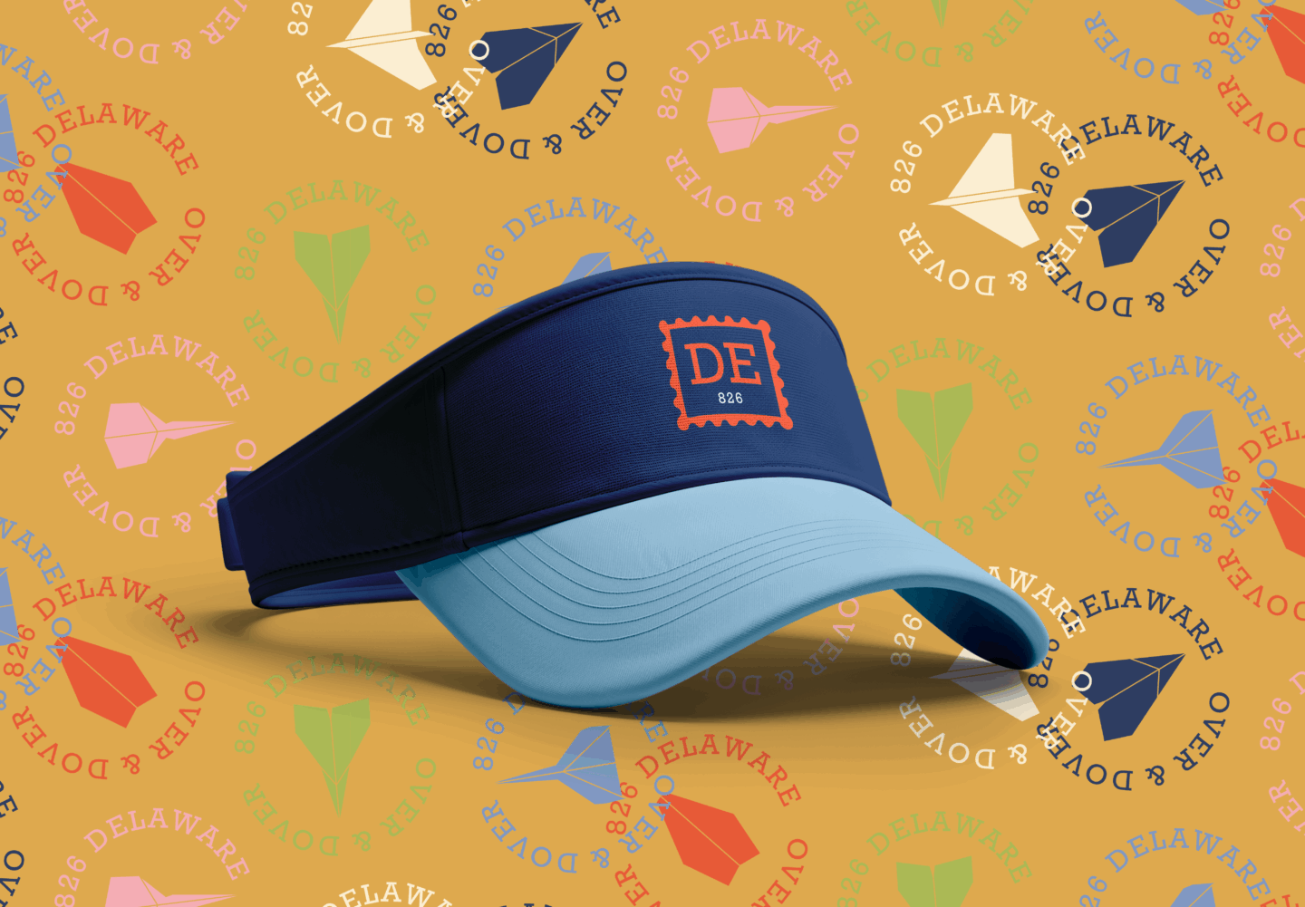
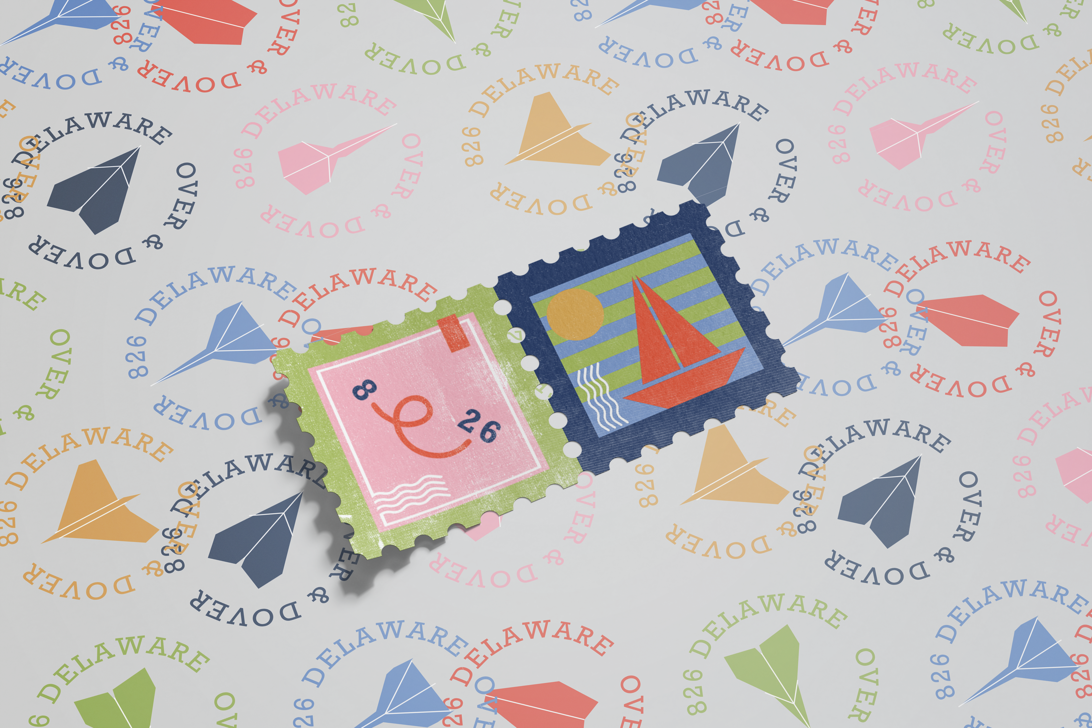
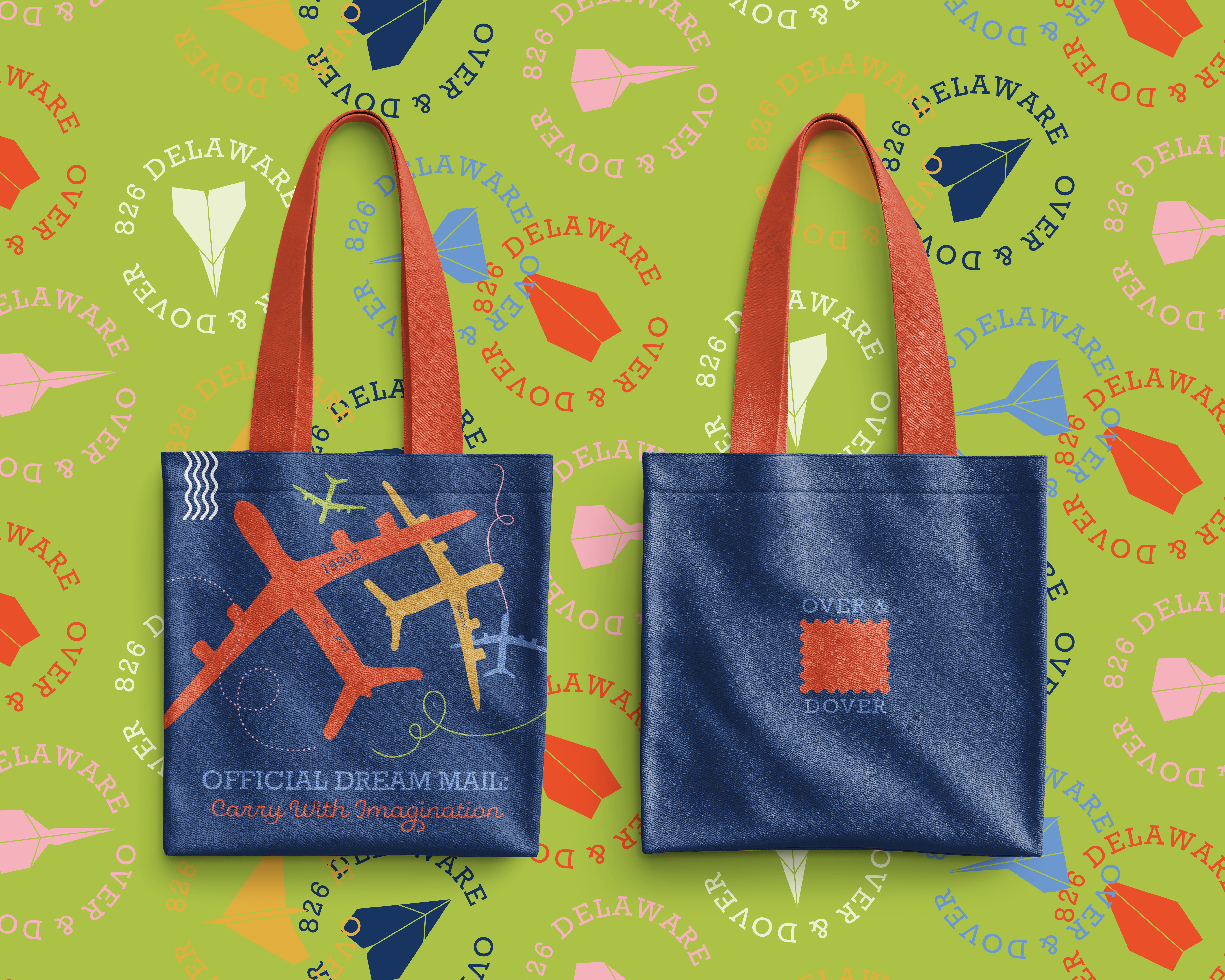
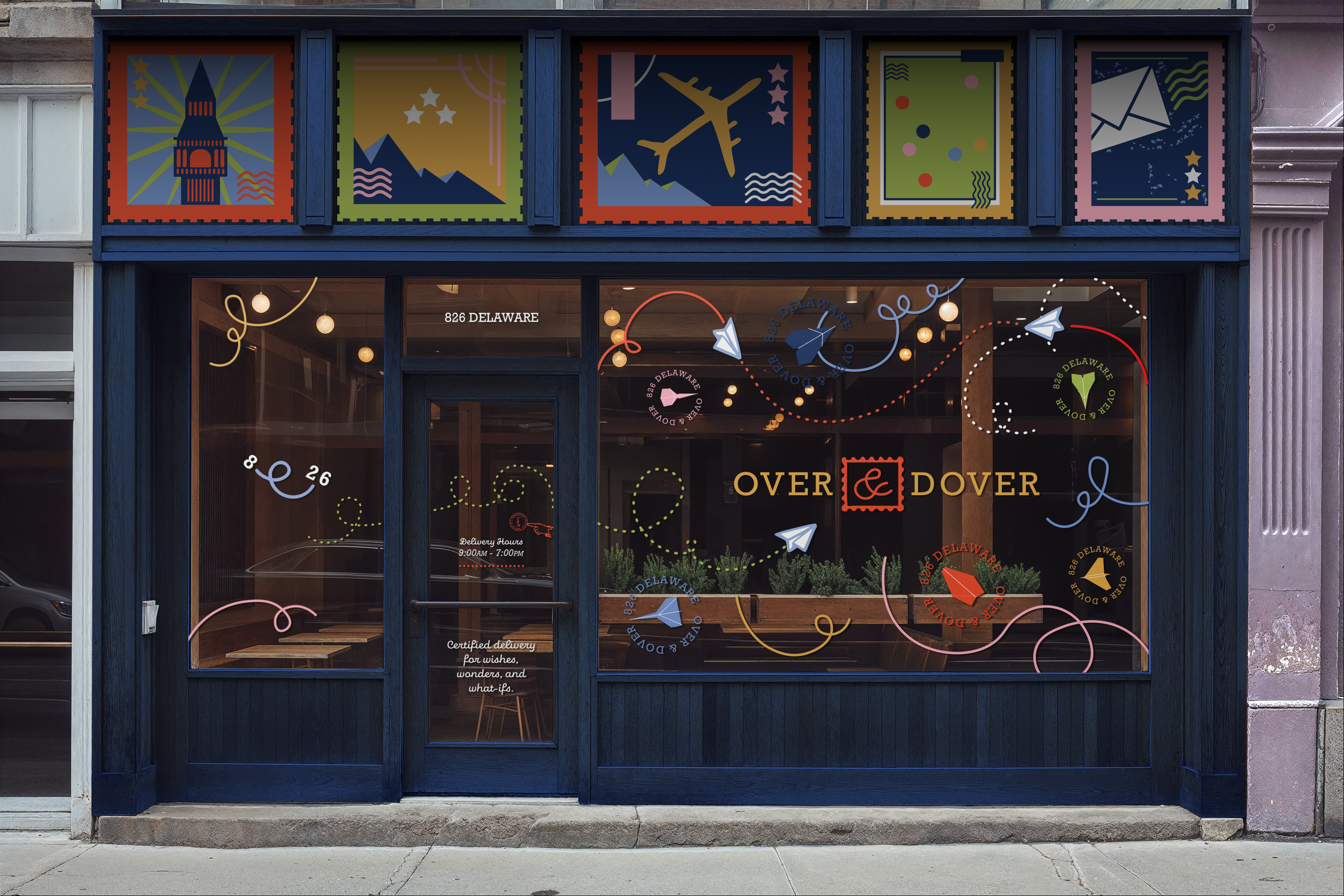
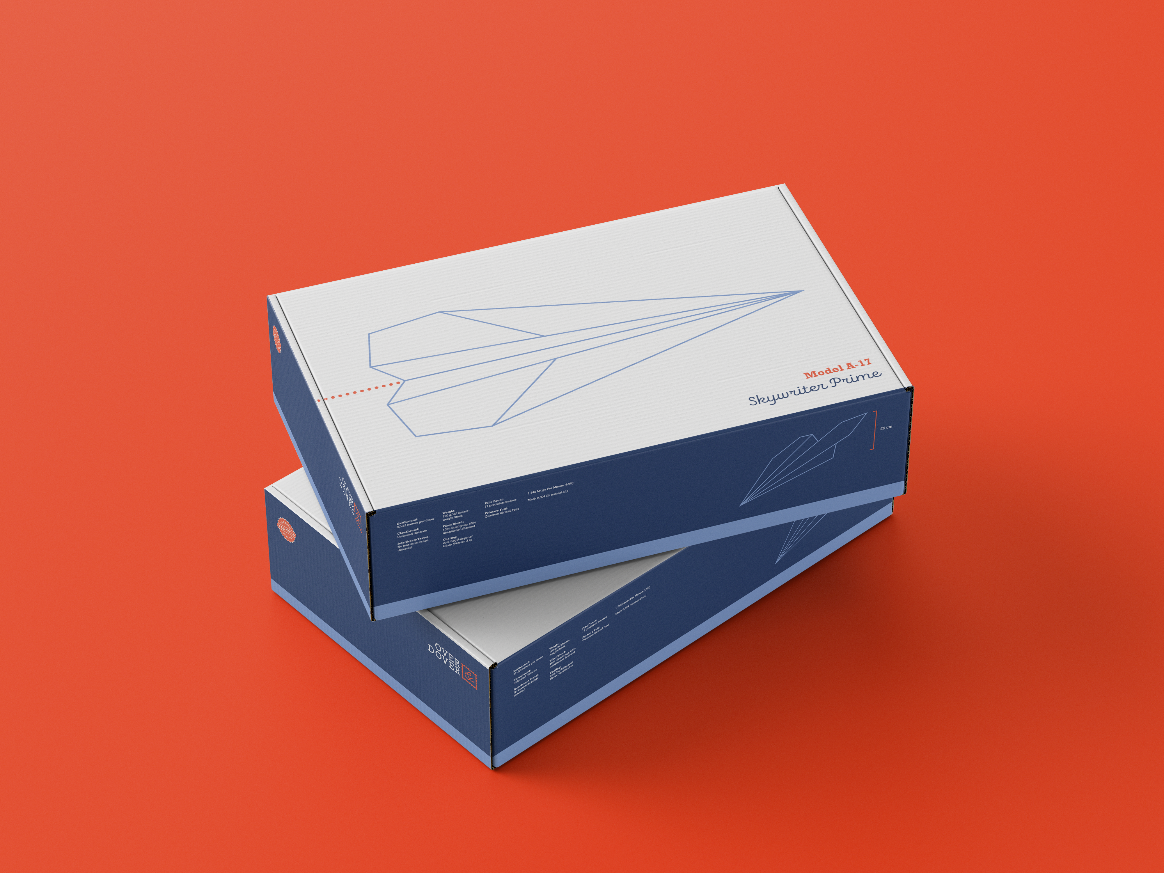
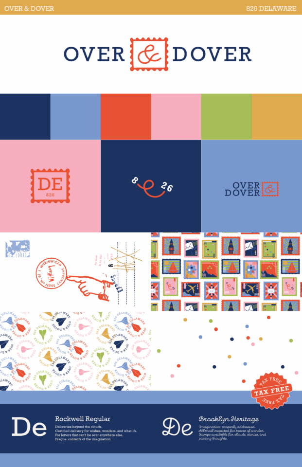
826 is a nonprofit organization dedicated to supporting children’s literacy through free tutoring, writing workshops, and publishing programs. Each 826 location is anchored by a themed retail storefront that funds the organization while creating a playful point of entry for young writers. 826 Over & Dover imagines a new concept store for Delaware, using branding and environmental storytelling to make literacy feel exploratory and fun. The project began with research into literacy statistics in Delaware, grounding the work in local need before moving into concept development. Inspired by the Delaware Air Mobility Command Museum, the store was envisioned as an imaginary air mail post office where stories become cargo and writing feels like travel. An initial branding iteration leaned too mature, missing the mark for a children’s education center and prompting a shift toward brighter, more accessible visual language. The final identity was developed through extensive iteration, including sixty-eight logo explorations and a flexible system of colors, patterns, and typography drawn from aviation and postal ephemera. The brand was then applied across a series of fictional objects designed to extend the narrative of the space, such as a ghostwriting ink pen. Rather than functioning as a traditional retail brand, 826 Over & Dover operates as an imaginative system that invites children to see storytelling as an adventure worth sending out into the world.

Condon Report Book

Condon Report Book

Redesigning The Condon Report, a government study on UFOs, was not just about giving the document a fresh look; it was an exercise in transforming dense, technical writing into something readable and engaging. A strict grid system in InDesign was established to control the flow of text, then strategically broken when the content required breathing room. Typefaces were selected to balance authority with accessibility, giving the book a voice that felt serious without becoming sterile. To cut through walls of text, graphics and tables were illustrated and combined with archival images, using scale and placement to create rhythm across spreads. Each page became a negotiation between clarity and curiosity, order and surprise. The process was not without obstacles. Just before print, the file corrupted, requiring a painstaking restoration spread by spread. Creating diagrams in Illustrator proved equally demanding, with each needing to be unique, avoiding repetition while remaining informative. These illustrations, paired with archival imagery, built rhythm and moments of surprise throughout the 106-page book. The result is a publication that feels both researched and designed, an ambitious exercise in turning overwhelming information into a visual system that invites readers in.

Micro / Macro Book

Micro / Macro Book

This 82-page book serves as an archive of seventy-seven pieces of communication design, created in response to a brief that required collecting works, researching each one, and recording written observations and reflections. Unlike a traditional archive organized by style or chronology, this project is structured entirely around scale. The first chapter presents works at a true 1:1 ratio, offering an intimate encounter with every detail as if the object were present on the page. Subsequent chapters expand to include posters and large-format designs up to four feet in length, each scaled to fit within the book while maintaining proportional relationships. Sourcing accurate dimensions required digging through inconsistent records, while organizing the archive demanded calculating the area of each piece to position it within the system. Once gathered, the images were measured and arranged to highlight their relative scale, with spreads designed to pair factual information alongside reflective notes. To further this idea, the book was structured so its pages can be rearranged in any order, encouraging nonlinear exploration where pages act as objects to shuffle, stack, and study side by side. In the end, the result is less a fixed archive and more a flexible system, a book that measures design as much as it documents it.

Spring Fragrance Packaging

Spring Fragrance Packaging

Inspired by the delicate yet unconventional beauty of nature, this fragrance packaging takes cues from Queen Anne’s Lace, a flower that feels both wild and refined. The concept channels soft femininity through clean structure, balancing organic inspiration with contemporary polish. Visual and scent direction draw from Bath & Body Works’ accessible approach to fragrance, reimagined through a more personal, illustrative lens. As a fully independent project, this collection marked a first exploration into digital packaging mockups and three-dimensional presentation. Every element, from the bottle silhouette to the typography, was guided by instinct, emphasizing lightness, texture, and quiet confidence.