Advertising Design

Owen La Belle

Graduation

2027

Skills
  • Digital advertising design
  • Branding/Identity Design
  • User Experience/User Interface Design
Employment Badge

Clever Cabinet of Curios

Clever Cabinet of Curios

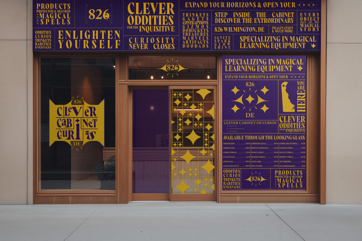
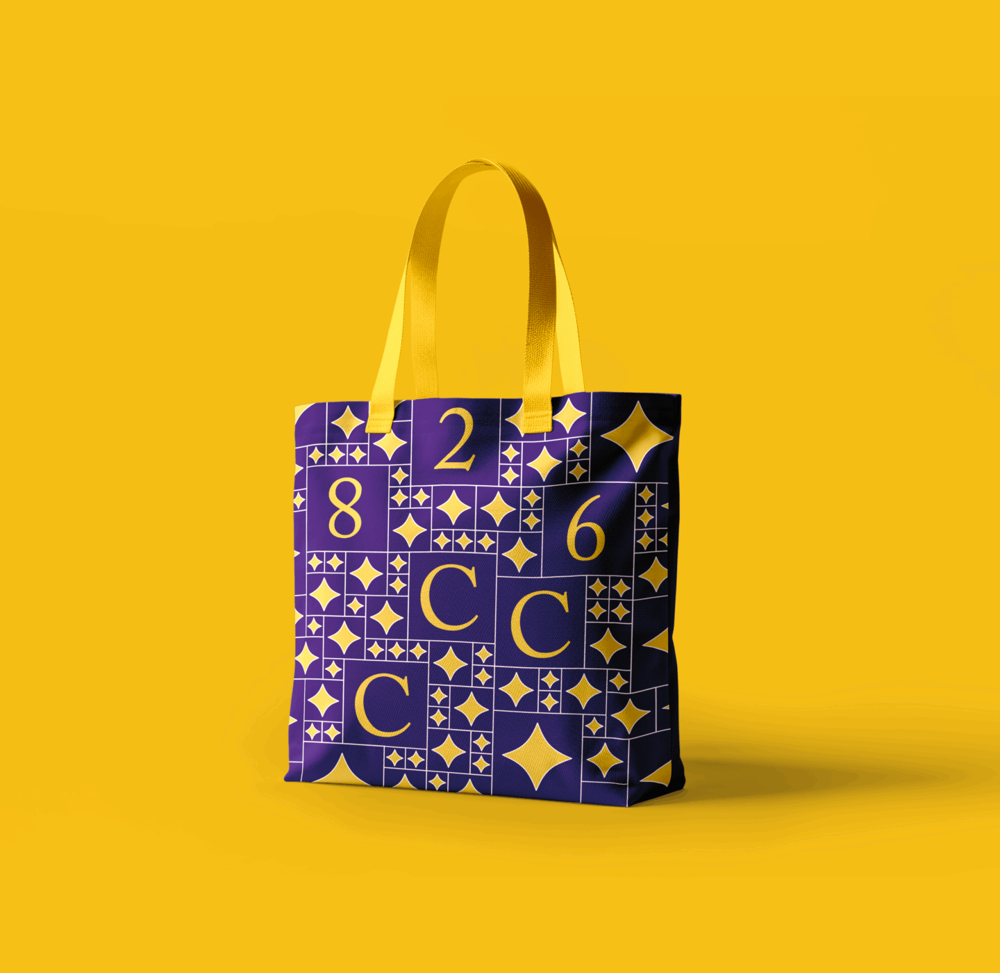
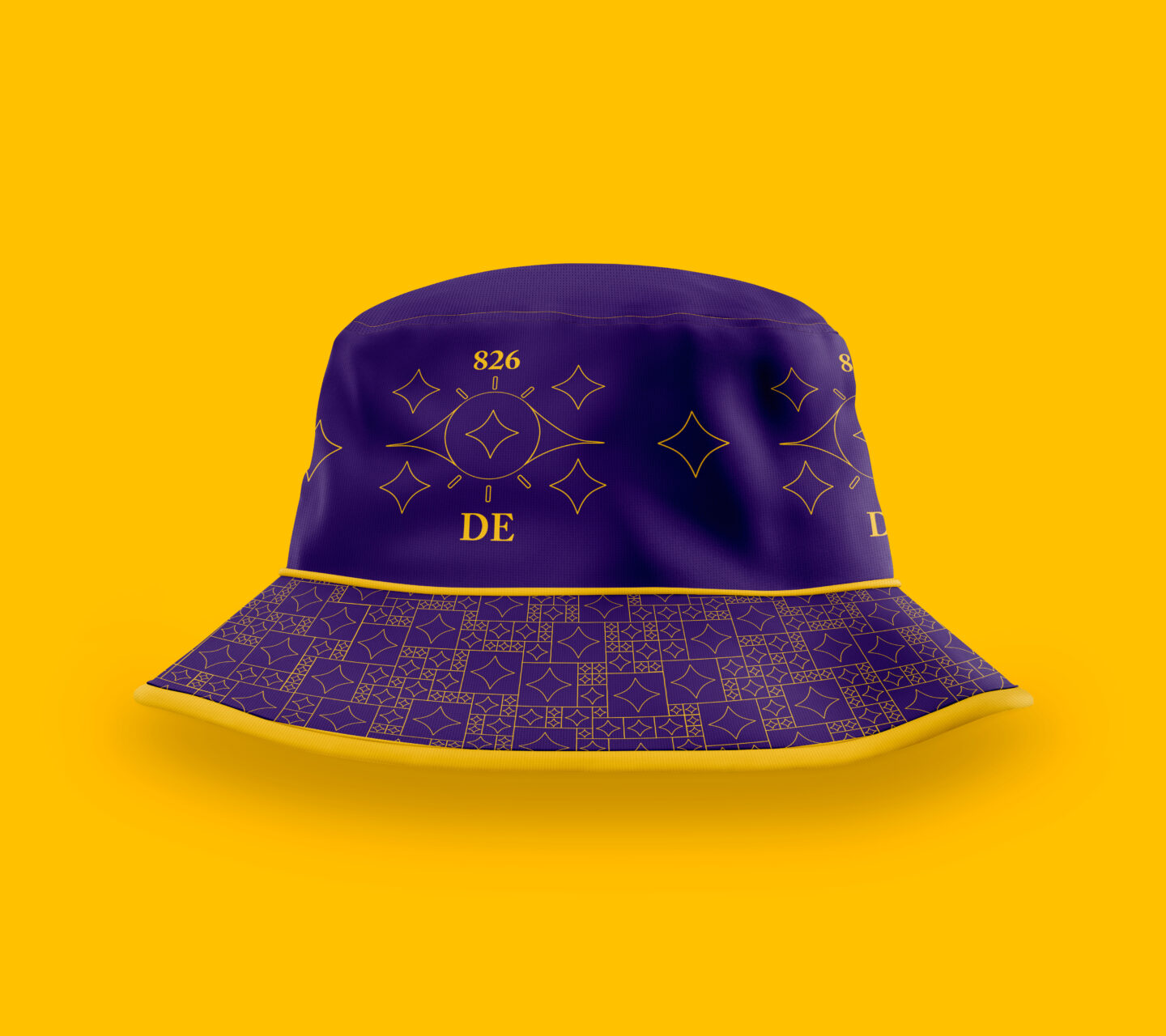
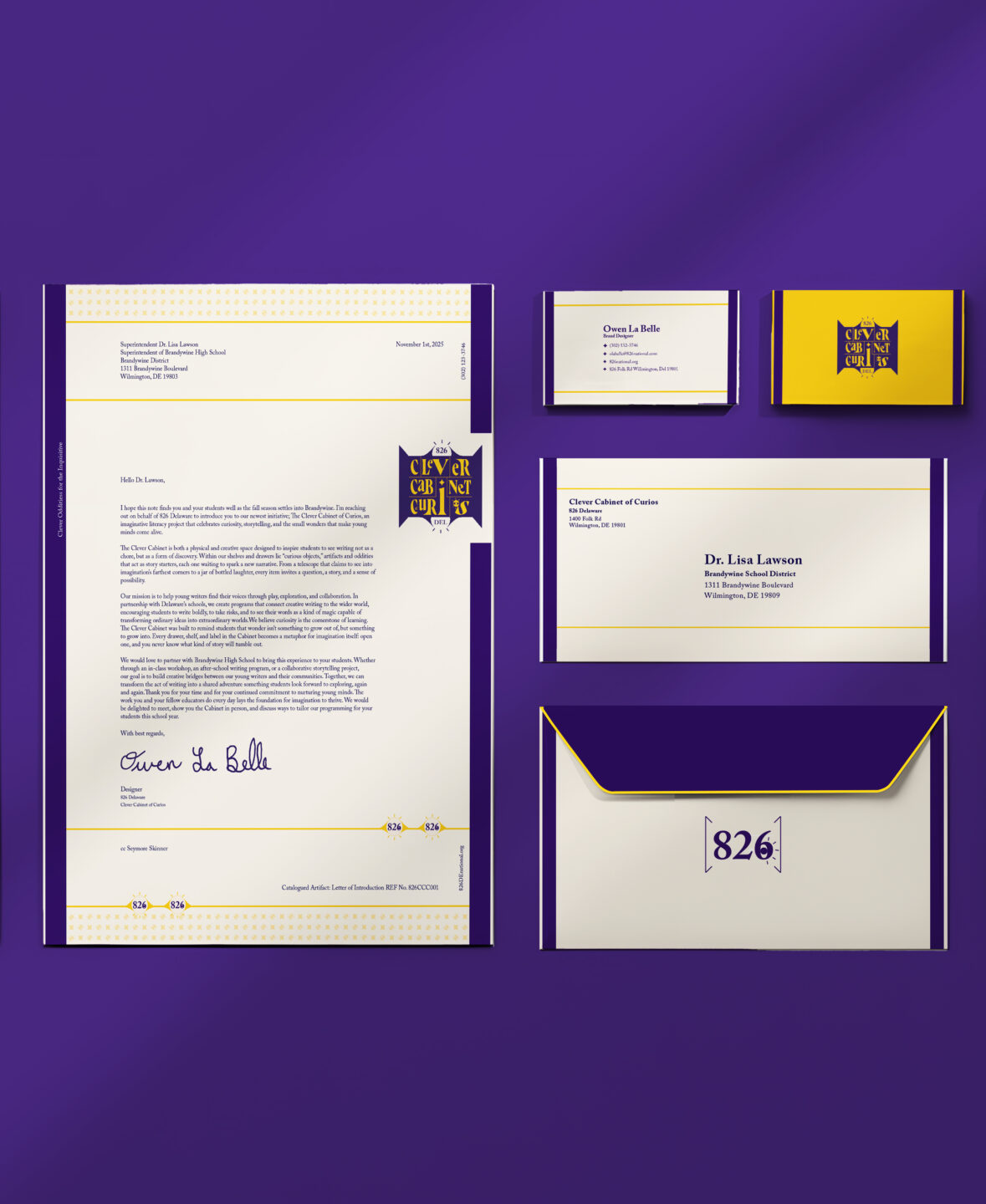
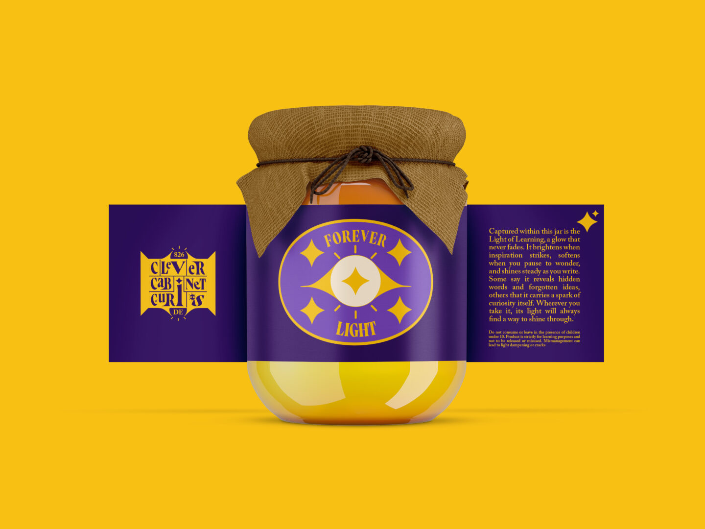
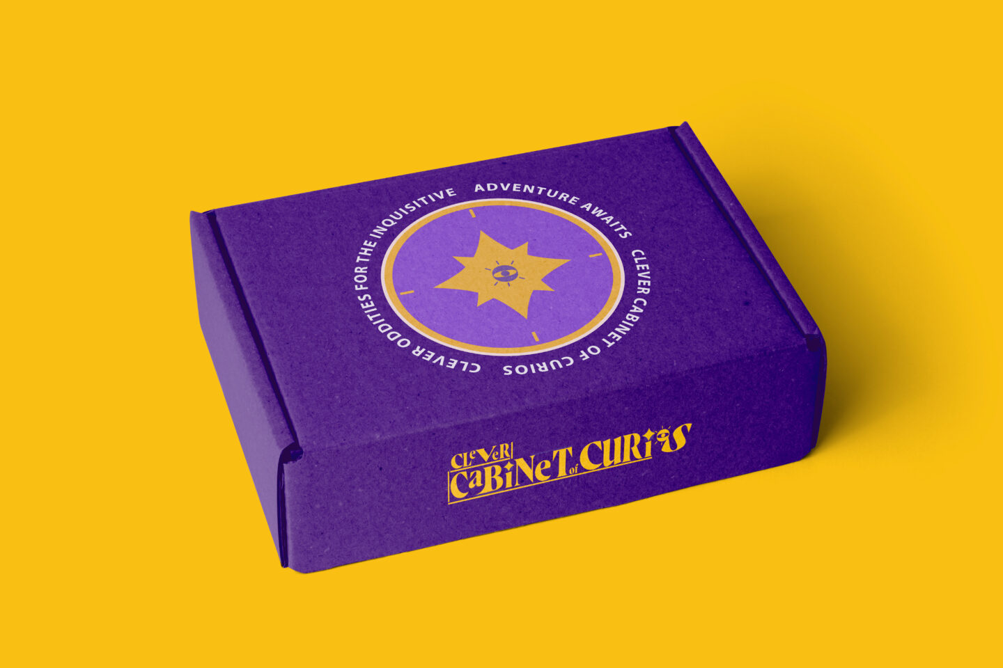
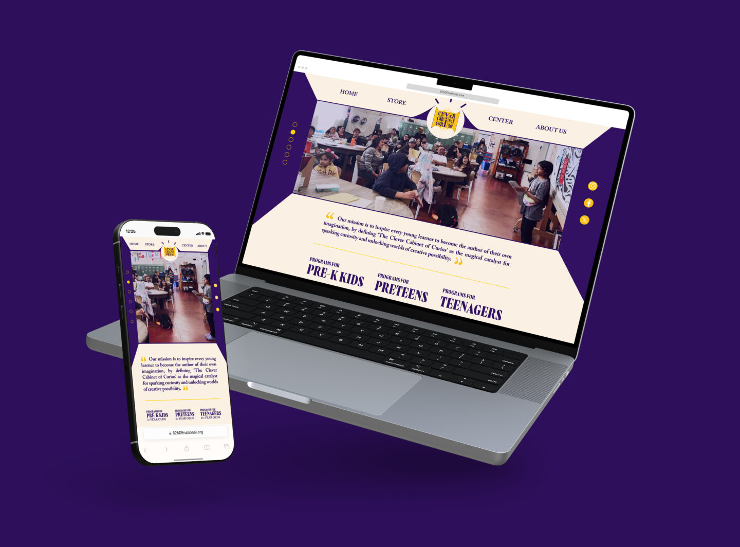
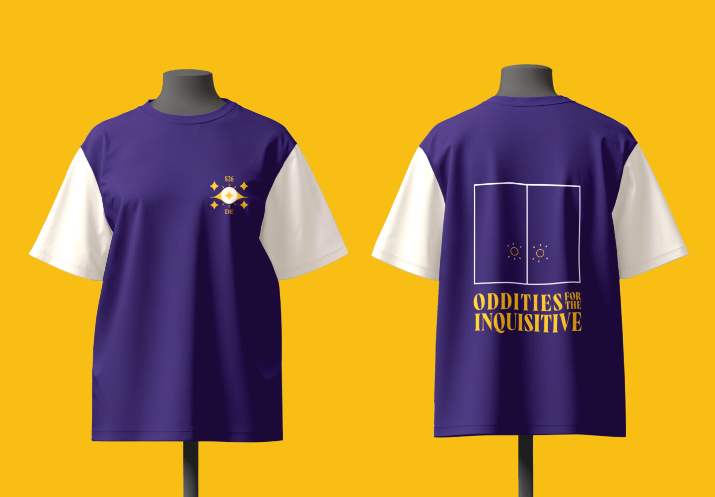
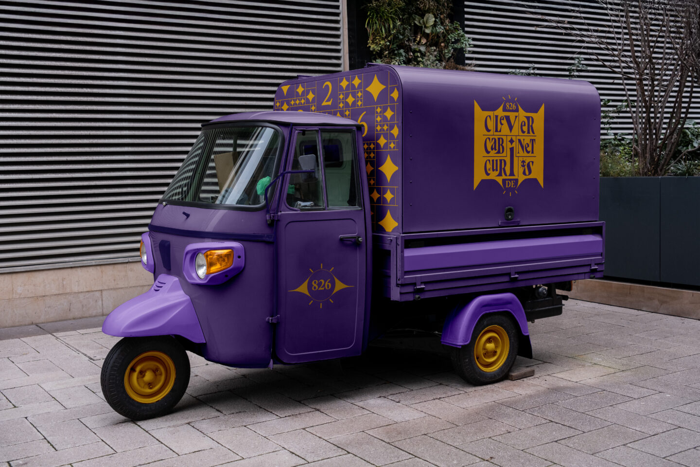
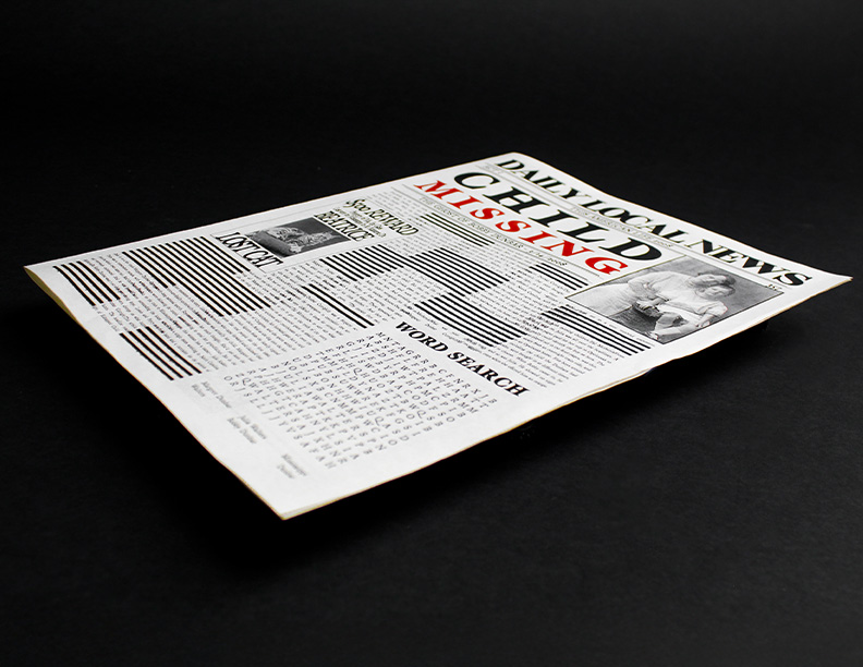
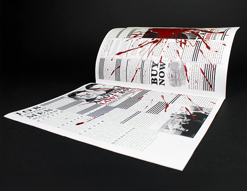
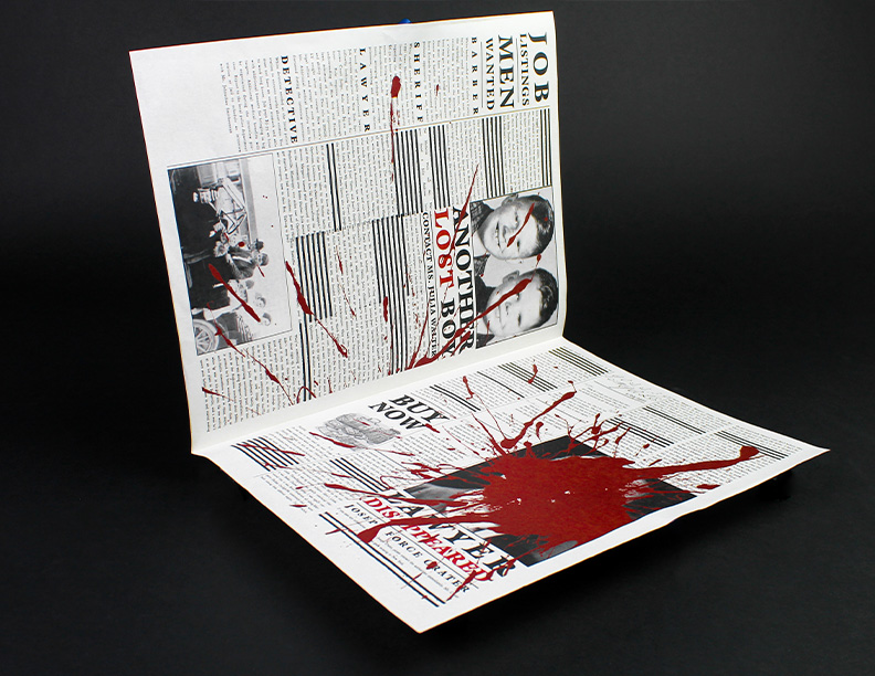
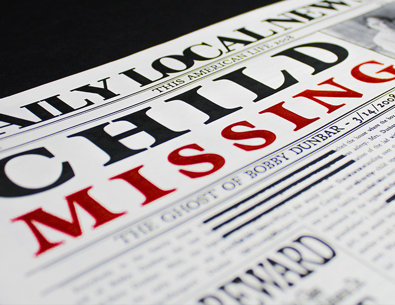
The Clever Cabinet of Curios is an 826 literacy center in Delaware, themed as a magical literacy brand built on curiosity, storytelling, and wonder. I created a full identity system: logos, patterns, merchandise, motion, storefront, and digital touch points, all designed to feel like a living oddities shop that empowers young writers to explore, question, and imagine. The result is an immersive, cohesive world where creativity leads and every detail invites discovery

Griffinclaw Tap

Griffinclaw Tap

This Figma web design mockup is a practical, fun design with a high focus on matching the branding and mythos of Griffinclaw. Griffinclaw Breweries have complete digital menus, and this app would take that a step further. Active when inside the brewery using geolocation, the user can explore the entire drink menu and pour their own drinks, and even pay for it without needing to wait for a bartender. The target audience was people who need a fun night out at Griffinclaw who may be stressed out or working hard, and just want an easy and accessible way to get their drinks. The ultimate goal of this was to gamify the ordering process, with the introduction of the Literboard. The Literboard rates all the drinks on the menu from most to least popular, with the least popular drinks getting changed out every season. This opens up possibilities for seasonal drinks and more experimentation to get the best draft drinks possible. The problem tackled was conceptualizing, researching, and organizing a large variety of elements to serve the final product pitch.

Skylands Hub

Skylands Hub

This Figma web design mockup is a sleek, clean design with a high focus on contrast and minimalism while embracing the fun of the original toys-to-life, brightly-colored video game series. The user can explore images and videos of the character, with a stat breakdown of what they can do in the game, and the physical figures. The target audience was people who knew of or had Skylanders when they were younger, focusing on people in the retro gaming market. The ultimate goal of this was to do a deep dive and reminisce on what this game series meant to people, and analyze it in a way people commonly may not have thought about it previously. The problem tackled here was documenting, researching, and organizing a large collection of visually abstract and unique items. There is so much information available about this collection that it was difficult to display everything and make it fully intractable with the rest of the content. Information that had to be found included both the video game character side of the model, as well as the dimensions and features of the physical figure. The biggest takeaway from this was learning how to display an object in mass. Making a Figma prototype where every page is unique with different elements is very different from copy and pasting the same content over and over again, and was a valuable lesson on utilizing parents and components to change objects across every page, and not doing everything individually.  

Child Missing Newspaper

Child Missing Newspaper

The problem we were tasked with solving was to create a newspaper surrounding an episode of the “This American Life” podcast, using the format of a newspaper as an object. The podcast was about a boy who went missing, and found another missing boy from a different family, Bobby Dunbar. This sparked a generational hatred between the families of the two boys. Due to the dark tone of the project, the goal was to design a vintage-inspired newspaper, exploring the dark history of the Bobby Dunbar case. To prepare, I listened to the entire podcast episode twice and took notes to fully understand the concept of what I was trying to adapt. One of the most striking features of this newspaper is the way typography is treated as a visual object rather than simply a tool for readability. Through the use of strikethroughs, the project intentionally withholds information, creating a sense of mystery that draws the reader in and builds anticipation for the resolution revealed later in the episode. There is also a large blood splatter on the inside of the newspaper, hiding much of the text to draw the viewers attention towards the end of the newspaper in the bottom right. 

Neuroscience of Design

Neuroscience of Design

This collection is coil bound on card stock with thick grey covers, divided up by color coordinated chapters. This is made to emulate a scientific handbook, professional and educational while diving deep into the contents of the book. The particular challenge that was tackled with this book was to organize a large collection of pieces, along with their metadata, into a lengthy book. After having designed the book, it was also difficult to achieve the originally desired effect for the chapters and covers. At first the book was going to have a purple cover with the basic outline of a brain shaded in behind the title, however there were limitations that changed the trajectory of the project. There were several challenges, including creating an organized grid design system, and project management challenges. This was overcome through critique and compromising with the printing team. The finished collection ultimately balanced clarity with creativity, resulting in a polished and professional outcome. The structure of the book reflects careful consideration of hierarchy, readability, and flow across its chapters. Overall, the project demonstrates how design decisions, even when adjusted due to constraints, can lead to strong and effective results. 

How Will You Spend Your Time?

How Will You Spend Your Time?

The problem that was solved was to make a printout poster, and augment it in a 3D space using Adobe Aero. This AR poster is about time slipping away, losing yourself to the mundane day to day tasks and not stopping to enjoy the rewards in life. This project is a dark poster in black and white, with a morbid and slightly unsettling undertone. The goal was to make a poster that has two components and thus two storytelling elements, one being a printed poster and the second being an augmented layer of content. The biggest challenge that had to be overcome was the software itself. Aero was a beta program that has since been discontinued. Aero was extremely buggy and not all the controls did what they were designed to do. Being able to navigate through new, buggy software to tell a thought provoking story was the most difficult part of this process. Changes had to be made to the final design due to software limitations. Outside of software, the type was challenging as well. There were 10-15 different versions of the type before landing on the final product. The biggest takeaway from this was learning how to build 3D interactions using augmentation, and how to properly utilize an augmented 3D space to tell a deep and meaningful story. This was achieved by playing with chronology of the storytelling and integrating interactivity into the design to engage the users.