Advertising Design

Veronica Trevino

Skills
  • Advertising Illustration
  • Brand Strategy
  • Creative Design
Employment Badge

Mash Potatotory, an 826 Branding Project

Mash Potatotory, an 826 Branding Project

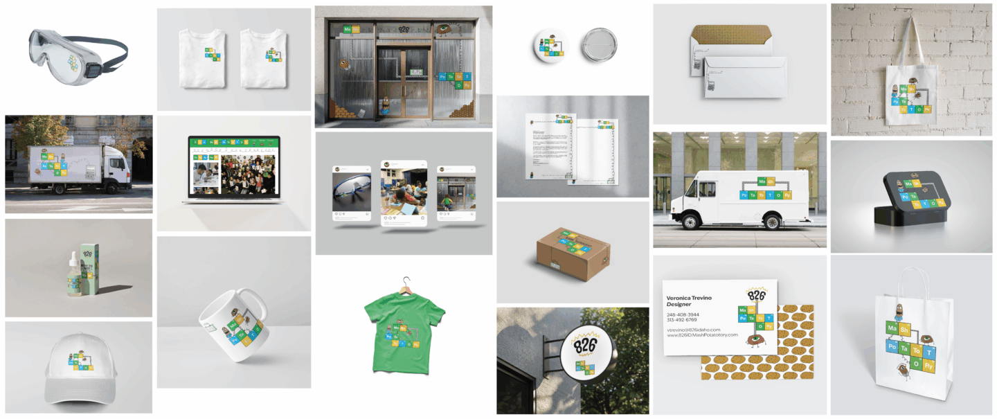
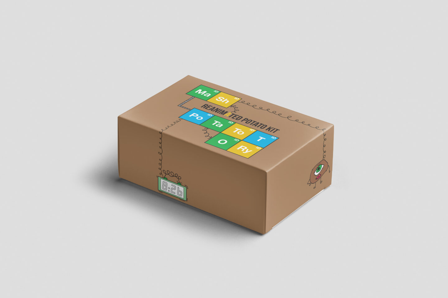
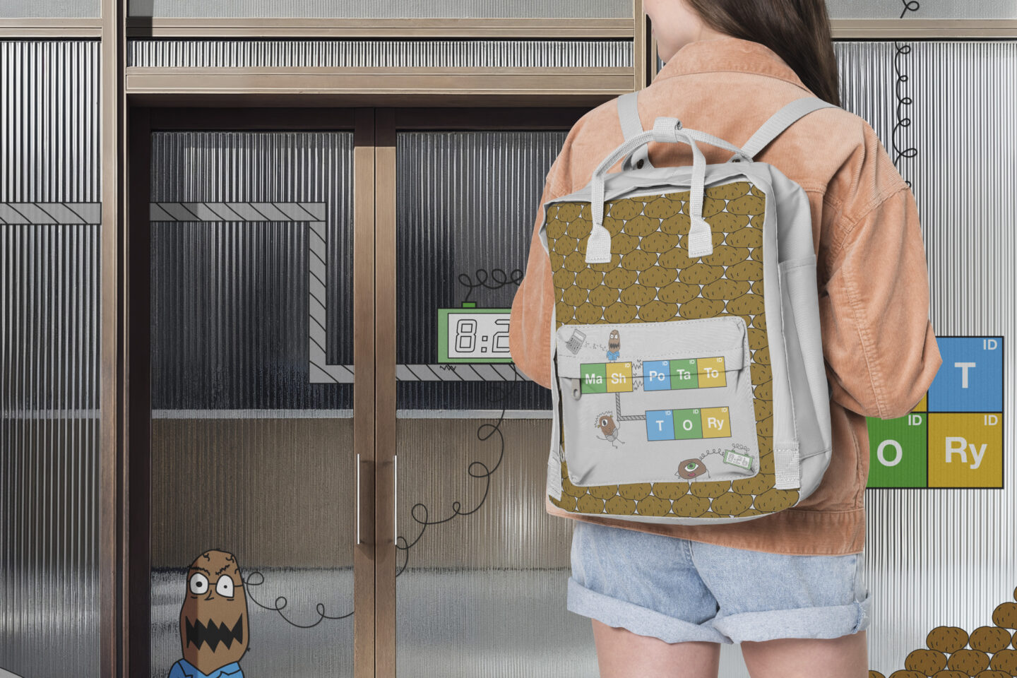
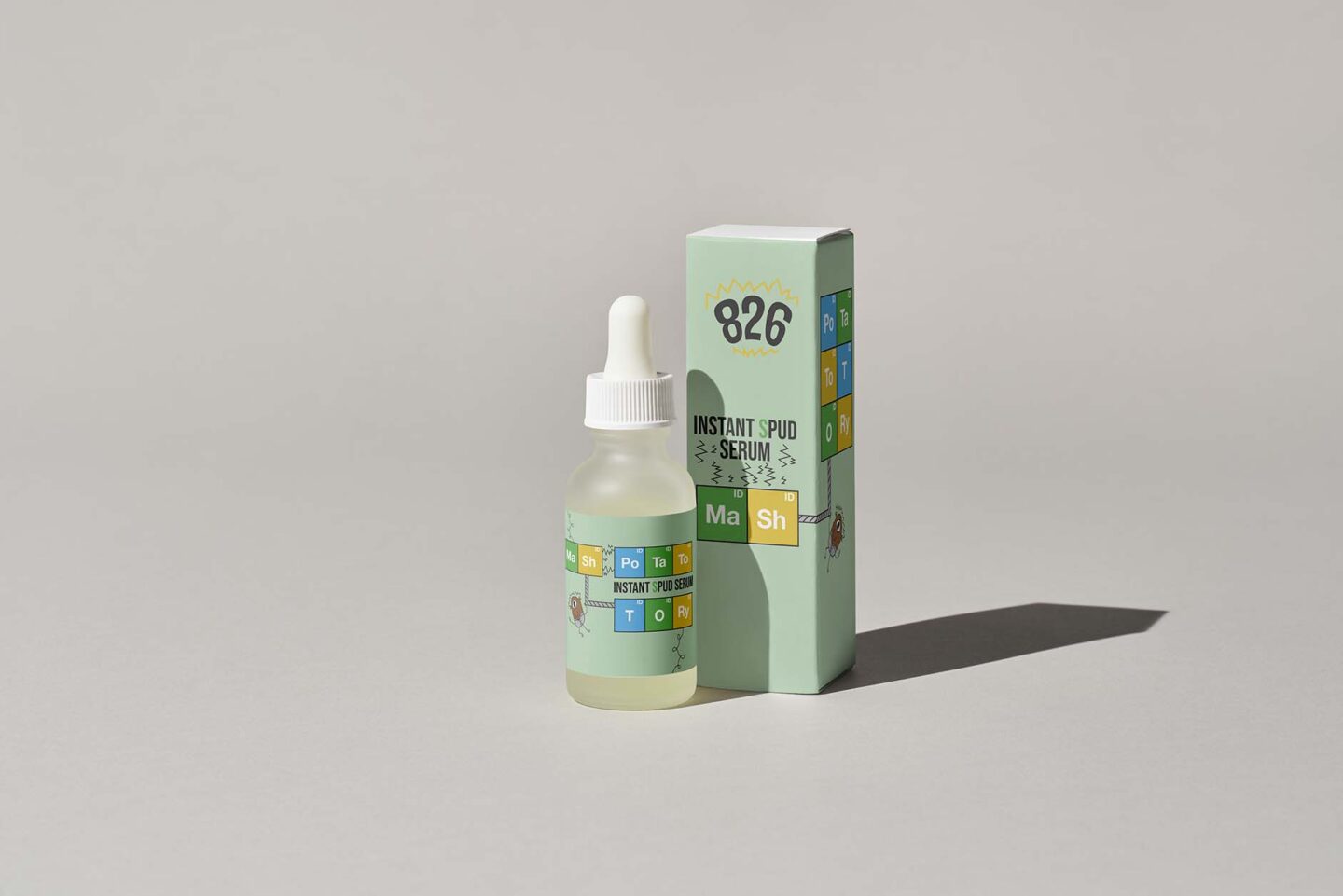
This project was about identifying a brand identity for a tutoring center in a unique location. This store was supposed to be located in Boise Idaho. The research conducted is what led to the theme of mad potato scientists. The objective was to create a distinctive brand system that consisted of a Letter head, business cards, envelopes, a vehicle, merchandise, and a store front. This was an informative project because it shows the full process of designing a brand identity but also gave the student creative freedom which was nice. It was hard to balance all of these components but overall it was very fun and engaging.

The Griffin Claw Tap

The Griffin Claw Tap

This was a project about picking a Michigan brand and designing an app for it that helps to solve a problem. This project was completed with Owen La Belle and Jennifer Sturges. The chosen company was the Griffin Claw Brewery and the problem was people were indecisive on choosing a beer so this app creates a point system with a beer “literboard” to encourage people to try more products and see what other people tend to enjoy. This was a fun collaborative project and it was a good learning experience because it helps you brainstorm unique app ideas and shows us how to spread the workload around.

Redesigning the Heathers Title Sequence

Redesigning the Heathers Title Sequence

The objective for this team was to redesign the Heathers title sequence because there were so many missed opportunities in the original. This was a long and stimulating process that required difficult decisions when things didn’t go as expected. Every scene was strategically planned so everything happened for a reason. This was a huge opportunity to learn more about after effects, film properly, and work with a partner for the first time. The design choice centered on using slime in the colors of the main characters, with its movement arranged deliberately to foreshadow elements of the plot. The first step was to make thumb sketches, then film, and lastly edit in after effects. A big struggle was securing audio but once that happened, the whole video fell into place. The biggest takeaway was definitely to always have a back-up plan and prepare for the worst because there were many moments required improvisation when initial plans failed, reinforcing adaptability as a key part of the creative process.

Collection Website

Collection Website

There are many ways to display a collection, and this project focused on a crochet collection. The objective was to showcase the collection in two different formats, one for mobile and one for desktop. After selecting the collection, the process began with sketching design concepts and photographing the pieces. Once the design is finalized, the wireframes and final prototype came next. A difficulty faced was developing a unique way to display the collection on mobile because too much time was devoted to the desktop prototype. The most valuable skill from this project was working in figma but as a whole it also taught people how to recontextualize across mobile and desktop platforms.

The Object Project

The Object Project

This project explored the different meanings of image and type. The final poster is 20 compositions that integrate both image and type. A magnifying glass with helping hands was the chosen object which first required research. From there, photos of the object were taken and edited. The photographs came out well due to the flexibility of the object. The final parts of this project were composing the refined images with type, which ended up being a challenging process. The difficulty came from the initial research because it wasn’t the greatest. This was a valuable learning experience because now knowing research is a foundational step in any design process helps a lot in future projects.

Breaking Down Baskerville

Breaking Down Baskerville

This book is a breakdown of the typeface Baskerville. It consists of notes on the different weights, 12 compositions highlighting the typographic features of Baskerville, and the sketching process. An interesting thing about Baskerville is its alignment because it’s perfectly vertical compared to other serif typefaces that have a diagonal alignment. During the assembly of the book, several challenges were faced. Looking at all the individual details for every character was time consuming but it also offered valuable insights. Zooming on the specific aspects of this typeface for half of the compositions was the most intriguing part of this assignment.