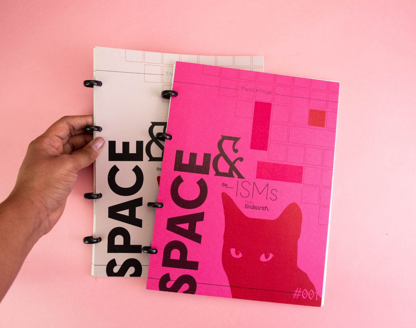
Type & Space in Design History
Type & Space in Design History

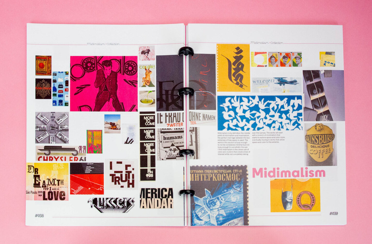
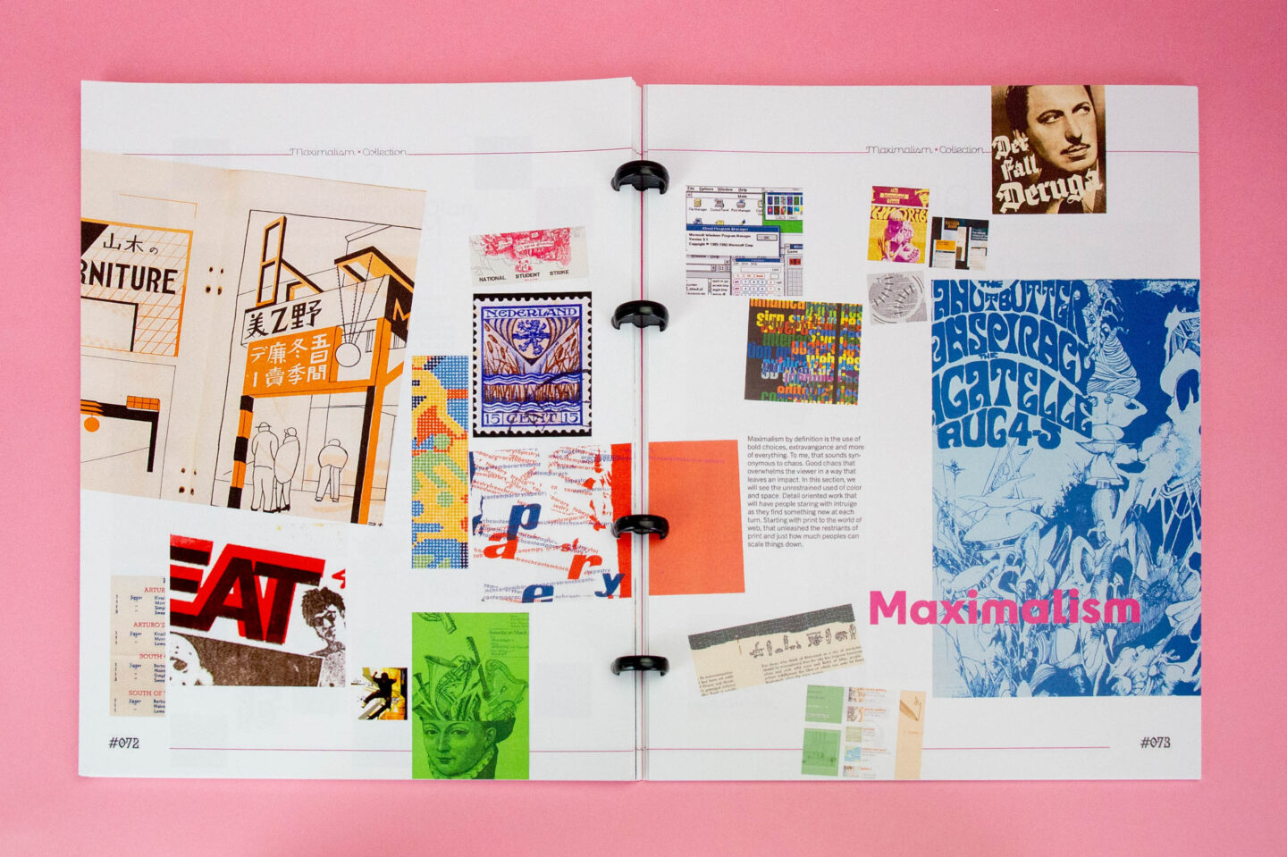
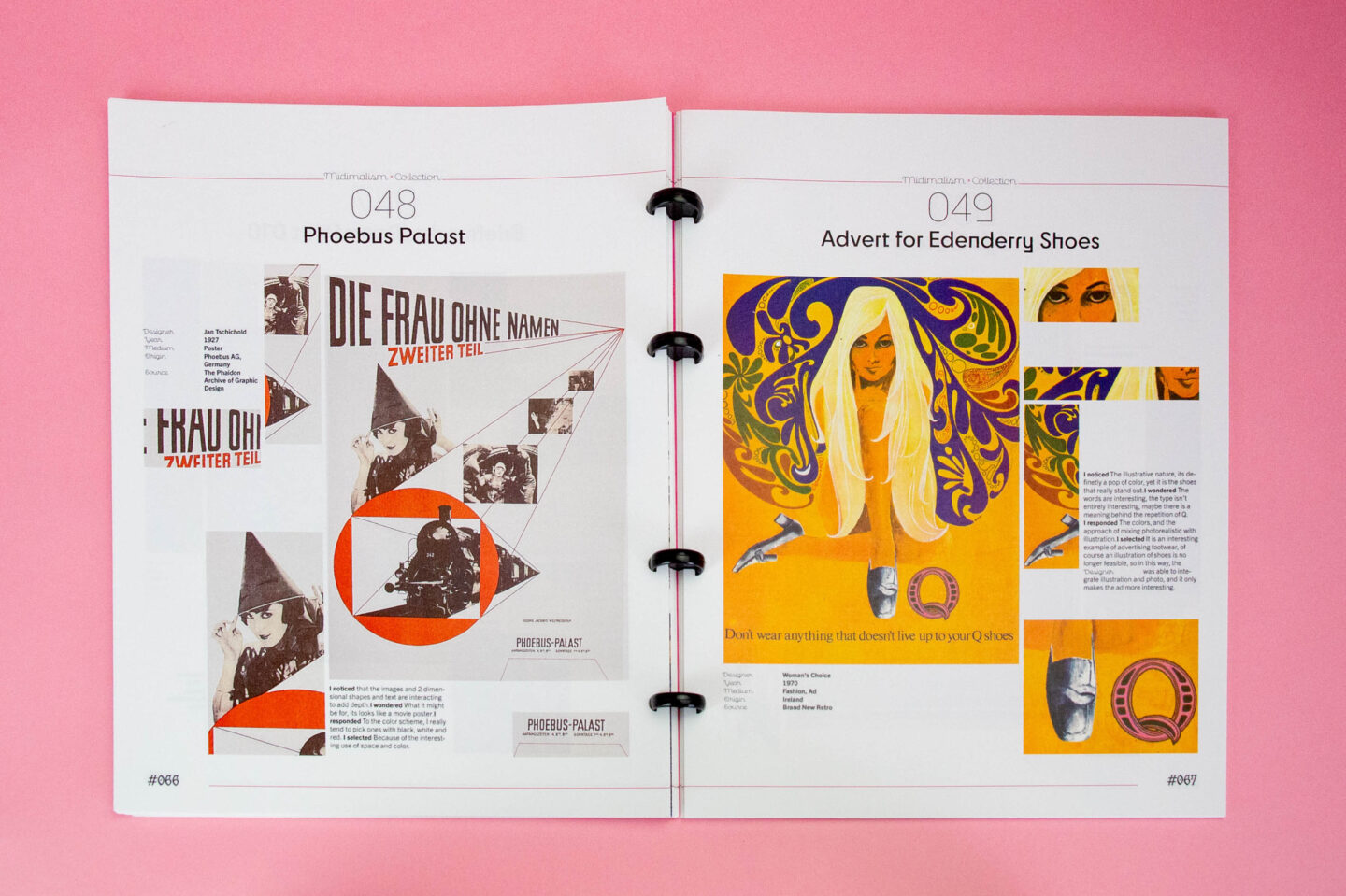
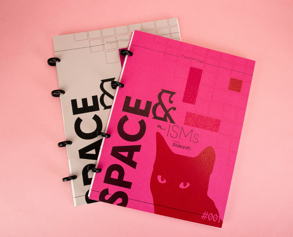
Building an eye for design and having a keen sense of what inspiration is intuitively being drawn from is a form of self-reflection, so, creating an archive that not only allows for this retrospective look at design preferences while also prompting expansion outside of the design canon to work outside of the Eurocentric lens sets a precedent of looking outward to a variety of work. This project emphasized the importance of remaining culturally educated to create designs that reach as many people as possible. The process started off with exploring different digital archives in the nooks and crannies to find pieces that intuitively interest the eye. Then, they proceed to sort and detail each piece in Fig Jam in different ways, trying to find a pattern among them. This specific collection was curated with a spectrum from mid-century minimal design to the maximalist designs from later in the century. The concept became exaggerated through this juxtaposition in the archive publication by the slow increase of interesting details in how each piece used the space from minimalist designs to maximalist designs. This became a self-discovery in terms of the spectrum of interests, a benchmark on how other design work can be appreciated in the future.