The Condon Report
The Condon Report
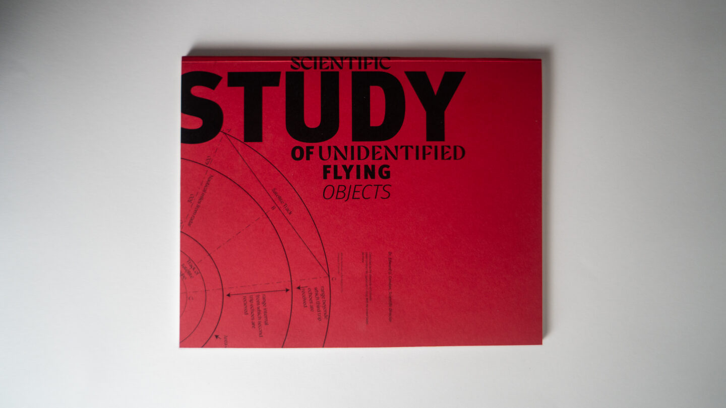
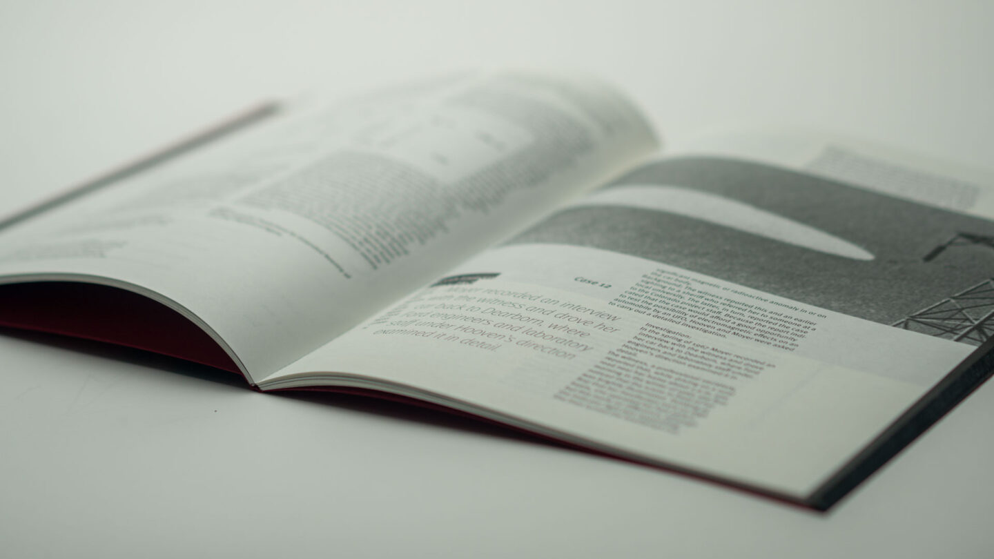
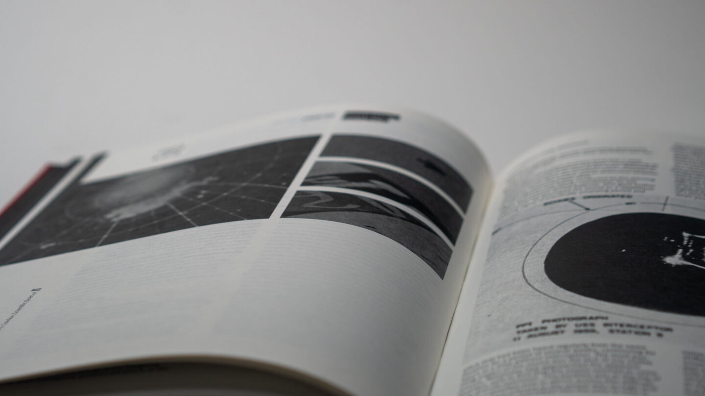
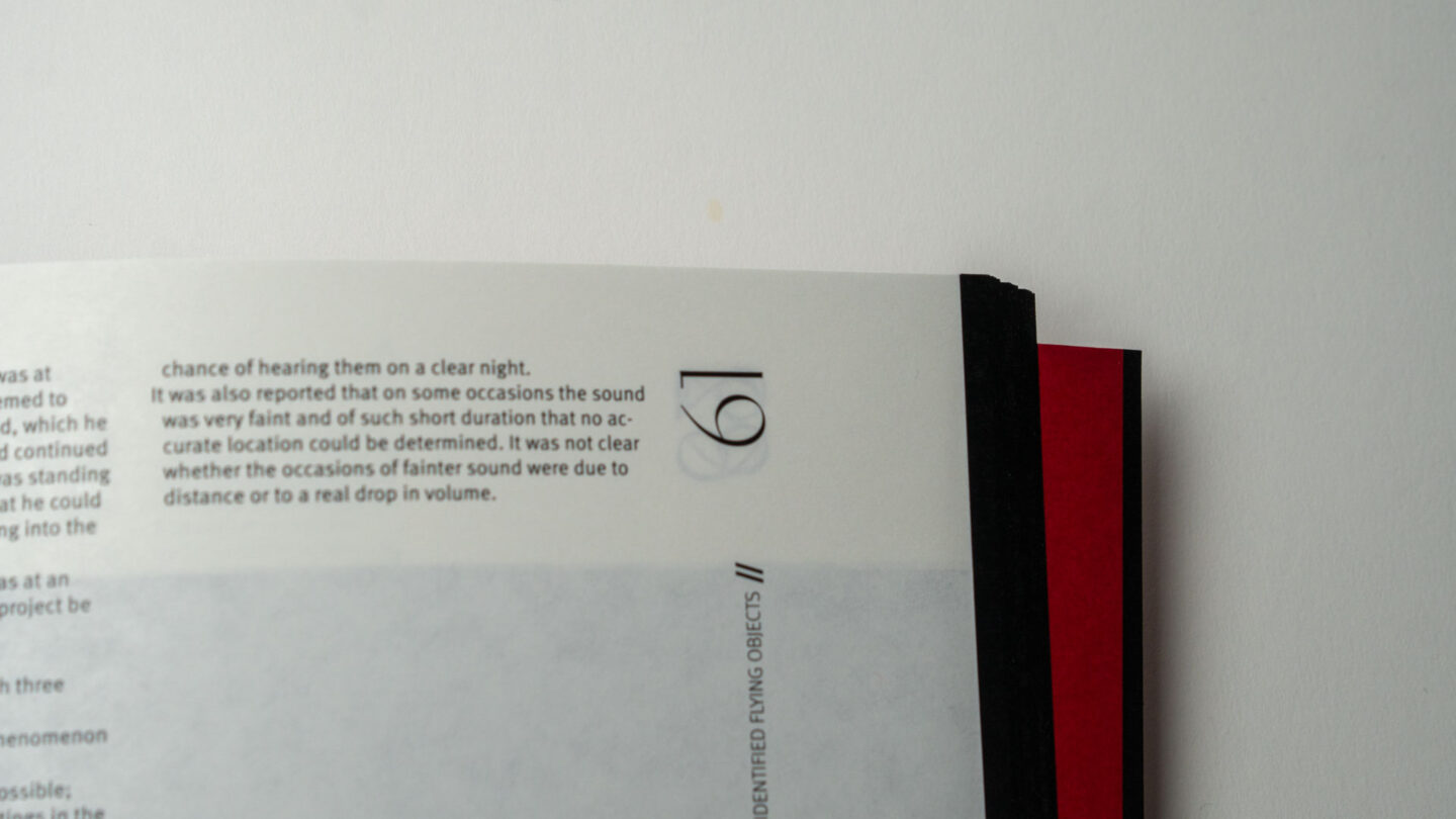
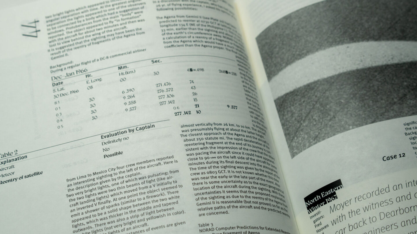
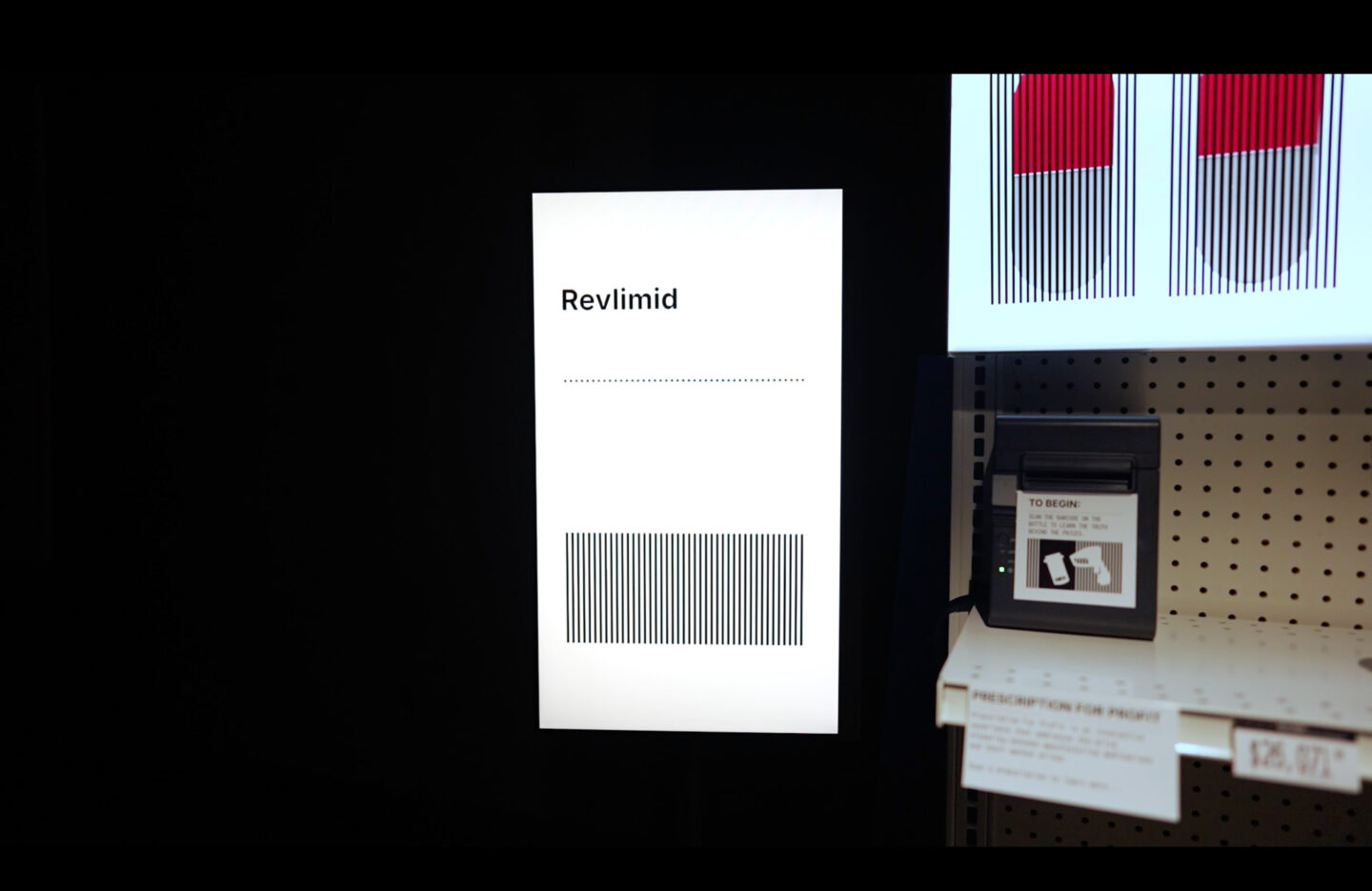
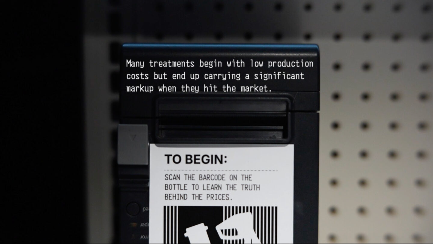
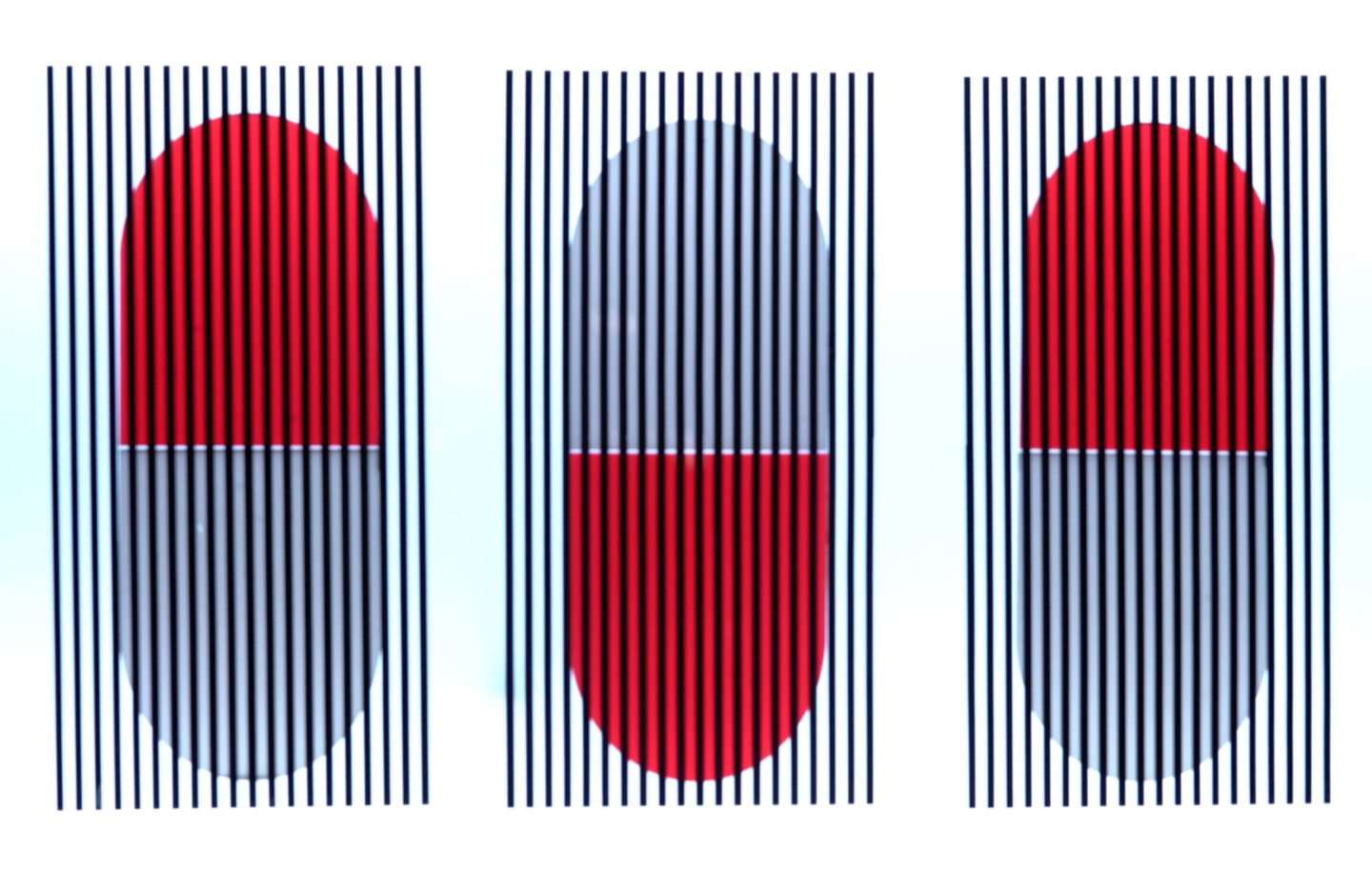
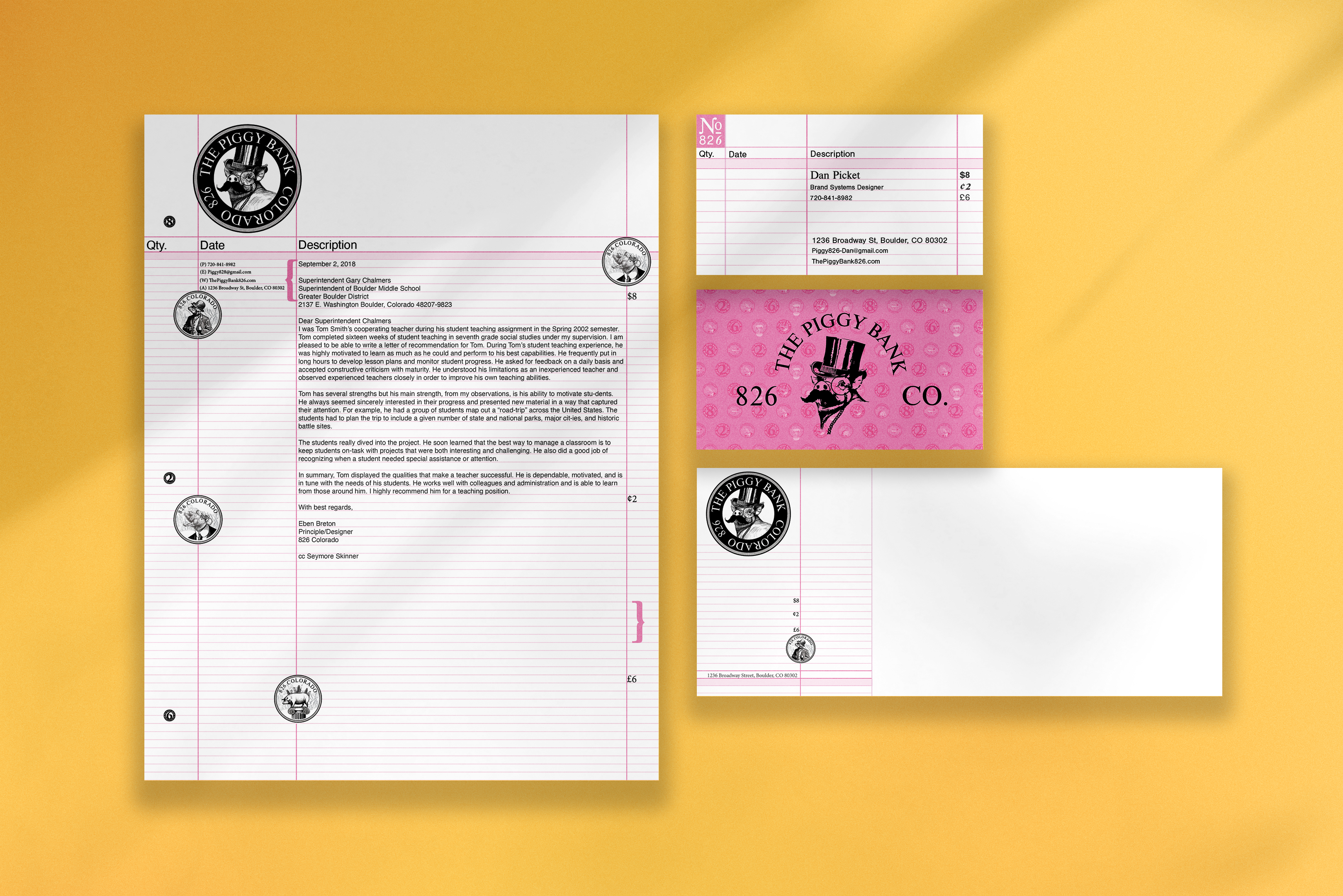
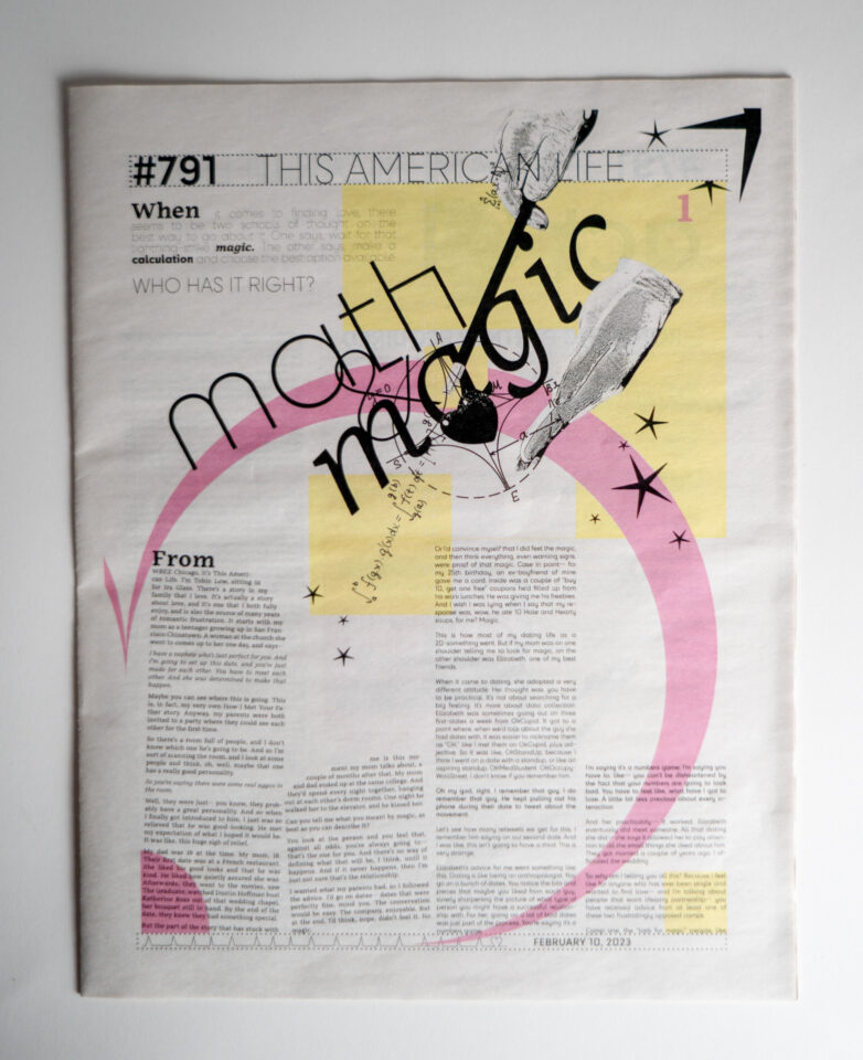
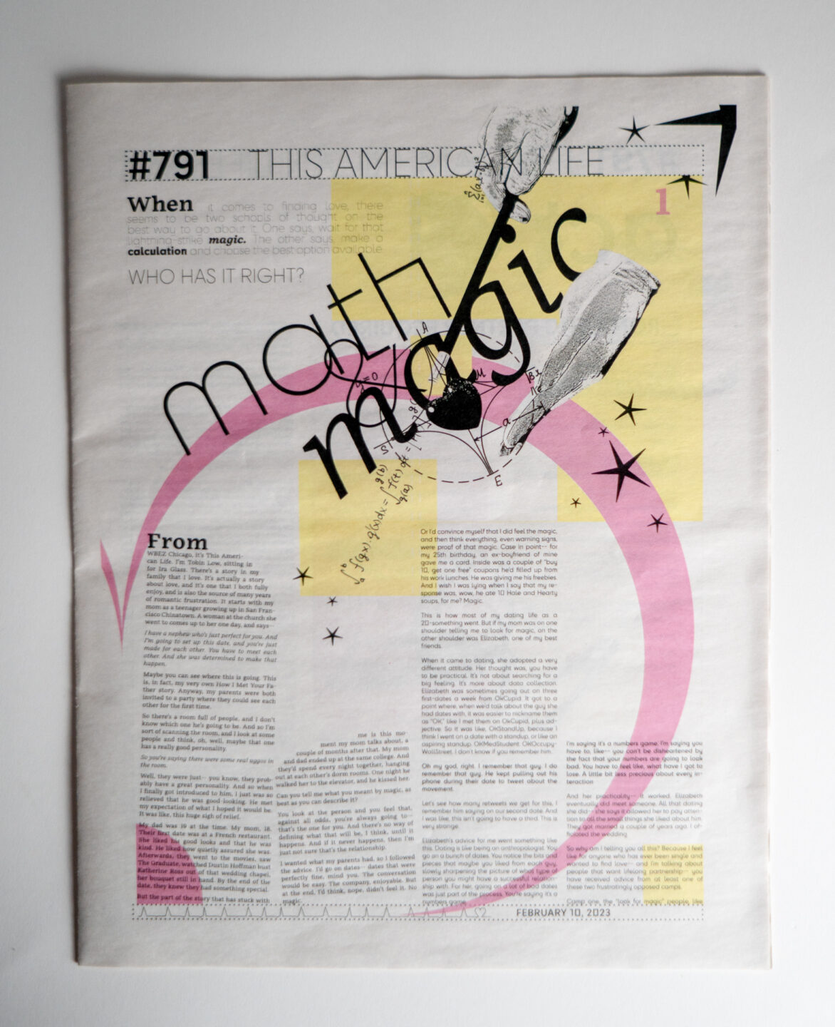
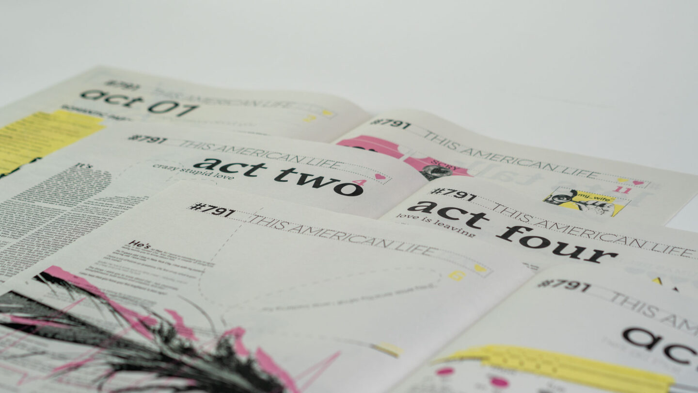
For the tinfoil-hat-wearing conspiracy theorists, The Condon Report was a publication made to give scientific reason to alien machinery, to explain the unexplainable, and to study that which cannot be understood. The Condon Report, having such an interesting message and goal behind its creation, lacks in the visual department where it counts—drawing the eye nowhere in particular and making it an absolute chore for even the fanatic to make it through one chapter. Disregarding the beliefs of each person who may come across this book, the redesign aims to make flipping through its pages an intriguing and enjoyable experience. Important information within the story is given the recognition it deserves, playing with type, grid, and image in fun and creative ways that make it difficult for anyone to put down. Developing these types of systems was difficult at first. Type was the most challenging element to play with—not so much grid-wise, but in experimenting with typographic variation, making each page an experience through systems that are meant to complement each other. This was achieved by making certain elements stand out with a more uncommon vertical type system for the page numbers, headers, folios & footers. Now, with the work completed, it’s easy to look back and say there is still enjoyment to be had flipping through The Condon Report. It became exactly what was imagined for it: that out-of-this-world book that was fun for anyone to read through. Although a really nice piece to go through from time to time, I’m really glad I don’t need my kitchen equipment to have fun with the book.