Communication Design

Jenna Vineyard

Graduation

2025

Skills
  • UI/UX
  • Branding/Identity Design
  • Typography
Employment Badge

Secure Our Saftey

Secure Our Saftey

This Project was done in collaboration with Maddie Beattie The task for this project was to rebrand an idea with a focus on creating a campaign that promotes gun safety in a way that subverts typical right-wing propaganda. The campaign aimed to encourage proper gun storage, cleaning, and the importance of background checks, using messaging and imagery that resonates with conservative family values. We strategically utilized similar colors, symbols, and imagery often associated with right-wing organizations. By incorporating family-centered visuals, the campaign tapped into the deeply held belief of protecting loved ones, reframing gun safety as an essential part of safeguarding the family. This approach aimed to shift the conversation around guns while appealing to an audience typically resistant to gun regulation measures. This project was my first experience creating a campaign, and it taught me the importance of developing a cohesive branding system. Working in a team, I gained valuable experience in collaboration, particularly in balancing multiple viewpoints and ensuring the final design remained unified. Additionally, I learned how to use visual strategies effectively to communicate a subversive message in a way that resonates with a specific audience.

#BreakTheBarriers

#BreakTheBarriers

This Project was done in collaboration with Chelsea Rogers and Trinity Tubbs This project was a collaboration between me and two classmates, for the Creative Conscience #WhyVote competition. Our campaign aimed to encourage multicultural first-time voters to participate in the Presidential election by emphasizing shared values and a collective identity. We focused on using powerful text-based designs to promote the importance of individual and community voices in shaping the future. Our campaign sought to emphasize the strength of diversity, showcasing how different cultural identities can come together for a common purpose. We wanted to create a message that resonated with young voters by highlighting the importance of their unique voices, while uniting them under shared goals of personal and societal growth through voting. This project was a sprint, completed in just three weeks, which required tight collaboration and quick iteration. I was responsible for creating the motion piece, which allowed me to refresh my skills in Adobe After Effects and gain more confidence in motion design. The experience of working in a fast-paced, team-driven environment gave me valuable insights into the importance of teamwork, quick decision-making, and delivering high-quality work under time constraints

Lavender Festival

Lavender Festival

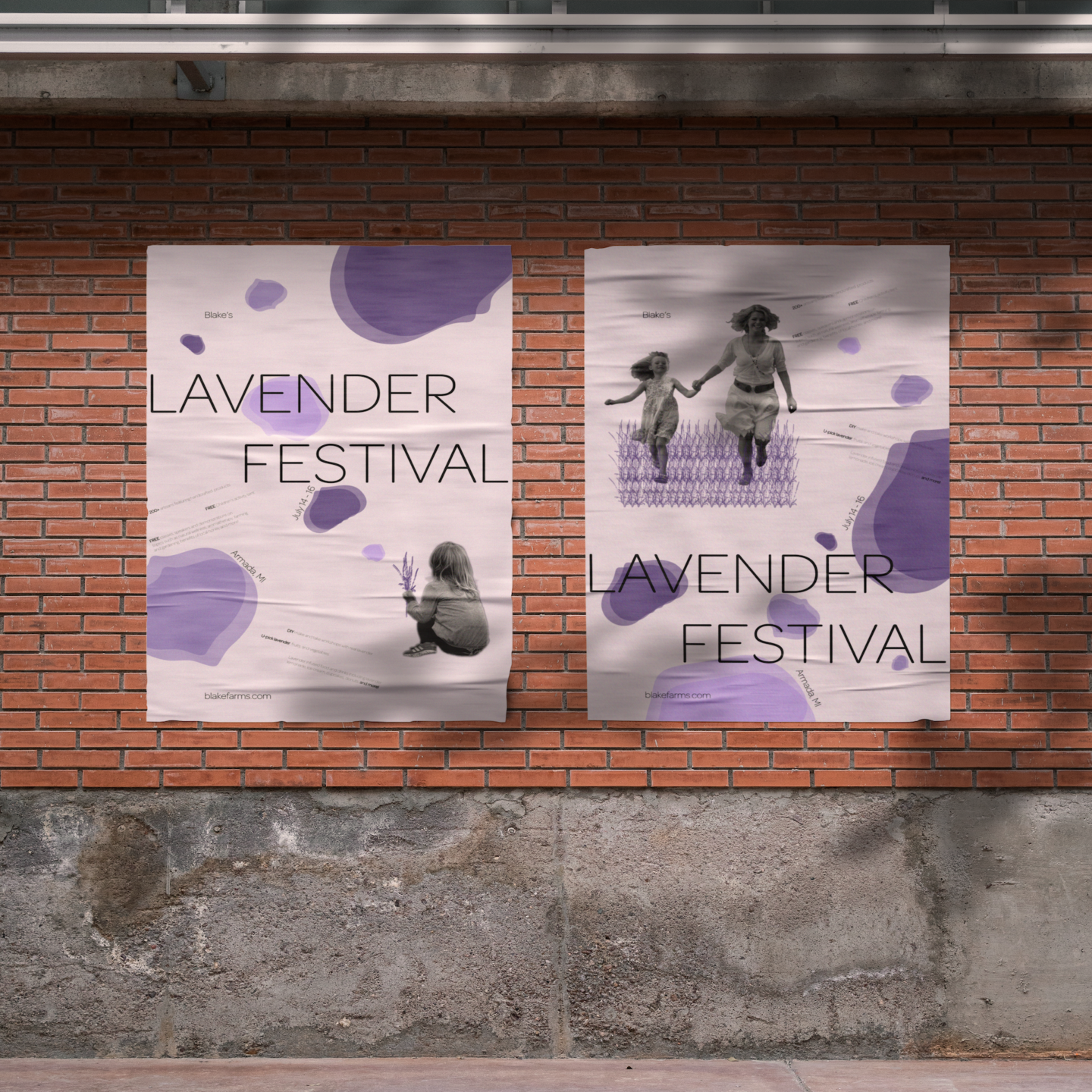
This project involved designing a set of posters for Blake’s Lavender Festival, a yearly event held in a rural town in Michigan. The goal was to create a fun and inviting design that captured the spirit of spring and appealed to both adults and children attending the festival. Having personally attended the festival, I wanted to convey the joy and adventure that the event brings to its visitors. I researched the rural setting where the festival takes place, which inspired me to highlight an adventurous, outdoor vibe that resonates with the local community. This allowed me to create designs that would not only attract visitors but also feel familiar and appealing to residents. This project allowed me to blend both physical and digital design techniques, broadening my creative process. I learned how to translate the personal joy I experienced at the festival into visual storytelling, while also considering the preferences and interests of the local audience. It was a fun and meaningful project that pushed my design skills in new directions.

StickScape

StickScape

StickScape is a fictional store concept created as part of the 826 store brand, which is known for its unique, themed storefronts in various cities. StickScape was imagined as a Baton Rouge-based store, with the branding inspired by the city's cultural and historical significance. The project focused on creating a store identity that connects with the local community while sparking creativity and imagination. The concept behind StickScape is rooted in the translation of Baton Rouge, which means "red stick" in French. I conducted several weeks of research into the city’s history, art, culture, and people to ensure that the store’s identity was both relevant and engaging for the community. The idea of a whimsical "stick" dimension emerged as a playful tribute to the city’s name, inviting children and visitors to explore a world where sticks come to life. This project was my first major experience in creating a brand identity for a fictional store, and it taught me the importance of cultural research in informing design. I learned how to balance creativity with community relevance, as well as how to develop a cohesive store identity from concept to execution. StickScape also strengthened my branding skills and gave me the confidence to tackle larger projects.

Punk In A Box

Punk In A Box

For this assignment, I was tasked with selecting a well-known graphic designer and creating a project that embodied their spirit without simply copying their style. I chose Jamie Reid, best known for his work with the Sex Pistols and his influence on the U.K. punk scene. My goal was to capture the rebellious essence of Reid’s work and translate it into a modern context. Jamie Reid’s work was heavily influenced by the desire to challenge the status quo, much like the punk movement itself. Through in-depth research, including interviews and articles about Reid and the punk scene, I explored how the social and cultural climate of that time parallels the frustrations felt by younger generations today. This project was a way to bridge that gap and highlight the enduring spirit of rebellion. This project deepened my understanding of how design can be a form of social and cultural expression. It challenged me to not only honor Jamie Reid’s rebellious spirit but to also make it relevant to the current social climate. I learned how to thoughtfully integrate research and storytelling into physical products, making this one of my most fulfilling projects at CCS.

Affrimations Detroit

Affrimations Detroit

In this project, I was tasked with redesigning a section of a website for a local charity. I chose Affirmations Detroit, an LGBTQ+ youth center that provides a safe space for community members. My focus was on improving their chatting service, which connects younger members of the community, helping them feel less isolated. Through research and user interviews, I identified that the existing chat service needed to be more engaging, user-friendly, and accessible, especially for mobile users. I created personas to represent potential users of the service and conducted interviews with individuals who fit these personas to better understand their needs. This project showcased my ability to apply both my UX/UI design and coding skills. I learned the importance of user research and feedback in shaping a design that not only looks good but is also functional and accessible. It reinforced my ability to handle end-to-end design projects, from ideation to coding.