Communication Design

Christine Peruski

Graduation

2024

Skills
  • Motion design
  • Graphic Design
  • Motion Graphics
Employment Badge

Plastic World

Plastic World

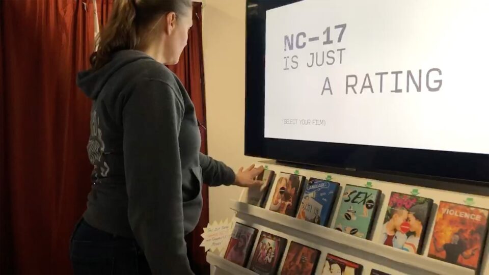
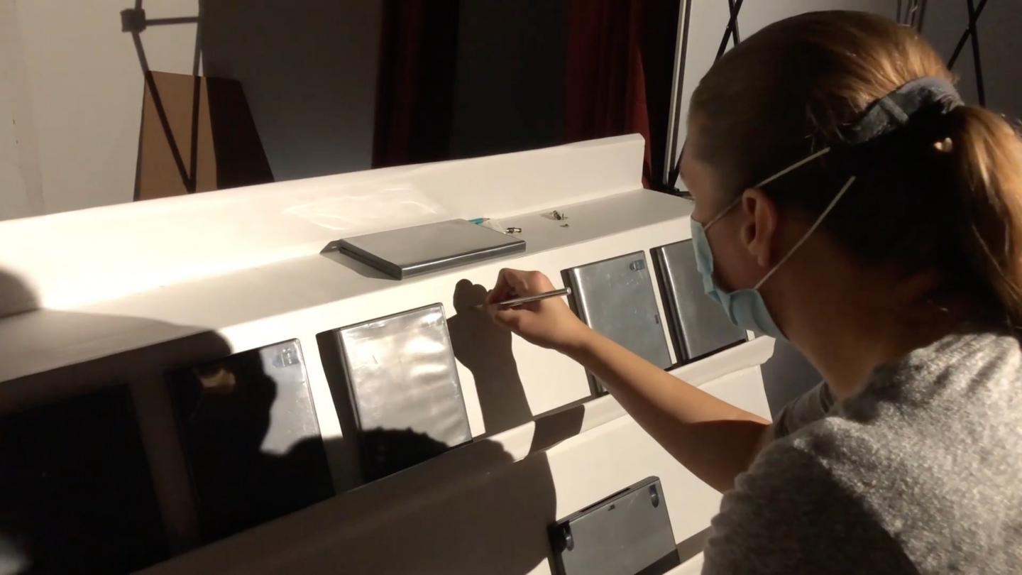
This immersive experience was designed to bring awareness to the growing problem of plastic waste in America. My partner and I took a satirical approach and created a 1950s themed sales pitch for the \"wonders\" of plastic and how cheap and disposable it is.

Sweet Dreams Lyric Video

Sweet Dreams Lyric Video

This lyric video was designed considering the content of the song and how the beat and lyrics can influence the motion. My choice of song was Sweet Dreams by The Eurythmics.

NC-17 Rating

NC-17 Rating

The Motion Picture Association of America (MPAA) uses the NC-17 film rating as a means of censorship through the use of extreme taboo. I designed this experience to raise awareness of how this rating is equal to censorship, and what content is being censored.

The Kickstand

The Kickstand

826 National is a non-profit tutoring organization that creates funding through themed store fronts unique to the cities in which they\'re located. The Kickstand is a store theme and branding system created for Madison, WI. My store combined the biking culture of Madison with the rougher nature of the rural community just outside of the city which can sometimes be at odds with the city population.

Pablo Ferro Motion Posters

Pablo Ferro Motion Posters

I choose Pablo Ferro as my designer to research, outline, write, design, and produce a piece of design using print, motion, or interaction/experience to educate audiences on the chosen designer. The final solution needed to reflect the values and philosophy of my chosen designer and the context that informed their work, and make it relevant for today’s audience. Pablo Ferro was a motion designer and editor, so I chose motion design to display his work.

Thanos Card Series

Thanos Card Series

I chose to design a series of 12 cards to represent aspects of the character Thanos, from the Marvel Cinematic Universe, through abstract concepts. The project objectives included conducting research, connecting with pop culture, and managing a design system. My design system was based on the art deco look of the character’s armor and the character’s ideals of balance, which informed my decision to split the cards between purple and yellow.