Communication Design & Strategy

Cecilia Morales-Enriquez

Graduation

1992

Skills
  • Motion Graphics
  • Branding/Identity Design
  • Art Direction
Employment Badge

How you do?

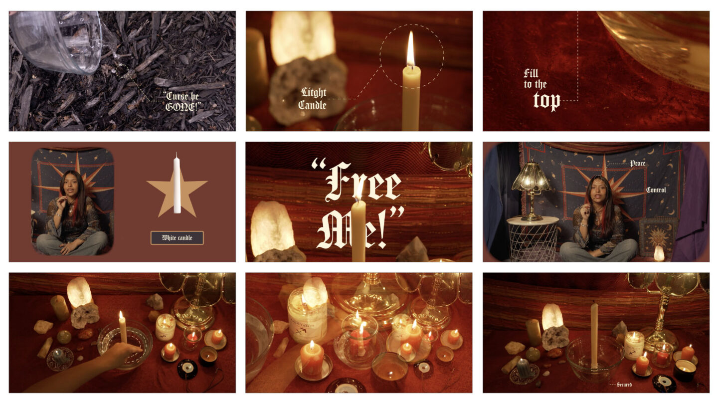
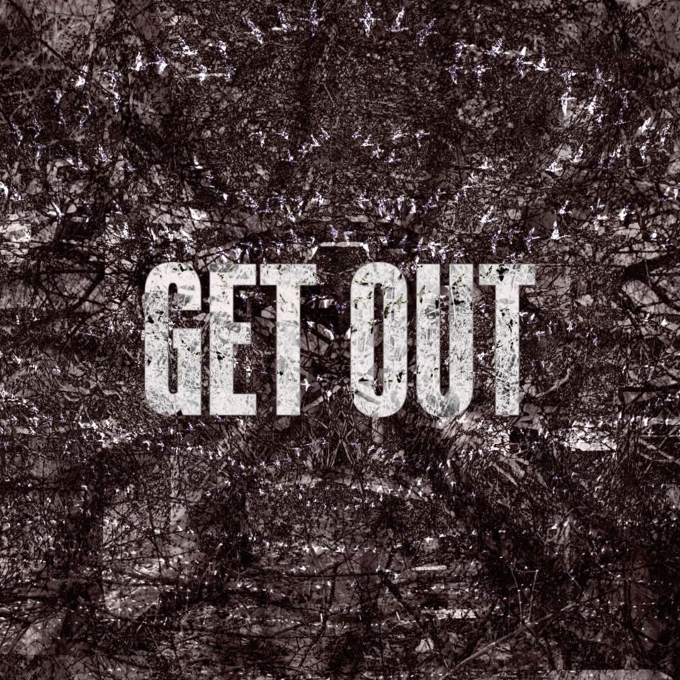
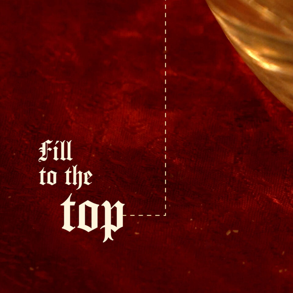
Visuals, Visuals, Visuals! In this project, we were asked to create a short 90-second how-to video that explored composition, graphic elements, typography, and story. At this point, the main goal was to create something visually aesthetically pleasing. I came up with a “how-to video” on how to get rid of a curse. I've always been drawn to all things witchy like candles, crystals, and tarot cards, so this was the perfect project to incorporate the things that I visually gravitate towards. One of my favorite parts of the project was moodboarding. I had a very clear idea of how I wanted everything to look and feel. However, when it came time to shoot, I struggled to execute my big ideas. This was the first project where I had full autonomy to set design and art directly by myself, so I spent hours prepping and setting up both sets. With help from friends, I gathered as many witchy things as I could, and I even took a couple of shopping trips to the thrift store to find props. Overall, this project holds a very special place in my heart because it made me realize that art direction is something I am passionate about. I learned a lot from this project in terms of software, and I grew my editing skills tremendously.

Semiotics of a Swiss Army Knife

Semiotics of a Swiss Army Knife

“10 problems, 01 fix.” Growing up I was always fascinated by my dad’s Swiss Army Knife that he would carry around everywhere he went. When tasked to create this type and image semiotics project that focused on connotative and denotative meanings, there was no better object to honor other than the Swiss Army Knife. This small but mighty tool kit not only has everything that a person could need, but also holds so much historical value, making it perfect for this project. This was an accumulation of weeks of research, photoshoots after more photoshoots, and continuous ideations. Through this process I realized the importance of extensive research. The process started by laying out a large piece of roll out paper and writing down everything that could be found about its function, its form, stereotypes, the industry, and its history. Understanding the denotative meanings helped me idealize the photos I wanted to take, and understanding the connotative meanings helped me experiment with clever copywriting phrases that I could use for my compositions. In the experimentation part of the brief I began to play with a macro lens, which allowed me to get up close to the texture of the blades and tools. I became obsessed with the different textures and patterns the Army Knife created and began composing typographic compositions on top of the image that reflected that texture and energy. A challenge in this process was learning how to integrate type and image seamlessly. Sometimes the type would feel disconnected, or it would feel bulky or like it had no structure and hierarchy. Because of this, it was important to iterate over and over and find new ways to crop images so there was more space for type or find hidden guidelines within the photo that I could place my typographic clusters within. Now I can say this is one of my favorite and best projects I have worked on. I learned so much more about composition, hierarchy, how type can integrate with a photo, taking photos, editing photos, and having copywriting that draws the viewer in.

Title Sequence Re-design of "Get Out"

Title Sequence Re-design of "Get Out"

When I first watched “Get Out,” I was immediately enthralled by the suspense of what was about to unfold. This thrilling movie is one of Jordan Peele's most critically acclaimed movies that won him an Oscar for best screenplay. When tasked to re-design a title sequence, Ethan Phail and I made a list of every movie we had watched, and at the end we came together to decide on “Get Out.” To begin the research portion of the brief, we re-watched the movie together and wrote down notes of important plot points, possible metaphors, colors, quotes, and visual imagery that the movie used. The next task was the mind map. We focused on researching the colors in the movie, the shot visuals, the graphic visuals, the type, the themes, the sounds, and the metaphors/symbolism. During this process, we watched discussion videos and read articles interviewing Peele. We began to have different elements that called out to us as visual clues into what we wanted to do with the title sequence. After our research was done, we focused on the mood and tone of it by mood boarding all our ideas. We liked the idea of playing with split screens or doubles of things, as well as playing with a void and distortions. When beginning to create our initial storyboards, I took a trip to Belle Isle and shot countless photos of wilderness. I focused on getting photos that had an eerie and a little bit off putting vibe to them to match the overall tone of the movie. Ethan and I found that the best way to tell this story was through collaging found media with our own nature photos and footage. Once we actually delved into making the title sequence, I took charge of storyboarding our ideas out by drawing out each frame in our animatic and figuring out how I wanted the type to lay out. While Ethan focused on sound mixing and colorgrading, I began to put together the initial rough cut. Once Ethan and I came together again we played with distortion effects to represent split personalities and divide between black and white and got the timing right. After countless rounds of critique we finally had a finished project. In this project I learned how to create a cohesive story as well as work alongside a partner to blend our ideas to create a final piece.

826 Boze Mt: Summit Dare

826 Boze Mt: Summit Dare

826 Boze Mt: Summit Dare is an imaginative sanctuary where K–12 students come to explore the daring terrain of storytelling and discover the bravery already living within them, transforming writing into a daring task where every student is both a risk taker and author. Building from this concept of fearless ascent, the visual strategy draws from the rugged world of ice climbing that Bozeman Montana is so well known for. The sharp geometry of ice-climbing shoe spikes became the foundation for the brand’s star system and graphic language, symbolizing traction, grip, and upward momentum in the creative process. These spiked-star forms serve as navigational cues throughout the identity, echoing the precision and determination required to climb toward a summit. Paired with a fierce color palette inspired by high-visibility climbing gear, the brand radiates energy, urgency, and courage, encouraging students to take risks, embrace mistakes, and push toward their own limitless summit.