Graduation

2027

Skills
  • Typography
  • Publication Design
  • Motion design
Employment Badge

The Condon Report: Revisualization

The Condon Report: Revisualization

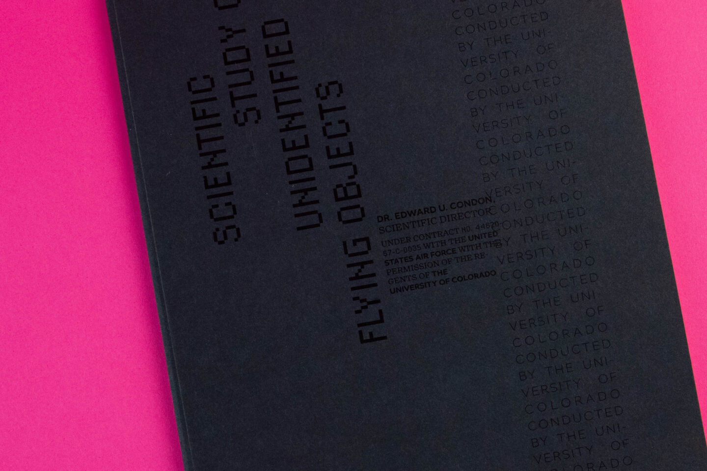
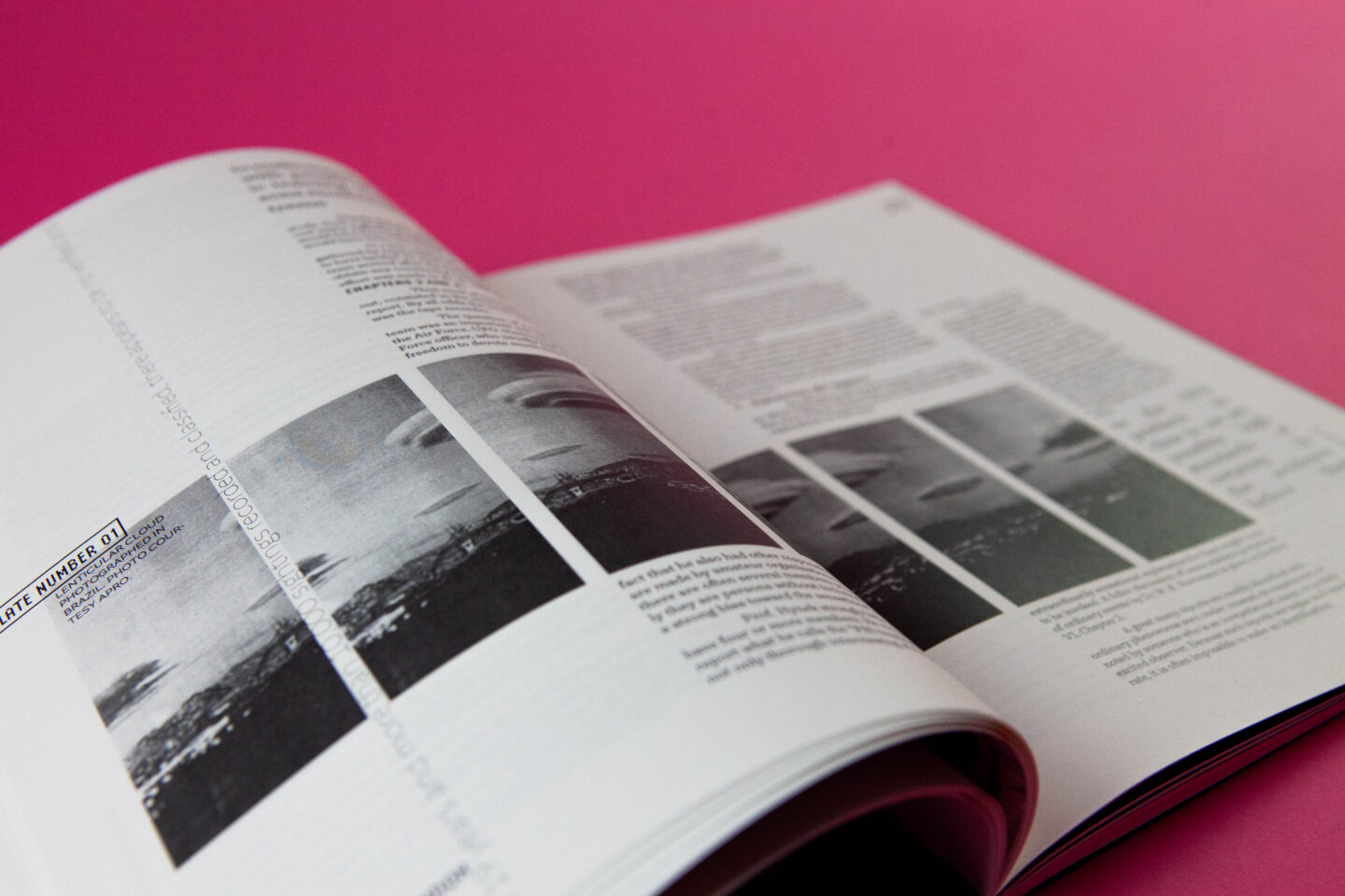
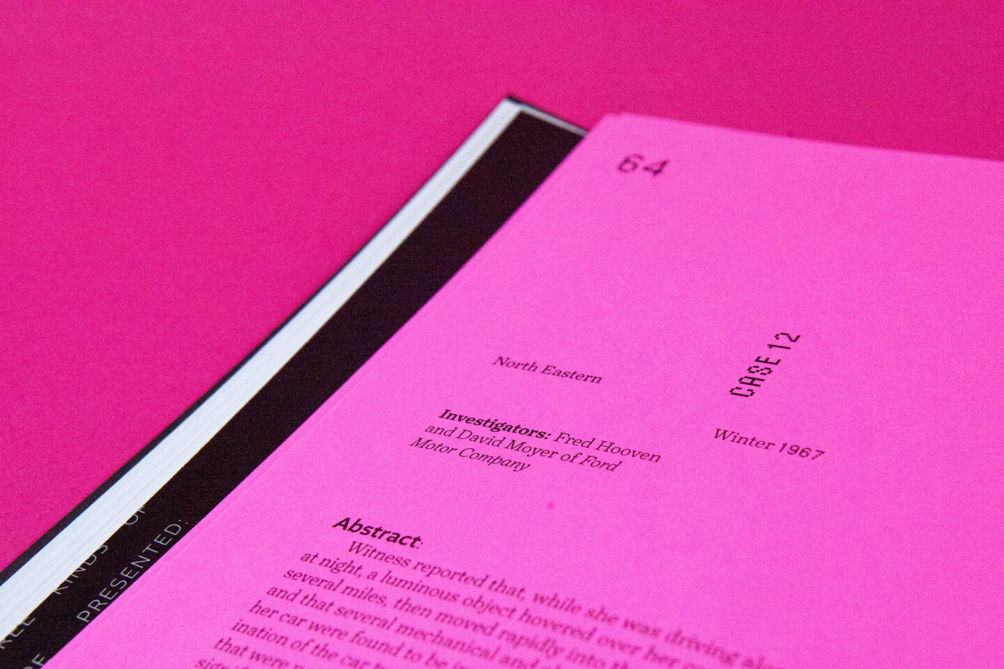
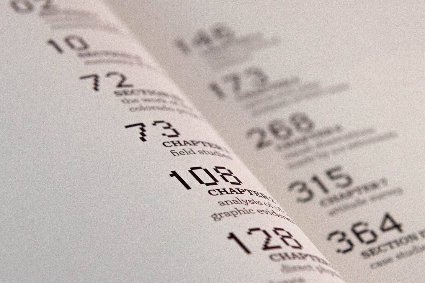
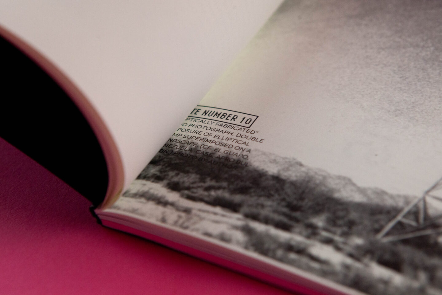
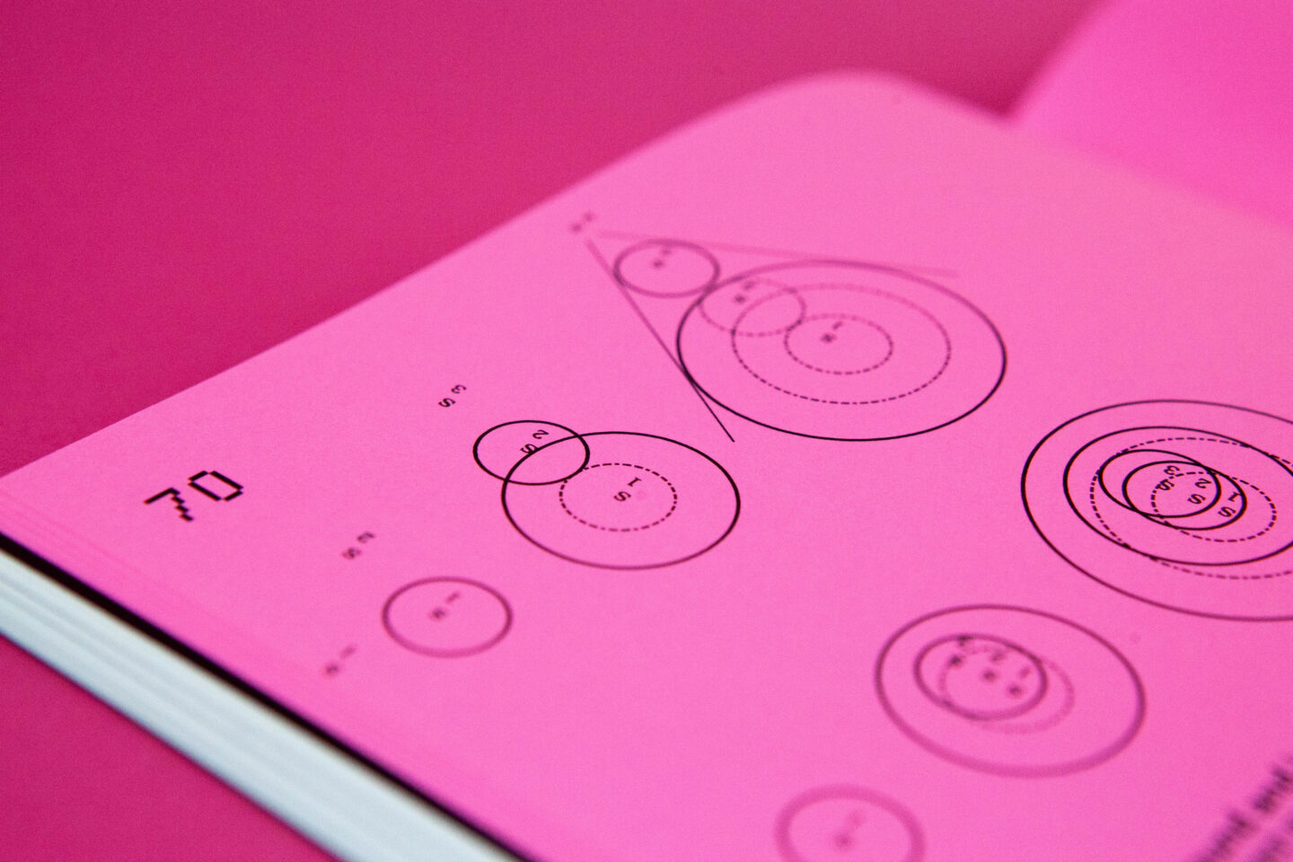
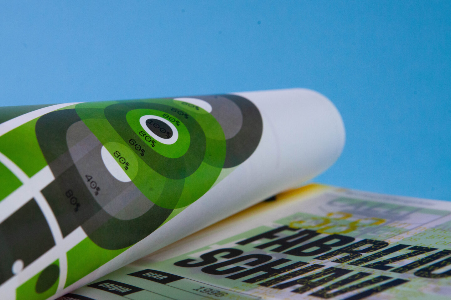
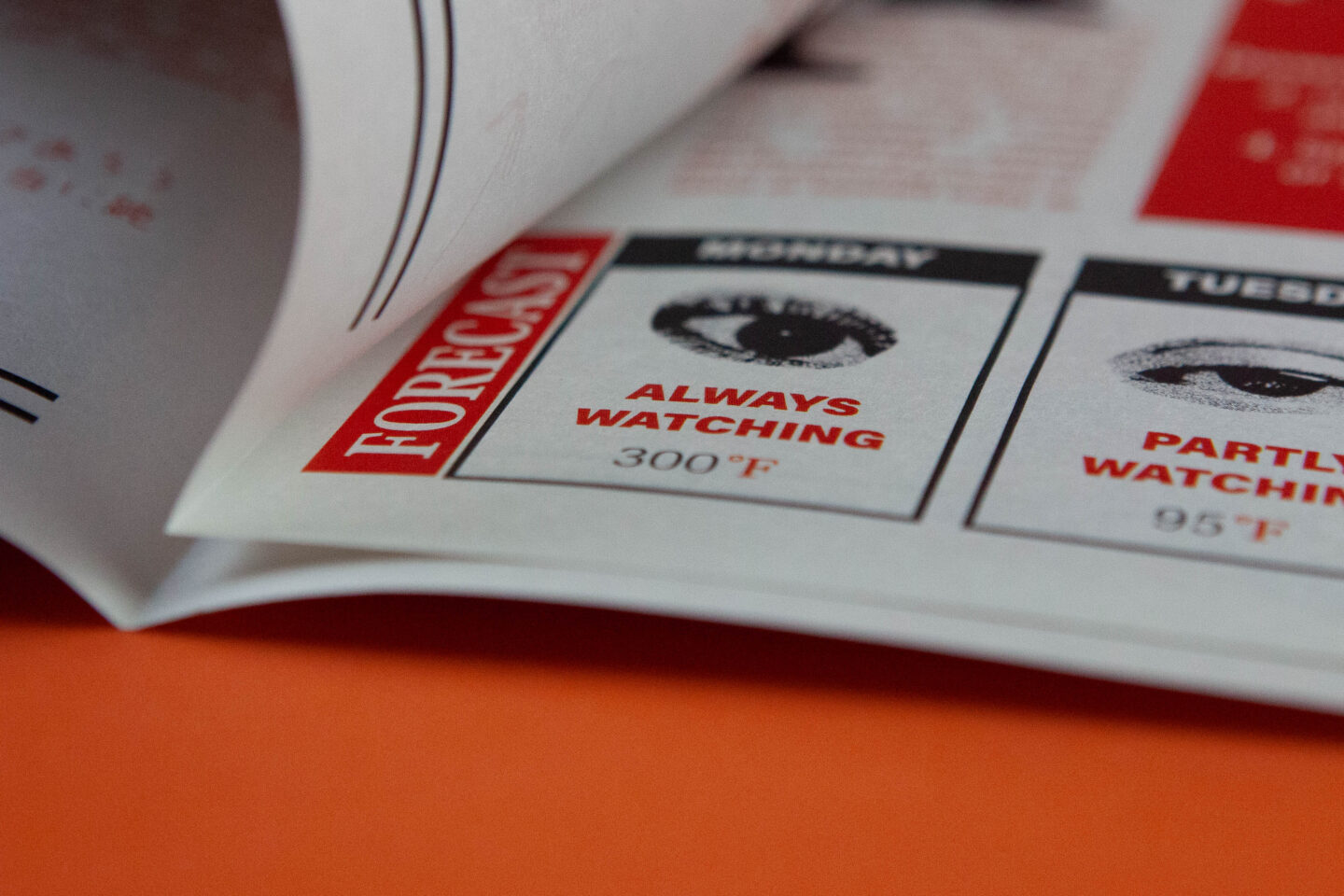
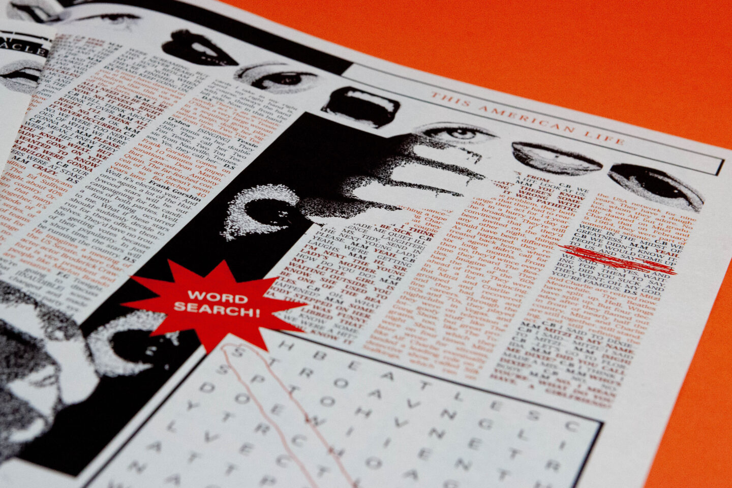
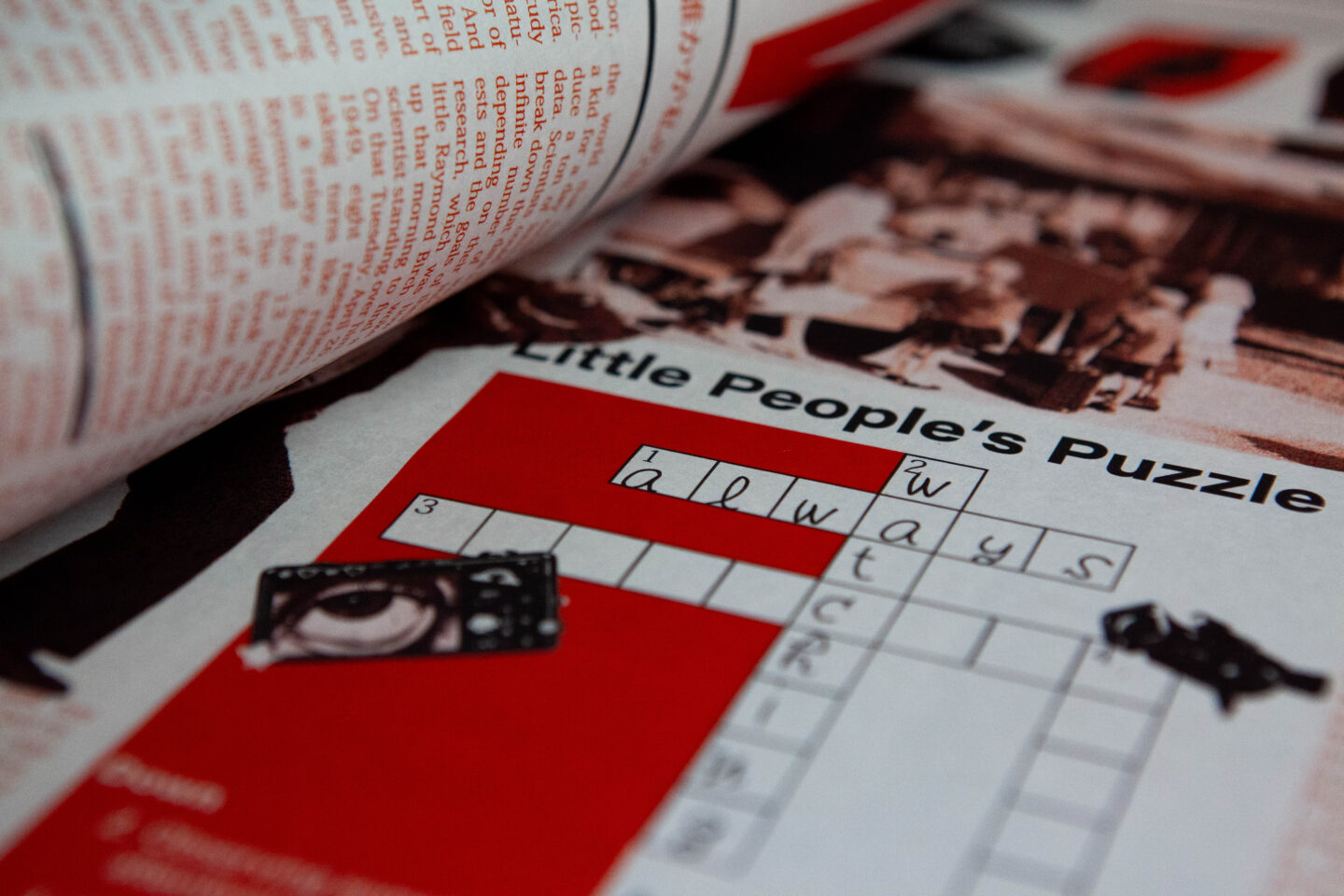
The existence of aliens has long been one of the greatest mysteries and conspiracies in the world. Questions persist: are they a threat to civilization if they exist, are they coming to brainwash humanity, or do protective tin-foil hats need to be worn to repel mysterious powers? Edward Condon attempted to evaluate the threat level of these unidentified objects in his publication. Although useful to the U.S. Air Force, the report was undesigned and visually unappealing—both for readers and, humorously, for aliens. This redesign set out to make the report both functional and visually engaging. Evaluating the report proved to be no easy task. With its multiple charts, data points, essays, case studies, diagrams, and photography, the content required a unifying system. The redesign began by establishing a flexible grid adaptable to imagery, diagrams, pull quotes, and data. Inspiration from typefaces guided the graphic language, which was then integrated into each diagram, essentially modifying their visual DNA. Once type and diagrams shared a cohesive style, imagery was refined to carry the same tone, giving the publication a consistent structure while introducing an otherworldly personality. The result was a 120-page book, completely bound by hand, that pushed the boundaries of design discipline and craft. Developing a system of grid, type, and hierarchy across such a large, data-heavy project in just six weeks proved to be a significant learning curve. The process demanded efficiency, adaptability, and problem-solving, transforming initial challenges into a cohesive outcome. Ultimately, the redesign became both a test of endurance and a lesson in how to build and maintain a complex system—while still leaving room to “think like an alien.”

The Substance: Title Sequence

The Substance: Title Sequence

Have you ever wished for a younger, better, more perfect version of yourself? The Substance takes that desire to the extreme—offering a sci-fi horror spin on beauty, aging, and obsession with self-improvement. Despite its sharp commentary, the movie never had a title sequence. That absence became the spark for this project: creating an opening that could visually echo the film’s themes of transformation and unease. Every frame of the sequence was shot from scratch—fragmented body parts filmed under harsh pinks and greens to blur the line between allure and discomfort. The camera’s slow movements concealed as much as they revealed, leaving each shot suspended between recognition and distortion. The challenge came in merging this footage with typography, not as separate layers but as a single language. Type couldn’t simply sit on top of the video—it had to move with it, respond to it, and feel like part of the body itself. Hours were spent refining pacing, keyframing, and rhythm so that names and titles emerged seamlessly from the filmic texture. What started as two parallel processes—shooting and designing—became a single, cohesive vision where typography and videography were indistinguishable. The result was a nearly two-minute sequence that doubled as both introduction and extension of the film’s identity. With one designer sequencing footage and the other shaping typographic rhythm, the collaboration produced a balance of craft and experimentation. In the end, the biggest lesson was clear: treating type and video not as separate mediums, but as co-conspirators in storytelling, is what made the title sequence come alive.

Hue To Hue // A Design Archive

Hue To Hue // A Design Archive

When asked to define what “good design” means, there isn’t a single answer. Good design differs from person to person, bias to bias, experience to experience. What feels like good design to one viewer may be considered poor design by another; minds interpret color, hierarchy, and form through the lens of individual experience. Hue to Hue // A Design Archive was curated as a way to explore this subject through color. After extensive research into design from around the world, seventy works were analyzed and distilled into individual color palettes. Starting with the first image, one color was pulled from its palette and used to connect to the same color in the next piece, creating a chain of images linked through shared hue and bound into a 120-page book. This method revealed not only connections across works, but also patterns in how good design emerges through color. Good design, as reflected in this archive, is something carefully curated, explored, and unexpected. It breaks grids and transcends hang lines. Good design invites play, embraces authenticity, and radiates with hue. Curating an in-depth design archive proved to have its challenges; finding design across many different platforms and existing archives was no easy feat, and neither was creating a system that could be followed to display every piece cohesively. Through this process, the importance of having a structured organization was determined necessary. It would be nearly impossible to construct this large of a publication without a concise system in place, and moving forward this work flow will be a requirement. Through this archive a sense of self discovery was gained and a more productive production was noted around trial and error.

The Human Spectacle: Newspaper

The Human Spectacle: Newspaper

What do you get when you cross a podcast with a newspaper? Human Spectacle—a multi-page publication that transformed the dialogue of a podcast from This American Life into a typographic experiment on newsprint. Instead of covering headlines, this paper riffed on rhythm and tone of the podcast, turning spoken word about fame, surveillance, and what it feels like to be watched into visual structure. Printed in England on authentic newspaper stock, it blurred the line between what’s read and what’s heard. As one of the first collaborations of its kind, starting the project came with challenges. Finding a shared vision and rhythm took time, but dividing tasks and establishing design roles quickly became the key. While one designer refined typography or experimented with the masthead, the other collected assets, organized dialogue, and structured spreads. InDesign became the glue, keeping the publication consistent even as ideas bounced back and forth. Newspaper conventions—columns, pull quotes, and sprawling layouts—were tested, stretched, and reimagined until the system felt cohesive and gave an audience an eerie feeling as if they were being watched. Completed in just six weeks, the project underscored how collaboration sharpens both process and outcome. The experience proved that design partnerships thrive on clear systems, divided roles, and constant critique—lessons that will carry forward into future publications and beyond.