Graduation

2026

Skills
  • Branding/Identity Design
  • Communication Design
  • Creative Direction
Employment Badge

826 Tucson: Jardin Estrella

826 Tucson: Jardin Estrella

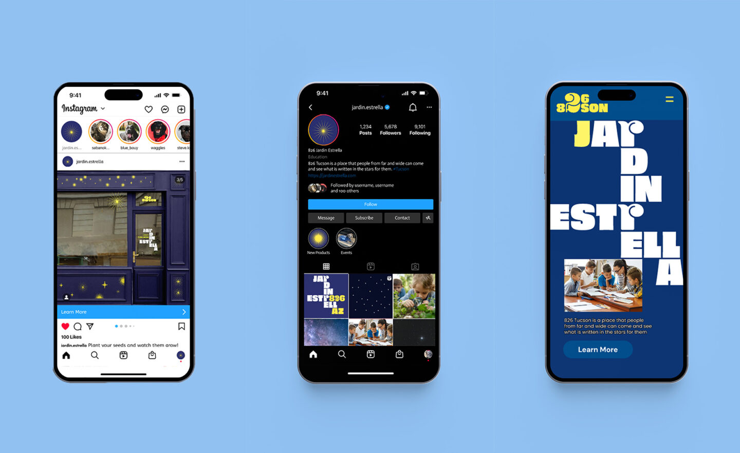
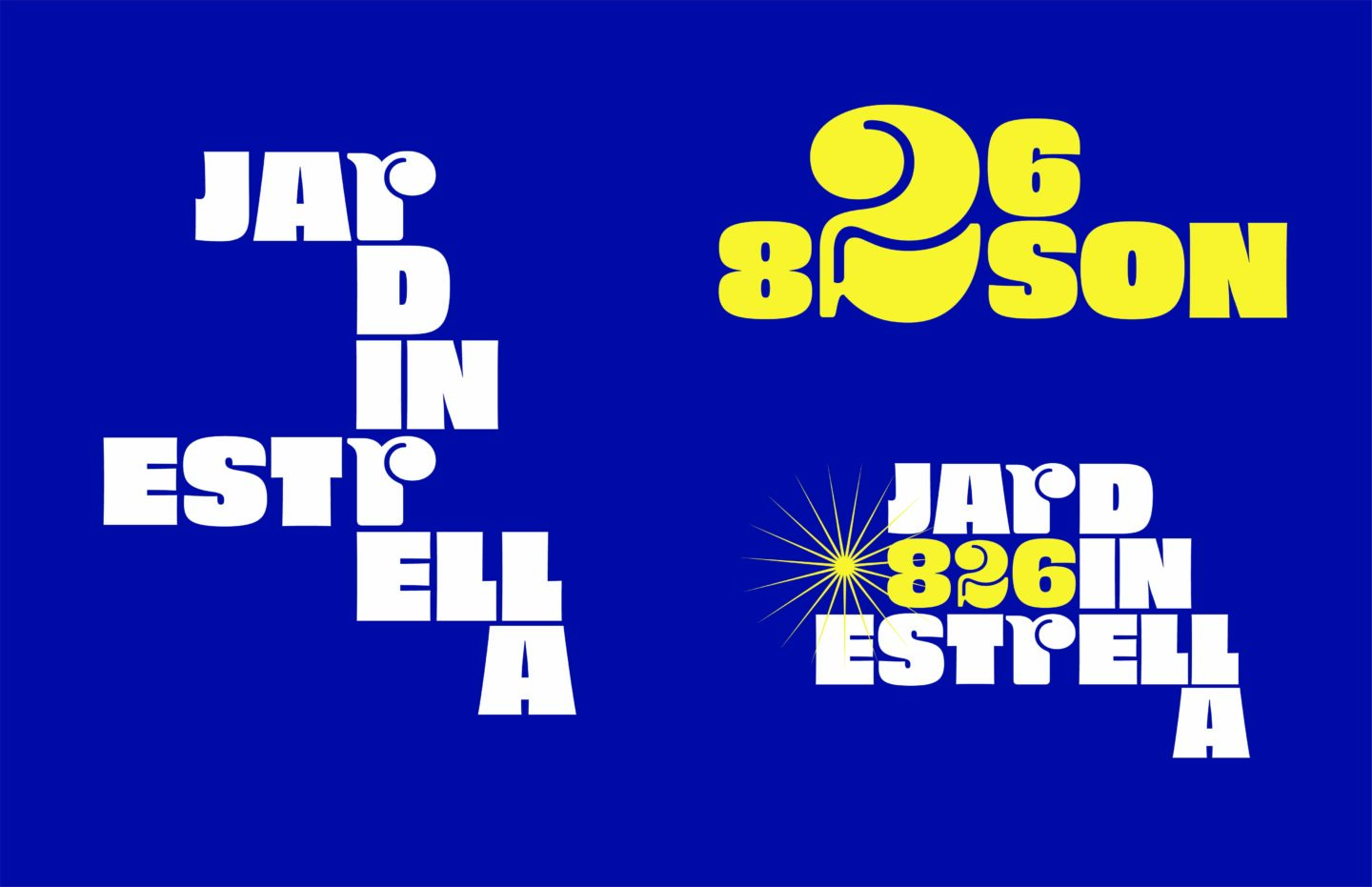
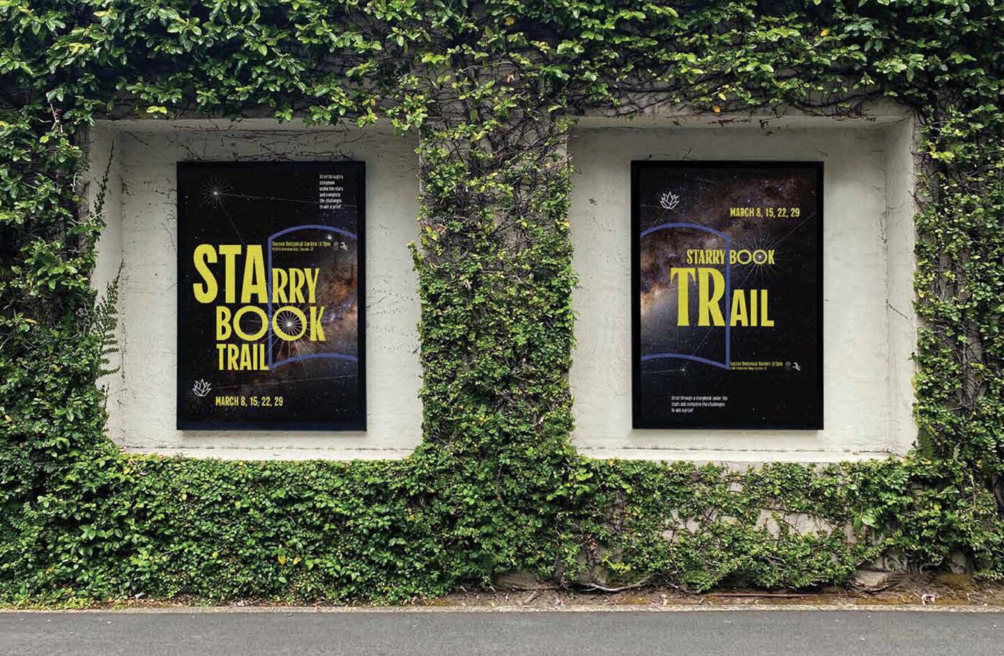
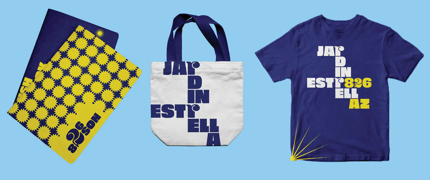
PROJECT BRIEF: Create a fictional 826 store brand identity in a new city pulling from the essence of the area. In this project it was Tucson, Arizona. WHAT IS 826?: You may be wondering, "what the hell is 826??" 826 National is a non-profit organization that supports students with their literacy and writing skills. Each store is a false front for the centers and they are themed to represent the city in which they are located. MY TAKE: Jardin Estrella is located in the city of Tucson, Arizona. It is inspired by the dark sky ordinance the city has put into place, and represents the city’s commitment to the preservation of its sky and of Arizona’s diverse plant life. The store provides its visitors with everything they need to grow their own star in their backyard. The word mark mimics a constellation like form and is modular to fit different contexts. The colors I landed on come from the bright vibrant sky of Arizona both during the day and at night. The brands motion identity is subtle. Like a shooting star cascading across the night sky. Considering the inspiration for the theme of the brand, 826 Tucson partnered with the Tucson Botanical Gardens to host a story book trail. This set of posters really focus on typography and can work effectively on their own, or side by side.

Gardner White Center: Re-Brand

Gardner White Center: Re-Brand

PROJECT BRIEF: Re-brand the Gardner White Clearance Center as its own branch of the Gardner White brand, making it more appealing and exciting to customers. COLLABORATORS: Jack Bennett Quang Dao Niclas Mueller OUR TAKE: We wanted to frame the Clearance Center as a place that offered affordable necessities, not just discount leftovers. It is a place for discovery, and turning your house into a home. We went for a fresh, flexible look for the rebrand that can adapt to show how life changes constantly. We even renamed the Clearance Center to GW Center to show our dedication to the customers. They are the center of the business just as much as furniture is the center of the home. We wanted to connect with our roots by selecting colors that come from different parts of Michigan since Gardner White as a whole is a Michigan born and raised brand. Our typography is friendly, and inviting, encouraging people to shop at the GW Center.

Only Angels Tour

Only Angels Tour

PROJECT BRIEF: Create and develop a motion and brand identity for an event for a specific audience/subculture. MY TAKE: I created a motion identity for a fictitious Harry Styles tour. I was inspired by the opening of the song “Only Angels”. I created an announcement video for the U.S. leg of the tour. To supplement the video I created a line of merchandise and additional advertising to promote the tour.

Volkswagen Terra Viva

Volkswagen Terra Viva

PROJECT BRIEF: Design a vehicle of the future that improves the lives of drivers, while staying within the Volkswagen mantra: the people’s car. COLLABORATORS: Woobin Park Samson Deroaches OUR TAKE: We created a vehicle that would promote physical activity, and mindful habits. We created a car that cared about its users and would help them live healthier and happier lives. I learned that my talents can take me to more places than I originally thought. I never pictured myself doing work in the transportation field.

Environmental Interpretive Center: Redesign

Environmental Interpretive Center: Redesign

PROJECT BRIEF: Redesign the Environmental Interpretive Center at the University of Michigan Dearborn campus to help garner engagement and visibility in their community. WHAT IS THE EIC?: The EIC is a nature and learning center located on the University of Michigan Dearborn campus. They really value teaching the community about their surroundings, and they really emphasize their rich nature trails. They want that same richness reflected in their building. COLLABORATORS: Karen Ruiz Autumn English Miyana Tatum OUR TAKE: Natural Movement movement became a prominent theme in our project. Nature is always moving and changing. We developed a new flow for the building that matched that sentiment. From its wayfinding to its content. We created a whole new experience for guests that spanned from the digital world to the physical world. We finished off this process by building a physical mockup of our watershed exhibit.

Alex Steinweiss: On the Record

Alex Steinweiss: On the Record

PROJECT BRIEF: Study a designer and create a project to present that research in the context of that designer's field and style. In this case, I researched Alex Steinweiss, the inventor of the modern album cover and lifelong music industry designer. MY TAKE: I created a gatefold vinyl record sleeve complete with a record, a dust jacket, and a “lyric” book. I learned that Steinweiss is very experimental with typography and loved using bright colors to grab the attention of the consumers looking to buy records. I used this as my driving inspiration in the making of this project.