Communication Design

Rachel Wixson

Employment Badge

Tolkien Cards

Tolkien Cards

The task for this project was to create a set of 12 cards based on a hero or villain. The hero in this story is J.R.R. Tolkien, the author of The Lord of the Rings and known philologist (a person who studies the history of languages). This project explores the deeper meaning behind who Tolkien might be. The cards have a vintage style and celebrate the books that many have come to love. Every card is designed to speak life into the different ideas behind each of the cards, just as Tolkien does with his mythology. In Tolkien\'s writings there is an emphasis on storytelling, lore, and the relationships the characters have with one another. These themes are explored throughout the card set as well. One of the avenues explored is Tolkien\'s values. The Value card represents what that would look like and feel like. A strong theme throughout his books is good versus evil and ultimately faith that good will win in the end. Every story must come to an end. The takeaway from this project was Learning how to make design decisions with meaning and intention behind them. The end result was being able to make connections between facts and ideas and create a story out of them.

Collage Posters

Collage Posters

This project is a set of black and white collage posters meant to represent two opposite ideas. The left side represents the advancement of technology and going too far- too far to turn back and the repercussions of advanced technology taking away our humanity . The right side represents being unplugged but at the cost of not being aware of the outside world. One could lose sight of the real world to live in a place based on wishful thinking and lies. Although these ideas are opposite, they are connected together by a single plug and two fingers. These posters serve as a warning to the ones struggling with this everyday without even knowing it. They could be accepting technology, oblivious to it, or ignoring it altogether. The take away from this project is to have a set concrete concept first and then gather the assets needed to make that concept come to life. Designs come easier when there is a clear picture of what needs to be accomplished.

Cheese Grater Posters

Cheese Grater Posters

In this project it was tasked to design and take photos for a series of 20 posters based on an only one object. The different meanings behind the object were separated into two different categories: connotative and denotative. According to Dictionary.com \"The denotation of a word or expression is its explicit or direct meaning, as distinguished from the ideas or meanings associated with it or suggested by it... When someone refers to a word’s connotation, they’re referring to what it implies or suggests—or to the secondary meanings or implications that are associated with it.\" For these posters many questions and conundrums were explored. What does it mean to be grate? How does one capture the sharp (cheddar) texture in a medium that is flat? How many puns can be in one poster set? Through research and mind maps and many, many lists these questions were answered- 1. Be a grater and one is automatically grate. 2. Using different angles and zooming in and out will expose the textures in unique ways that are still interesting to look at. 3. There can never be too many puns. There were two main takeaways from this project. The first was how to use typography and image in a cohesive way. Also picking typefaces that go with the message and feeling of the overall posters design. The second is exploring the deeper meaning behind the oject so the design decisions made have a reason behind them.

Hand Lettering Book

Hand Lettering Book

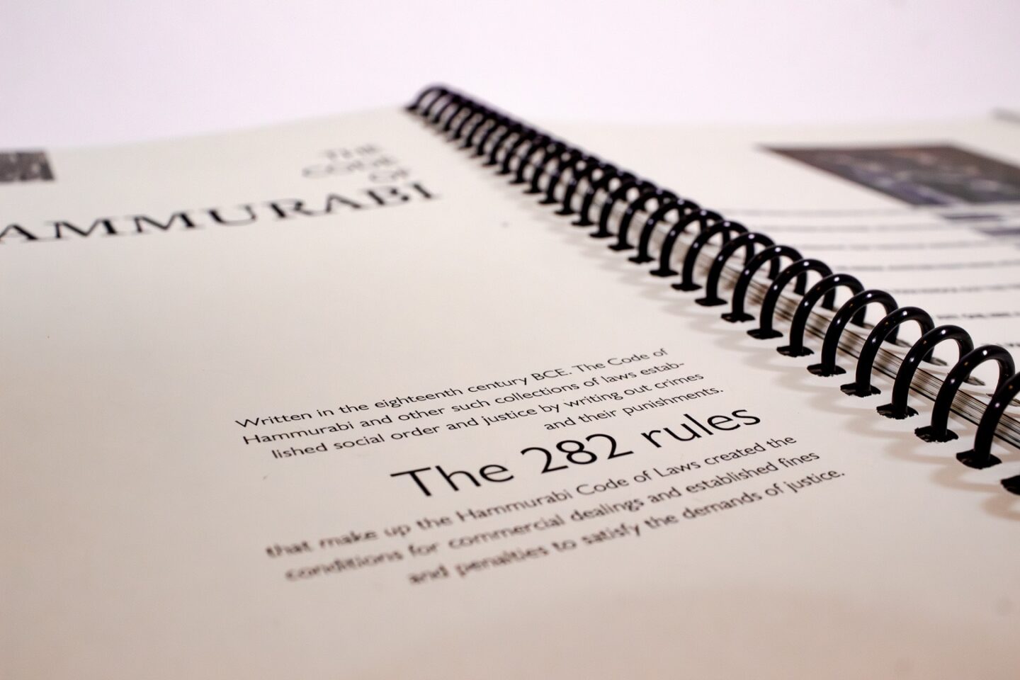
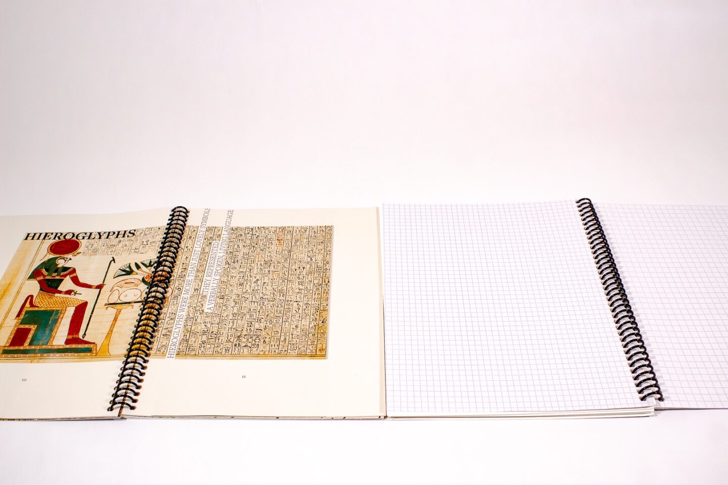
The task for this project was writing and designing a book based on a famous designer or a design concept. Hand lettering is a concept that has been shaped by rich history and interesting people. Words are the main way that we as humans communicate with one another, and the way words are visually formed can further communicate the feeling and meaning behind them. The content of the book dives deep into the history of the first written languages, and goes all the way to current hand letters. Many design choices within this project were made to reflect the content of the book. For example, a classical style grid was used throughout the pages to emphasize the fascinating history. One of the takeaways from this project was learning how to manage an entire book project including research, writing, editing, and designing. Through this, a general concept got turned into a physical object for others to learn from and enjoy.

Cultivate

Cultivate

Cultivate is a gardening supplies company that sells anything you might need to make your garden beautiful. The task given was to create a new branding system including the logo, business cards, packaging, and product design. The different roots explored in this project all lead back to who the customer of cultivate would be and why would they want to purchase this brand over another. The style chosen was more rustic and included lots of detail. This is meant for gardeners who appreciate both the beauty of the garden and flowers but also the functionality of growing food. The attention to detail and love shown in each illustration represents the care taken in the quality of products that the company provides. The takeaways from this project were how to build a brand. Through that it was learned how to use type and drawings together in multiple ways to build a brand identity. The result was a design system that worked together across many different items.

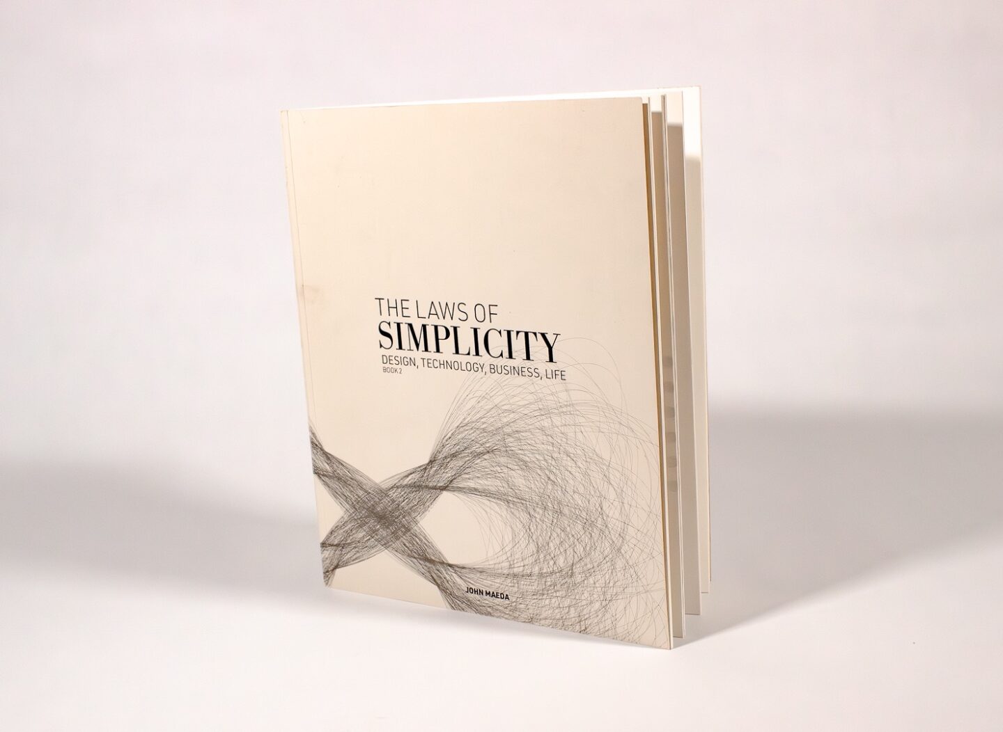
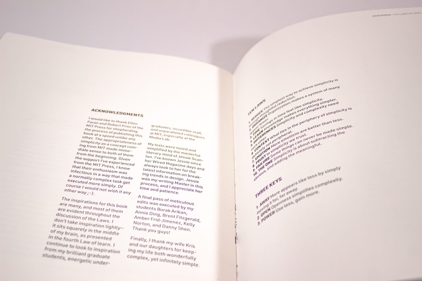
Laws of Simplicity

Laws of Simplicity

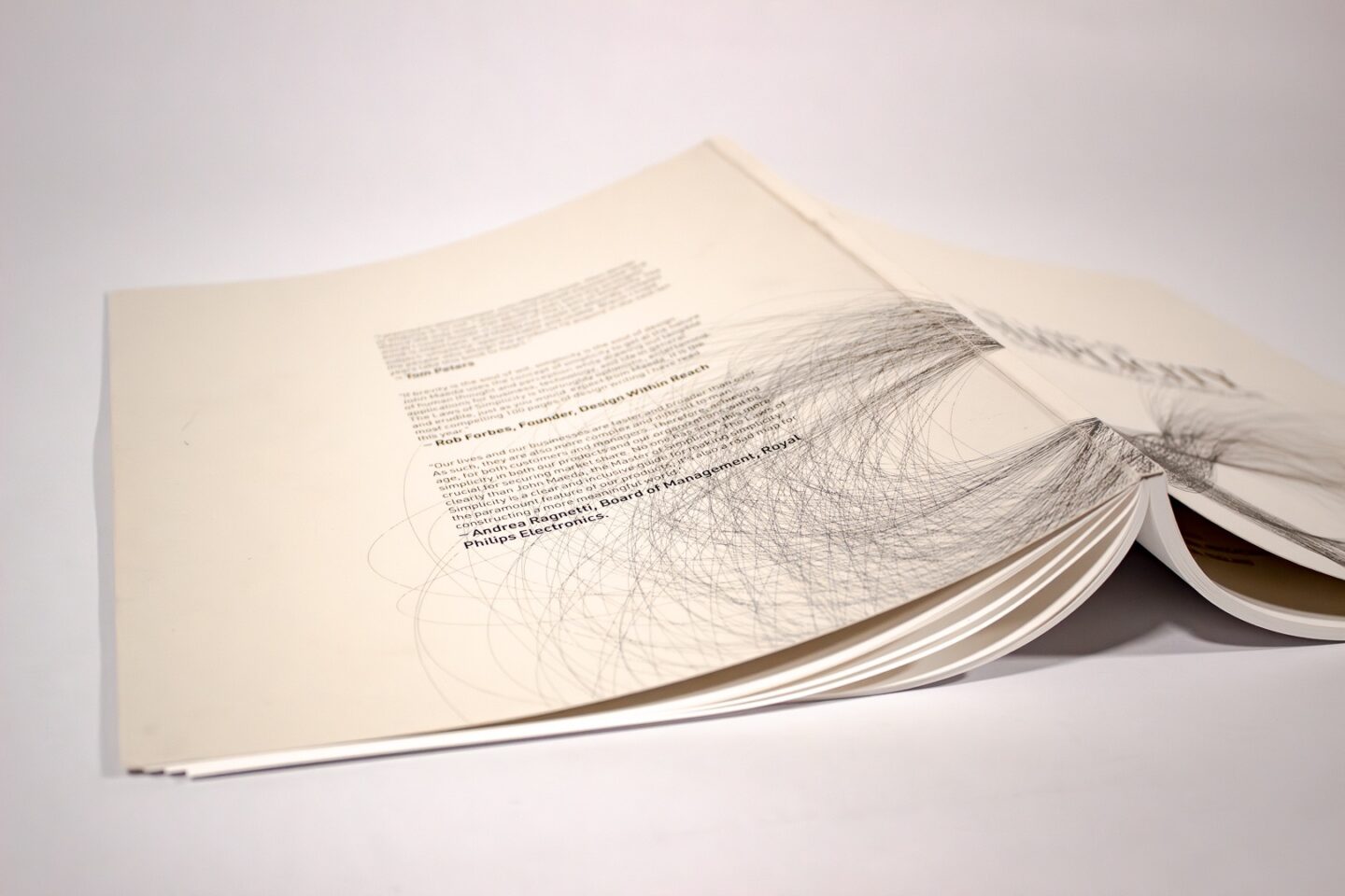
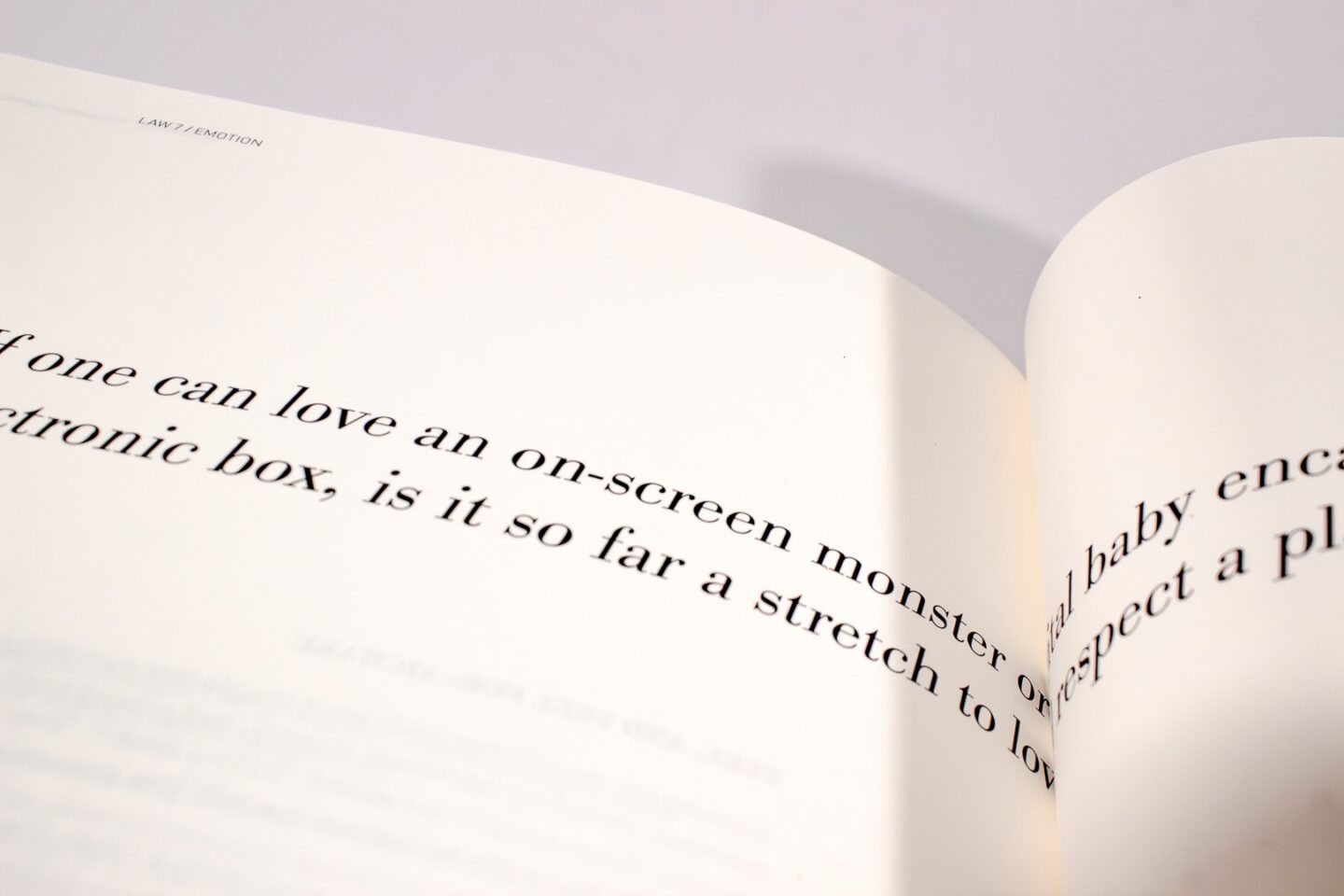
The task for this project was designing a set of three books based on the Laws of Simplicity, by John Maeda. When tackling a big project such as this one, it is important to look at the content of the book and how that will inform the design decisions. The original book discusses how technology has made everything overly complicated and how simplicity equals sanity. The layout, grid, and type decisions were made with this concept in mind to further prove the point of the author\'s words. In the layout, the white space is used to let the words do the “talking” and large pull quotes are used for the important information. The three book designs are not identical but connected through these informed design decisions: simple layouts, large images, and the same typefaces (but used slightly differently for the context of that specific book). For example, in the third book which contains images, only the large type for pull quotes is used. This emphasizes the meaning of the words as being important, and makes connections to the other three books. There were many positive takeaways from this project, and many skills learned as well. Some of those being: making a cohesive system of books with a large amount of content, using paragraph and character styles in InDesign, laying out a large book, creating a design system based on a book or concept, and having that concept shine through not just with the words written on the page but in the design itself.