CREATIVE CONSCIENCE x CCS
CREATIVE CONSCIENCE x CCS

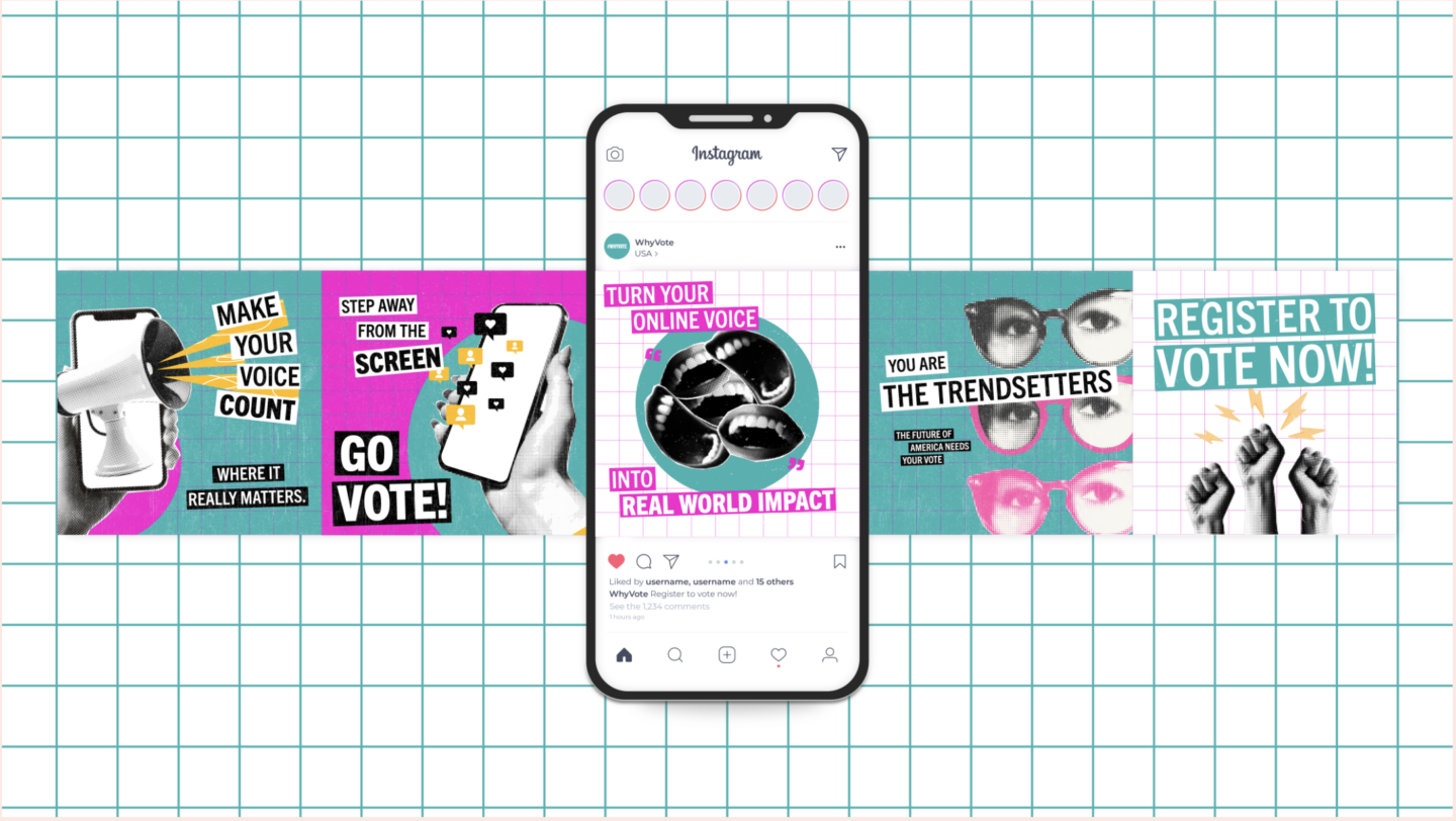
In anticipation of the upcoming U.S. presidential election, this project aims to inspire young people to use their voices by voting and actively participating in democracy. Many young individuals feel disconnected from politics, often due to a lack of representation or understanding of the political process. To address these barriers, we are launching a social media content competition focused on creating eye-catching, informative, and accessible youth-led campaigns. The competition invites young people to develop content that encourages their peers to engage, register, and vote. I collaborated on this project with my classmate, Lauren Moore. Our goal was to create a social media campaign aimed at encouraging young Americans to vote. We focused on highlighting the significant role social media plays in the lives of Gen Z and Millennials, and how it can be leveraged for more than just casual scrolling. As part of this project, we created an Instagram carousel, a motion video, and a vlog, all featuring a trendy and playful cut-and-paste style aimed at younger audiences. The result is a cohesive design system that’s not only engaging but also promotes something meaningful.