Employment Badge

'The Substance' Title Sequence

'The Substance' Title Sequence

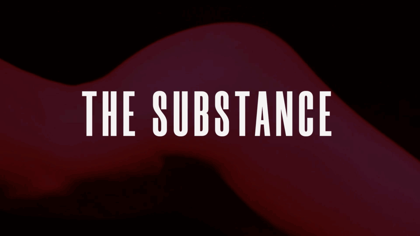
Body image is one of the most prevalent topics today, often discussed in politics, books and movies through metaphor or in your face stories. The Substance is no different, telling a story of an aging celebrity who wants nothing more than her youth and status back. Tasked with making a title sequence of our choice movie, The Substance stood out as something interesting we could play with. The film focuses a lot on the female body, so we knew we wanted the project to encapsulate that and be striking. We picked a nude model and pink to highlight the feminine parts of her body and green to block out overt nudeness. The entire video teases the viewer to the end where a big reveal could happen, but it doesn’t and it’s left to the viewer’s imagination. Sending the message that the viewer is not entitled to see her body was important and resonated with the overall message of the movie.

Classified

Classified

This American Life is a podcast that broaches a lot of different subjects. From ghost stories to national news, they never shy away from making an episode that is interesting. This inspired our newspaper project where we had to pick a podcast episode and create a newspaper based on the topic. My partner and I chose one of their scarier podcasts, Crime Scene (2000), where they chatted with real people who have dealt with crime scenes and included a scary story at the end. We were very interested in making the paper gory and weird to look at, and so compiled that together. We stuck to black and red with halftones to keep the mood dreary and sad, continuing to get more unsettling while going through the newspaper. This project taught me how important it is to communicate with your partner on the desired tone to carry throughout the piece. We were not always together when working, so making sure we would come back with similar ideas and pages was important to have a cohesive story. The masthead was my favorite part of the iteration; I took inspiration from fingerprints that police would collect when someone gets arrested. There were about five different versions of iteration as I kept trying everything I was thinking to add. We were lucky to have ten letters to match how many fingerprints are on a pair of human hands and seamlessly integrated that. Adding ‘left’ and ‘right’ hand helped tremendously to communicate our goal. Overall, this project helped us begin to understand other people's design processes and learn how to work together.

RE:HUE

RE:HUE

RE:HUE was a design archive project tailored entirely to our design tastes and preferences. The project specs were essentially to pick many design pieces we loved and then make a book out of it. It was challenging to make a book that was unique because many of us had similar picks. I came down to how it would be organized to best display the works. I chose color as my main focus and made sure to seek out designs for every color included: red, blue, green, yellow, white, orange, and purple. Every page followed the same system to ensure consistency throughout the book. Some things differed from page to page, the page numbers were different colors depending on the section and the lines on the back of the page matched them. I made it so it would be the easiest way for the viewer to know where they were even if the book were to be flipped upside down. This piece was very fun to work on because there were almost no constraints and had total creative freedom. My biggest takeaway from this project was that design is limitless, and because I will not always have that freedom, I should try to push boundaries to create something to be proud of. This project went through a lot of iterations and I am satisfied with my end result.

Condon Report

Condon Report

Edward Condon was a physicist that dedicated time to developing the Scientific Study of Unidentified Flying Objects. This book was a collection of messages, reports and diagrams dedicated to UFO sightings and government data. While Condon did a good job compiling information, the book needed work to develop systems, typography and give it an overall consistent layout. At over 100 pages long, being able to see consistency as the reader flips through the pages was important while also giving it personality. As the book progresses, more and more information is blocked out and unreadable. This was to give the feel of real government documents that the public does not have access to. While these reports were public, there were still certain things that were too intense for people to handle. With these random bits of information blocked out, it made the reader anxious and developed a feeling of dread for what could be hidden. Learning how to collect information and form specific systems was ideal to organize such a lengthy book and to help people understand what they are looking at.