Clarendon URW Typeface Study
Clarendon URW Typeface Study
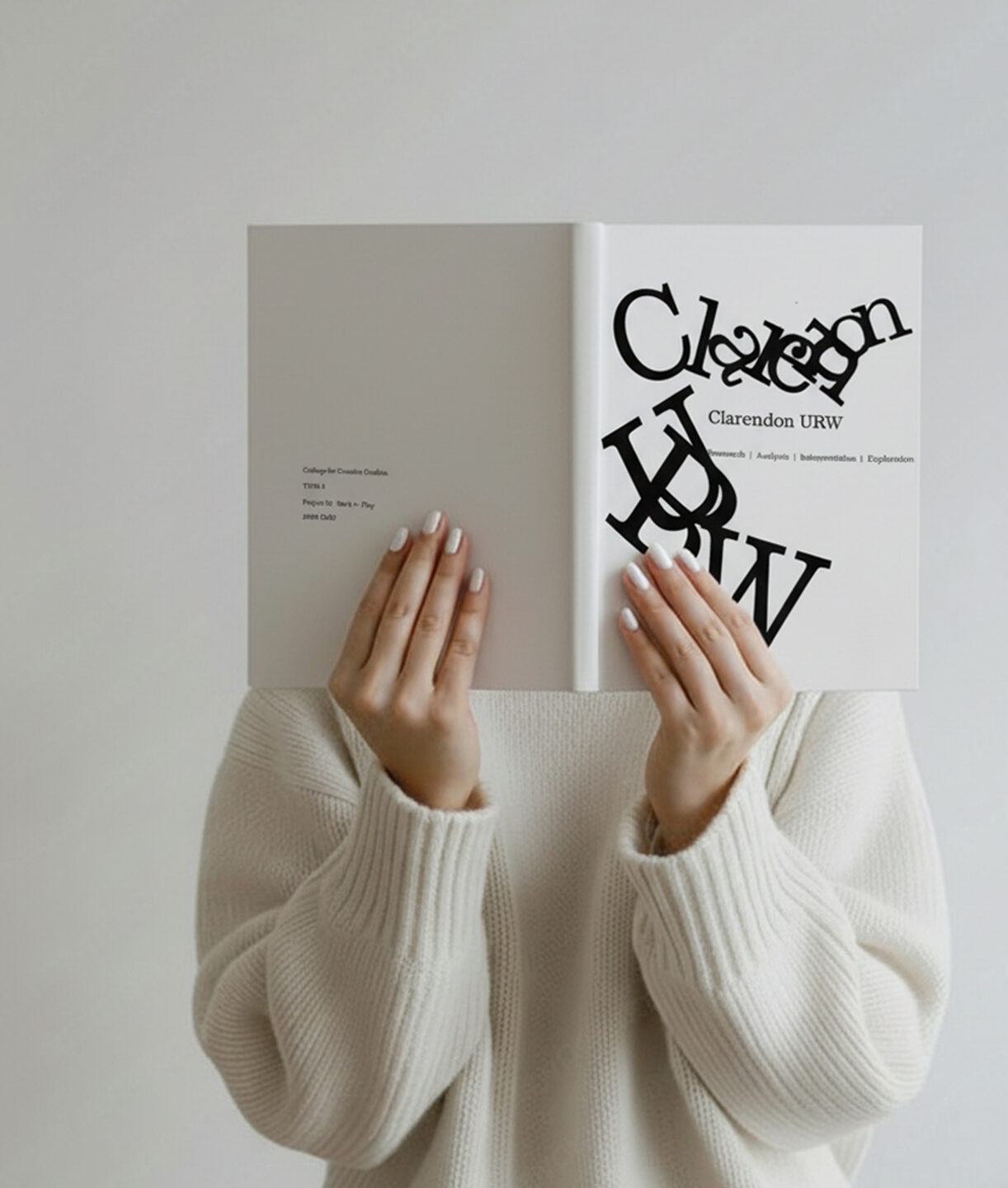
When I first started this project, I thought it would be straightforward—just putting the Clarendon URW letters in order and labeling their parts. But the deeper I looked, the more complicated it became. The curve of a shoulder, the weight of a stroke, even the way two lines connected—suddenly One of the hardest parts was deciding what to keep and what to leave out. Sometimes I wanted to show everything I noticed, but that only made the pages feel heavy. Other times I cut too much, and the work lost its meaning. I also kept running into the question of balance: how do I make a page look interesting without distracting from the type itself? I went through many versions, reworking layouts again and again, never fully satisfied. In the end, I chose this version because it felt like the typeface was guiding me instead of me forcing it. The process taught me patience, but more than that, it taught me to listen—to see design not just as something I make, but as something I can learn from