Graduation

2027

Skills
  • Motion design
  • UI/UX
  • Publication Design
Employment Badge

Condon Report Redesign

Condon Report Redesign

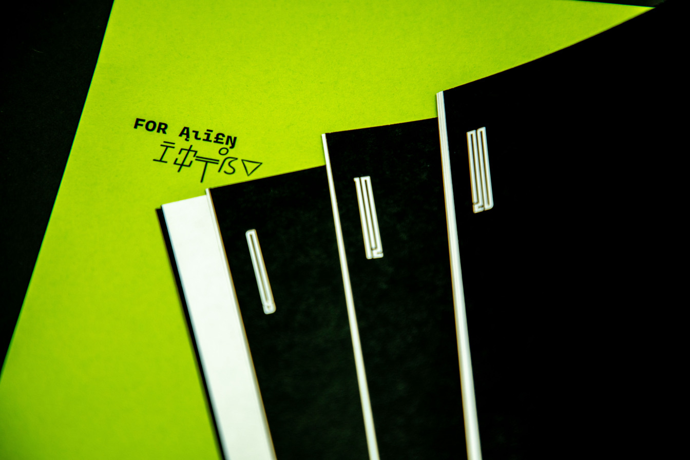
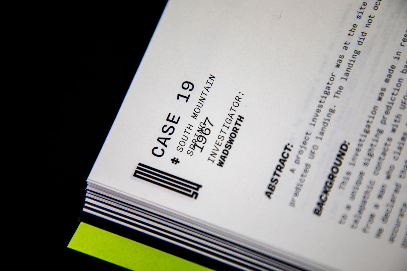
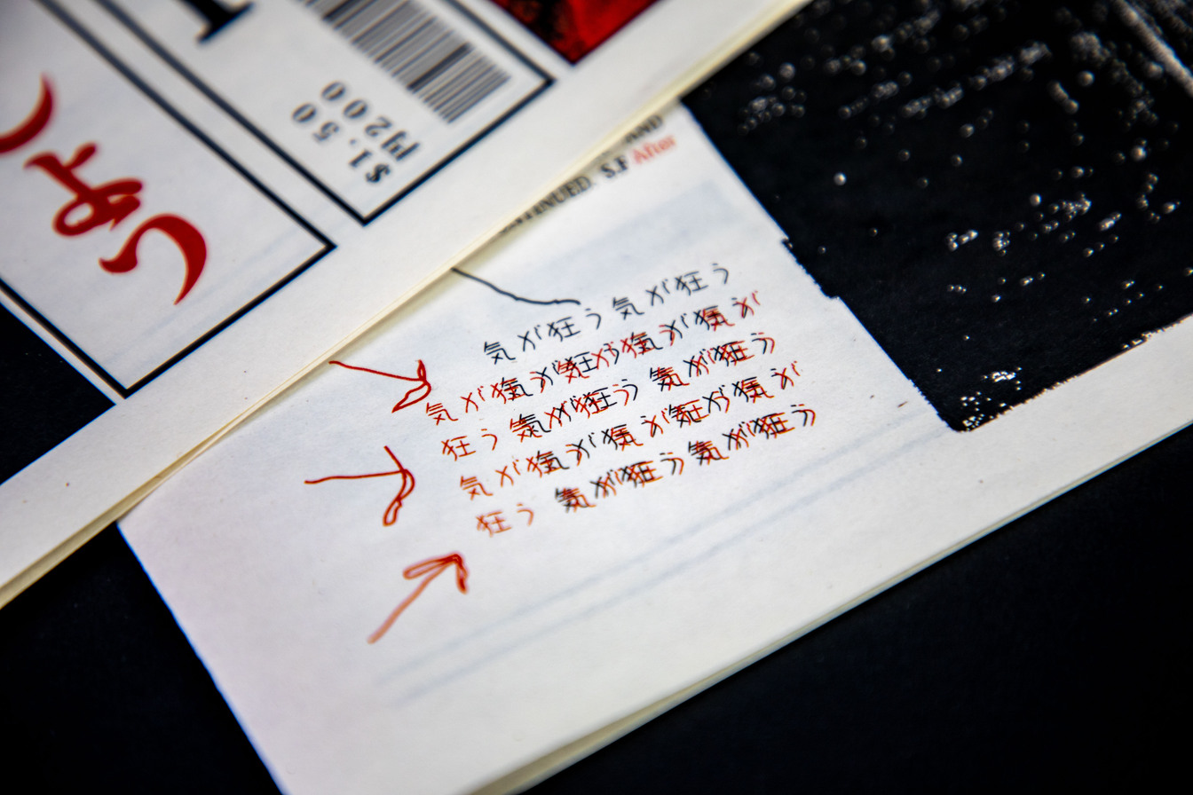
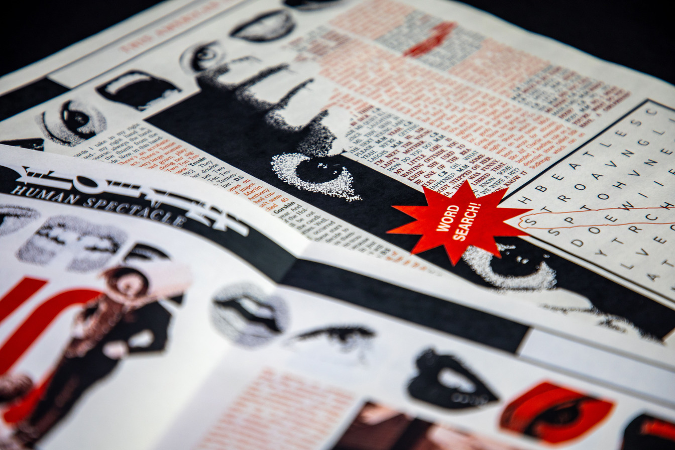
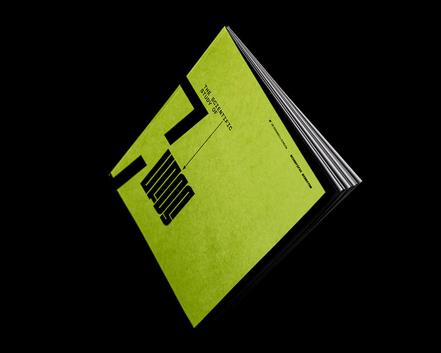
The Condon Report is a 100-page redesign of Dr. Edward U. Condon’s The Scientific Study of UFOs. The objective was to transform a traditional research document into an experimental, multi-page formatted publication that includes a dynamic grid system and unique typesetting to act as a portal of communication between Dr. Condon and its alien audience. The design process began with establishing a flexible grid system that evolved across the six sections of the book. Once the formatting of the book was created, typesetting and stylesheets were weaved in to support the objective. Midway through, overlapping text, varying font weights, layered subheadings, and custom glyphs were introduced and integrated throughout the typography, further challenging legibility and enhancing the feeling of cryptic interference. This suggested a sense of “corruption” and the feeling that aliens were communicating with the author. As the book progresses, the visual interference made many pages partially or entirely illegible, an intentional choice made to symbolize the breakdown of human-readable information as alien presence intensified. The greatest challenge throughout this process was the six-week timeline to rapidly learn stylesheets in Indesign and develop a “corrupted” typographic system, however this process helped to better the understanding of typographic development. Sacrificing traditional readability was a difficult but necessary decision to fulfill the project’s core objective: to reimagine a scientific report as an immersive vessel of alien contact.

The Human Spectacle

The Human Spectacle

THE HUMAN SPECTACLE is a conceptual newspaper based on The Human Spectacle episode from the “This American Life” podcast, featuring three stories centered on the theme of being watched. The goal of this collaborative project was to translate the unsettling, voyeuristic tone of the podcast into a visual and editorial experience. The newspaper’s structure drew heavy inspiration from Japanese magazines and newspapers, as the first and primary act of the podcast focuses on a Japanese game show. To capture the narrow and vertical style of Japanese publications, a grid system containing seven columns per page was implemented. The content design process began with the masthead, which featured the title of the newspaper in both English and Japanese. Text was styled to flow without paragraph breaks, using only changes in font weight and a strict black-and-red color palette to distinguish between speakers and emphasize emotion. To enhance the sense of surveillance and discomfort, grainy, posterized images styled to resemble security footage were integrated into the newspaper, alongside eerily on-brand advertisements, each reinforcing the feeling of being watched. These visuals were woven between the columns and within the text to break up the narrative in an intentional, disorienting way. The final layer consisted of handwritten typography and scribbled marks over the body text to emulate a human presence, suggesting that someone had interacted with the newspaper before the reader, watching and leaving their trace. The greatest challenge of this project was balancing the structured, formal design language of Japanese print media with the organic, humanistic elements of the podcast’s content. As a team, being able to seamlessly blend the aesthetic influences of Japanese publication with the thematic storytelling provided by “This American Life” was learned, resulting in a newspaper that successfully achieved a voyeuristic tone.

The Platform Title Sequence

The Platform Title Sequence

The Platform is a title sequence created for the horror sci-fi film The Platform, a dystopian thriller set in a vertical prison where food is delivered on a descending platform, leaving those on lower levels to survive on scraps. This group project aimed to visually convey the film’s core themes of inequality, greed, and systemic injustice, while reflecting its vertical structure, cold color palette, and unsettling tone. The design process began with in-depth analysis of the film’s narrative and visual language. Through collaborative mind-mapping and ideation over several weeks, a concept was developed that emphasized the eerie, industrial aesthetic and vertical movement present throughout the movie. Filming took place in cold, desolate environments honing in on concrete and rusted textures to mirror the prison’s harsh architecture. The camera work relied heavily on vertical panning to mimic the platform’s motion and underscore the hierarchical themes presented within the film. In post-production, a blue-toned color grade was applied to enhance the film’s cold atmosphere, with select scenes tinted in saturated red to evoke discomfort and reference the red alarm lighting in the film. The soundtrack, a fast-paced, industrial score, guided the editing rhythm, enabling rapid cuts and dynamic transitions between textures. Typography was integrated into the environment with offset letterforms that moved vertically, aligning with the platform's motion and syncing with the audio beats. The sequence ends in a final title reveal set against darkness, echoing the film’s haunting conclusion in a void-like space. The biggest challenge in this project was coordinating shared files and maintaining consistent creative direction between the team. These difficulties ultimately strengthened communication skills and created a deeper understanding of how to align visual and conceptual intentions, particularly with the storytelling of the shots and the chaotic typographic sequencing.

SER Mobile Website

SER Mobile Website

The SER Mobile Website is a digital program matchmaker designed for adults returning to school, built for the nonprofit SER. The goal of this project was to research and interview the SER nonprofit organization, then design and develop a website that helps users identify the right educational program based on their unique needs and goals. The project began with an in-depth exploration of SER’s mission and current website. To better understand its challenges, multiple staff and students were interviewed. The most common feedback was that the existing site was overwhelming, with too much information and no clear path for users to find the right program. In response, a streamlined matchmaker tool was created. Using FigJam, a storyboard for the matchmaking system was mapped out, which was then translated into a fully functioning mobile website using Phoenix Code. The final site features a clean, user-friendly homepage introducing SER and its mission, followed by a quiz-like matchmaking experience that helps users find their ideal program. Based on the answers provided, the site suggests a specific program, offering users the option to apply directly or explore other options. The visual design centers on various shades of blue (SER’s brand color) to create a calm and trustworthy interface. To make the site feel more inviting and personal, playful phrases such as “Find your match!” and “Woohoo!” were added throughout the experience. Small yet meaningful touches, like animated confetti at the end of the quiz and smooth page transitions, helped elevate the user experience. The biggest challenge was working in Phoenix Code with no prior coding experience. Learning along the way made development slower, but ultimately more rewarding. Through trial and error, it became easier to build key interactive features such as button functionality, page transitions, and celebratory animations, gaining valuable hands-on coding experience in the process.

826 Verdant Veil

826 Verdant Veil

826 Verdant Veil is a fantastical brand identity created for a literacy center storefront in Portland, Oregon, a playful “witchy apothecary” designed to capture the spirit of a city known for its lush greenery and magical subcultures. The goal was to build a cohesive brand world where young witches could craft potions, collect charms, and, most importantly, strengthen their literacy skills in an imaginative environment grounded in Portland’s natural mystique. The design process began with deep research into Portland’s unique character, from its richly forested surroundings to its embrace of the occult and the whimsical. Early concepting focused on translating these traits into a visual system that felt enchanted, serpentine, and nature-driven. Dozens of logo explorations were developed, eventually narrowing into a set of marks inspired by wrought-iron gates and twisting snake forms. These elements were then extended into a full brand ecosystem: storefront signage, apparel, delivery vehicles, and themed retail items such as a “Hold Your Snakes!” tote, lantern-shade seed husks, and bottled snake elixir. Brand guidelines codified the identity, documenting how the marks interact with products, the use of earthy color palettes and intricate patterns, and a playful narrative voice woven throughout every touchpoint to reinforce the magical storytelling. The biggest challenge in this project was preserving consistency across such a wide range of brand applications while ensuring all assets stayed aligned with the original mission: to celebrate both literacy and imagination. Extensive iteration ultimately led to the strongest visual components, solidifying 826 Verdant Veil as a bold and cohesive brand rooted in Portland’s witchy, natural charm.

How to Clean Your Figurines

How to Clean Your Figurines

How to Clean Your Figurines is a comedic how-to tutorial aimed at amateur figure collectors, demonstrating the proper way to dust and clean collectible figurines. The objective of this 60–90 second video was to create an engaging and light-hearted guide using refreshing lighting, expressive typography, and motion graphics to support the instructional content. The process began with outlining the cleaning steps, scripting the voiceover, and storyboarding each shot. Filming included a variety of dynamic angles, such as top-down, close-ups, and over-the-shoulder shots, to maintain viewer interest and clearly show the cleaning process. Minimal color grading was applied to preserve a clean, bright aesthetic. After sequencing the footage, expressive typography was motion-tracked into key moments, reacting to voiceover cues and sound effects. Subtle animations like arrows, sparkles, sweat drops, and blush, were layered onto the figurine to give it personality and bring humor and charm to the tutorial. A core challenge of the project was learning to use professional camera and lighting equipment to capture clean, professional shots. This hands-on experience provided valuable technical skills in cinematography, lighting setups, and color correction, all of which are essential to creating an expressive and visually refreshing guide on cleaning figurines.